Faller Real Estate needed a brand. As a new company, they needed everything from a logo to collateral and a website.
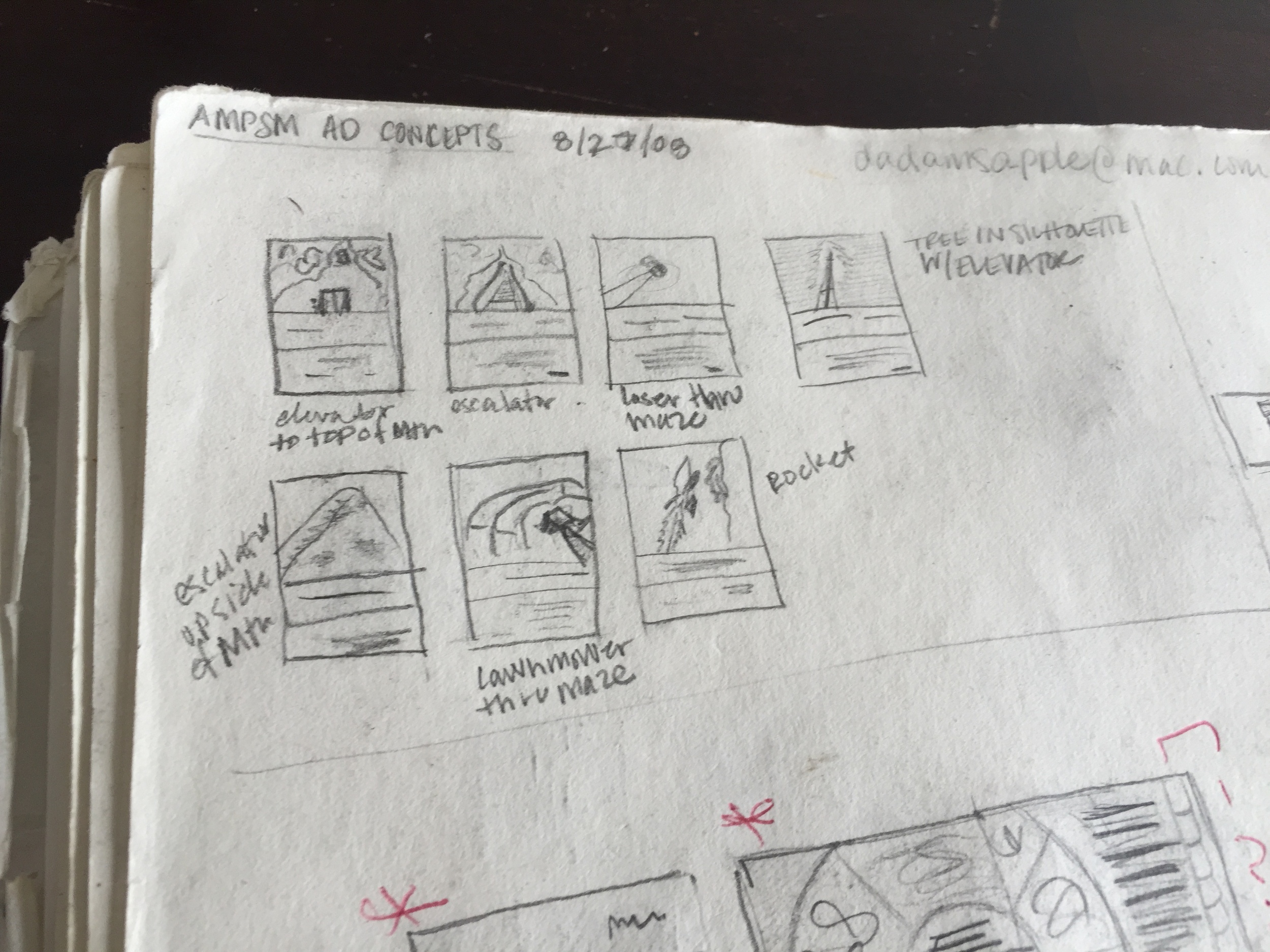
Preliminary sketches for Faller Real Estate’s logo
First round of comps for the logo with corresponding business card designs.
Round 2 with business card designs.
Chosen logo with color options and business card designs.
Chosen logo in chosen color with business card design options.
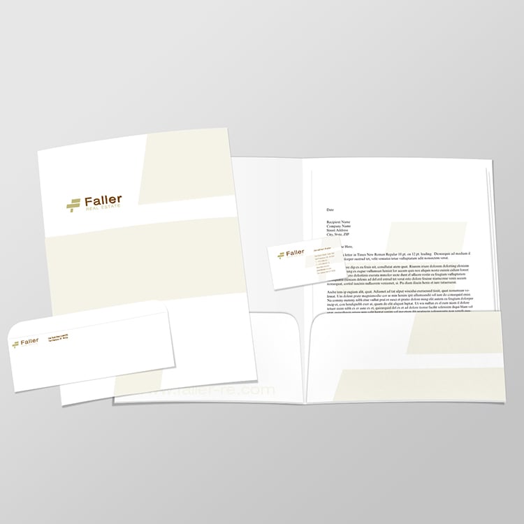

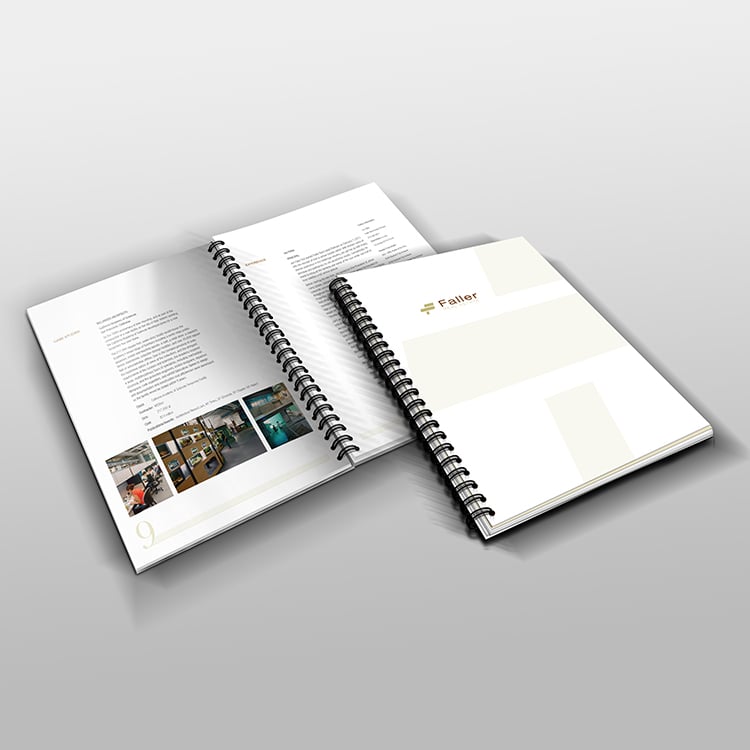
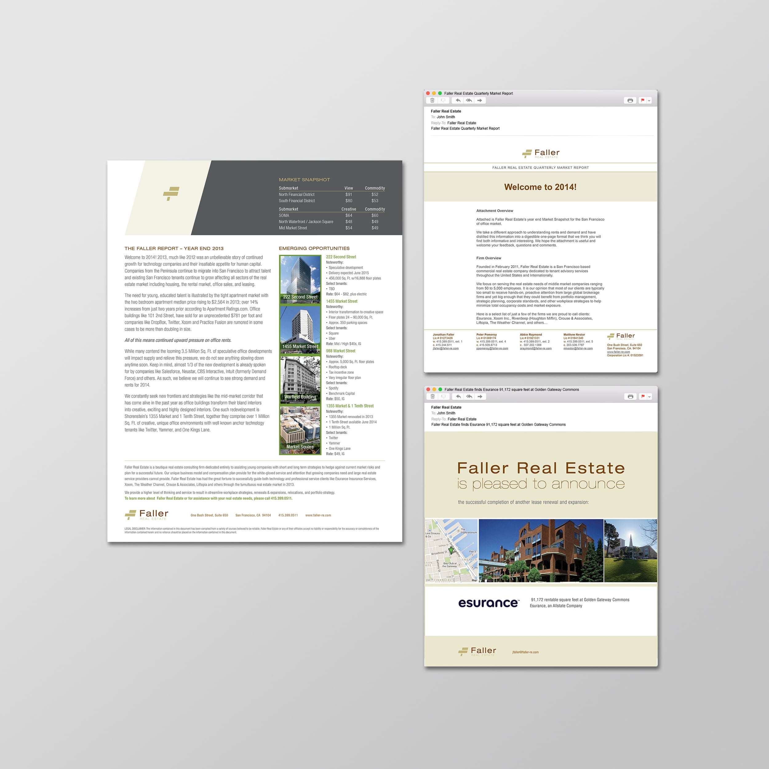
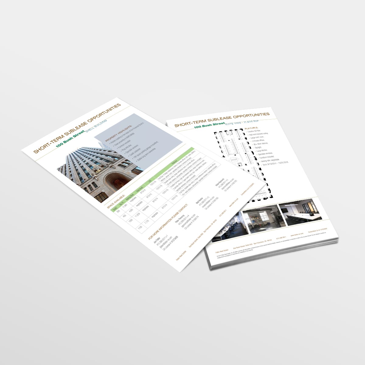
Brand collateral and website designs.