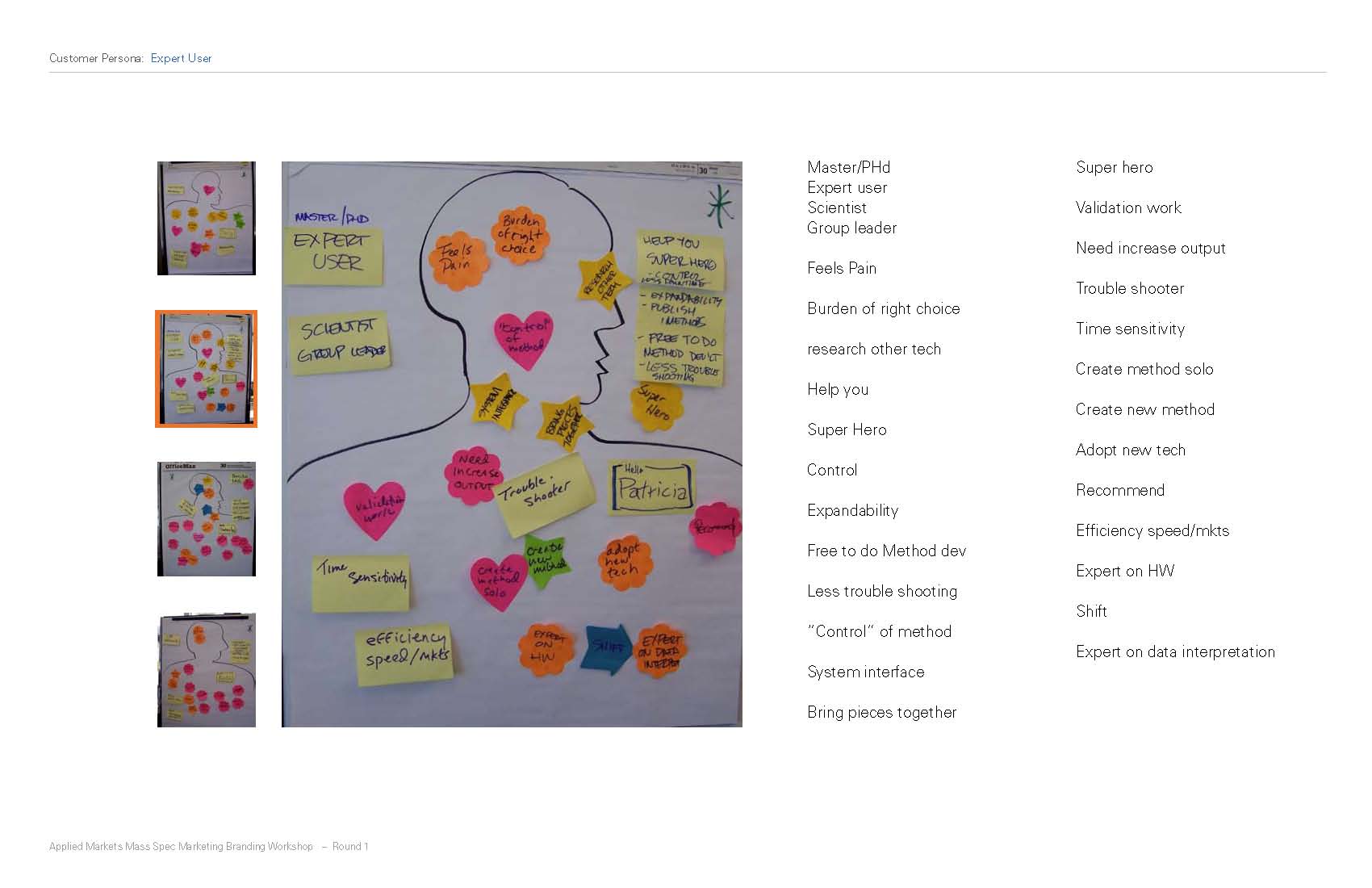
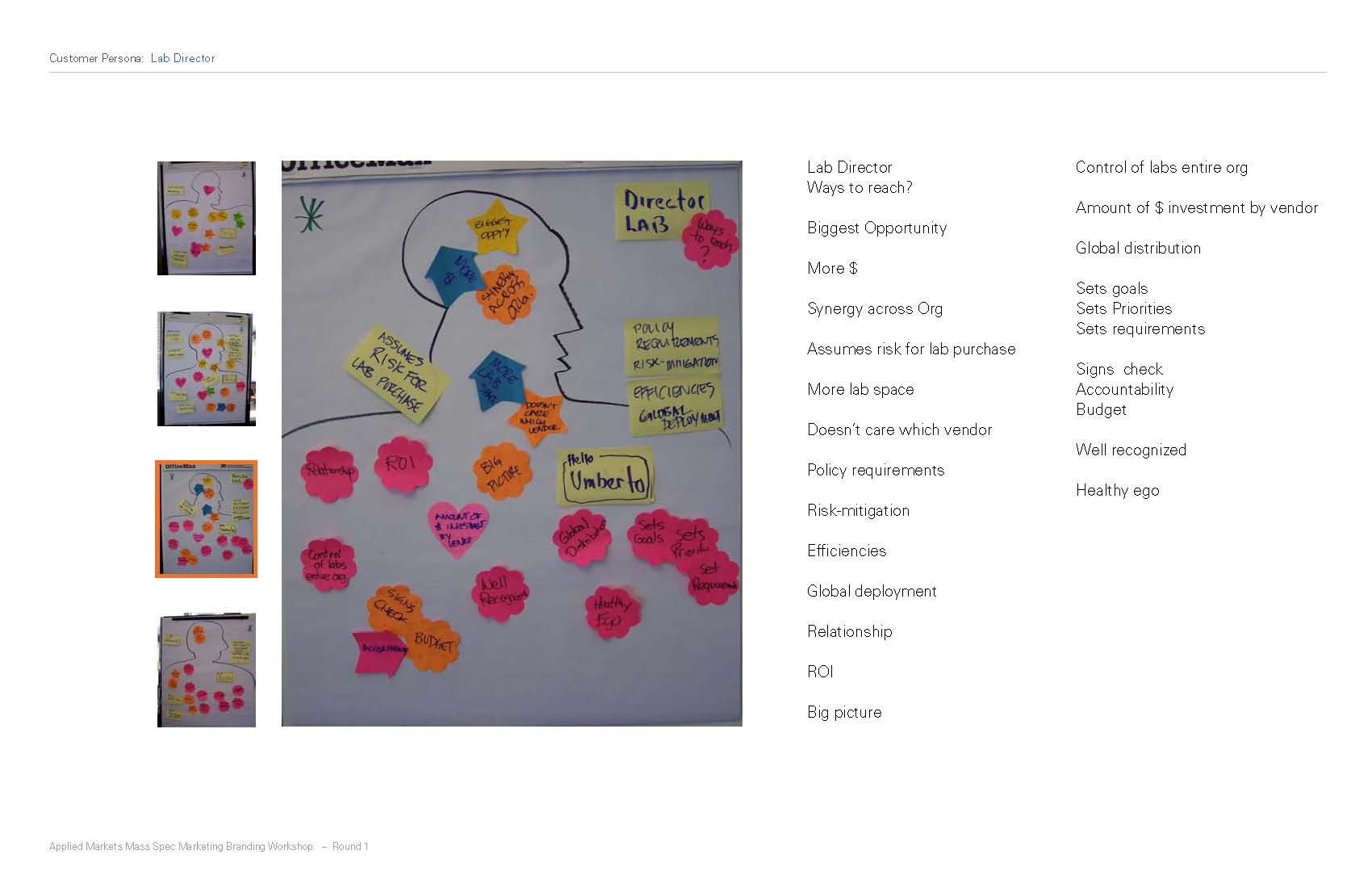
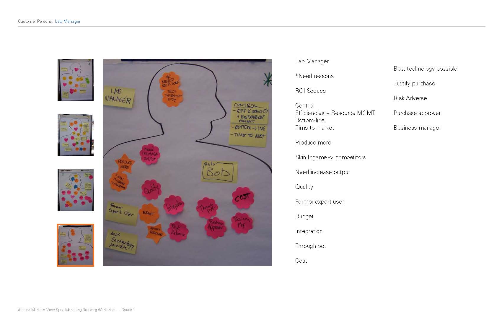
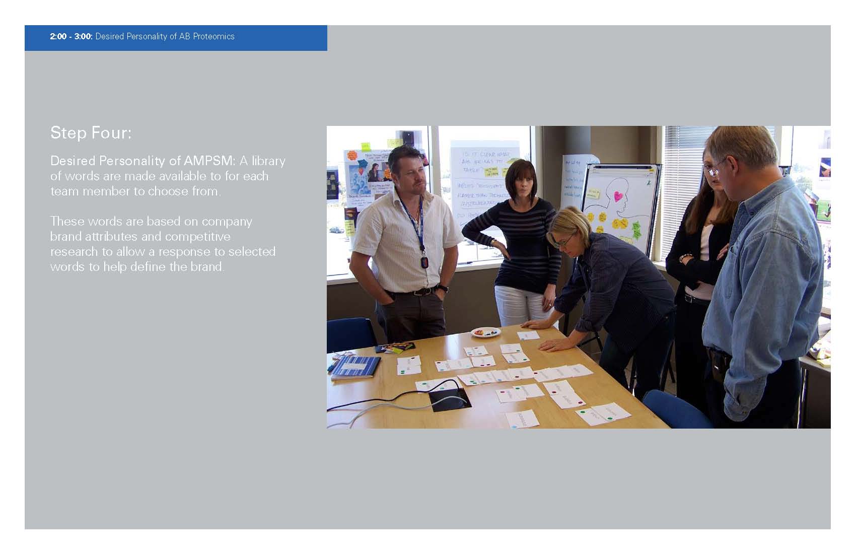
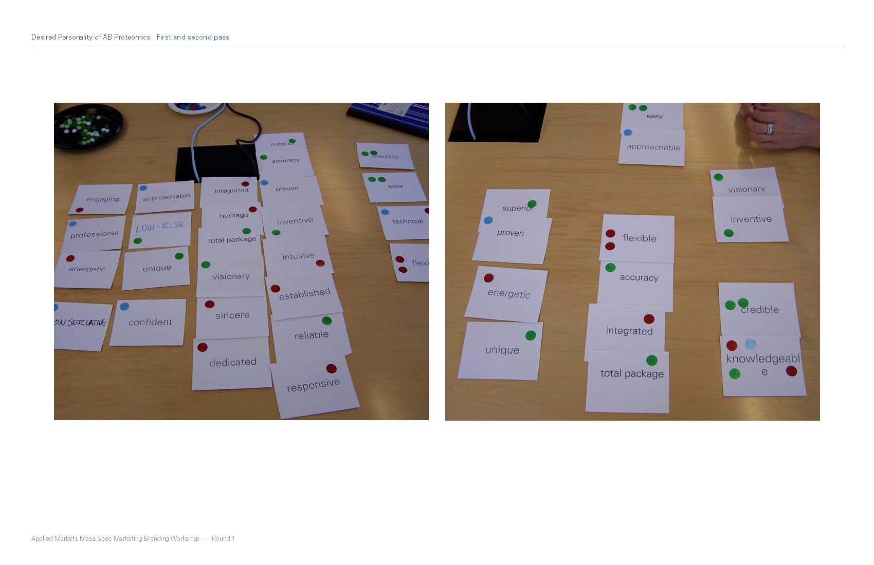
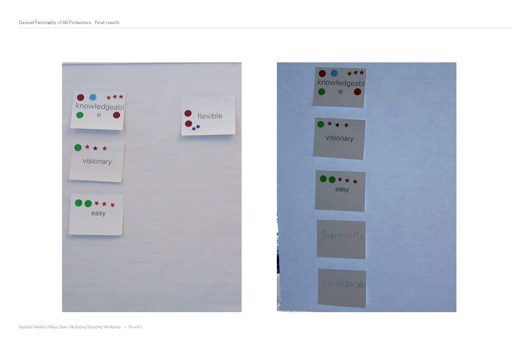
The first branding project that I worked on with the Applied Biosystems PSM team (consisting of James Stoecker, Design Director, Amy Vest, Designer and me) was called AMPSM (Applied Markets and Proteomics & Small Molecules). This workshop was led by Applied Biosystems' Global Marketing Creative Director Maryann Bell. James and Amy along with the marketing managers worked to set the tone of the brand.
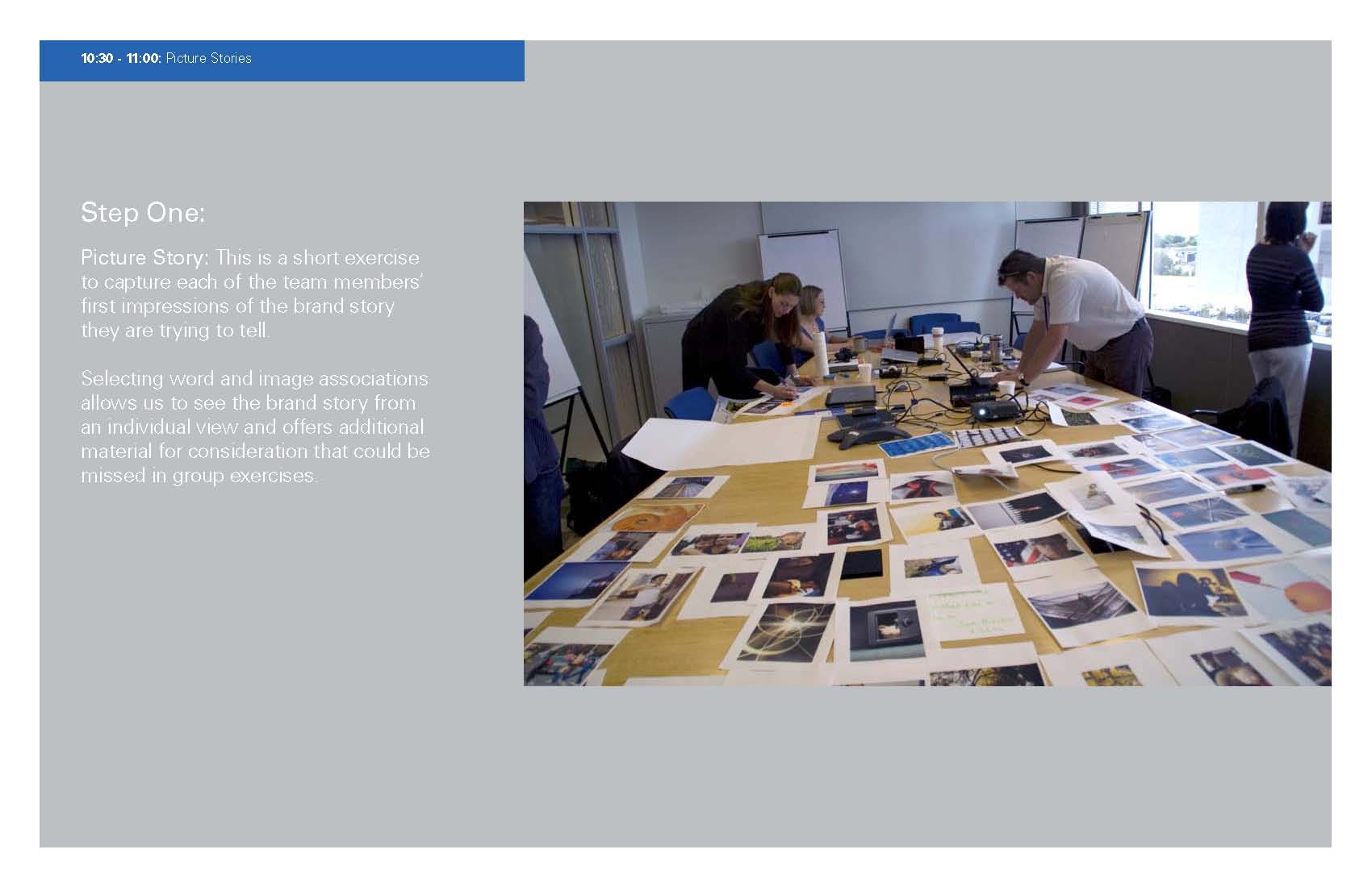
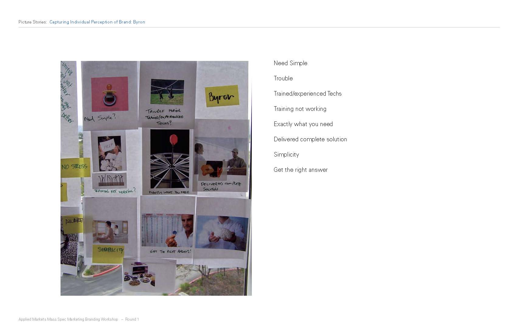
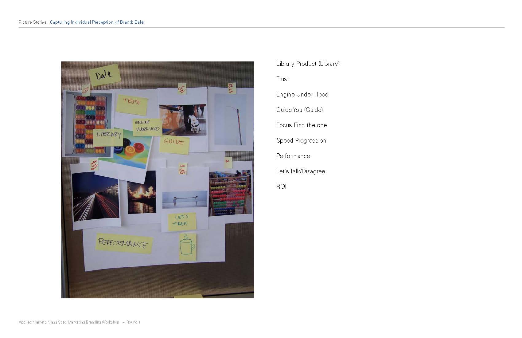
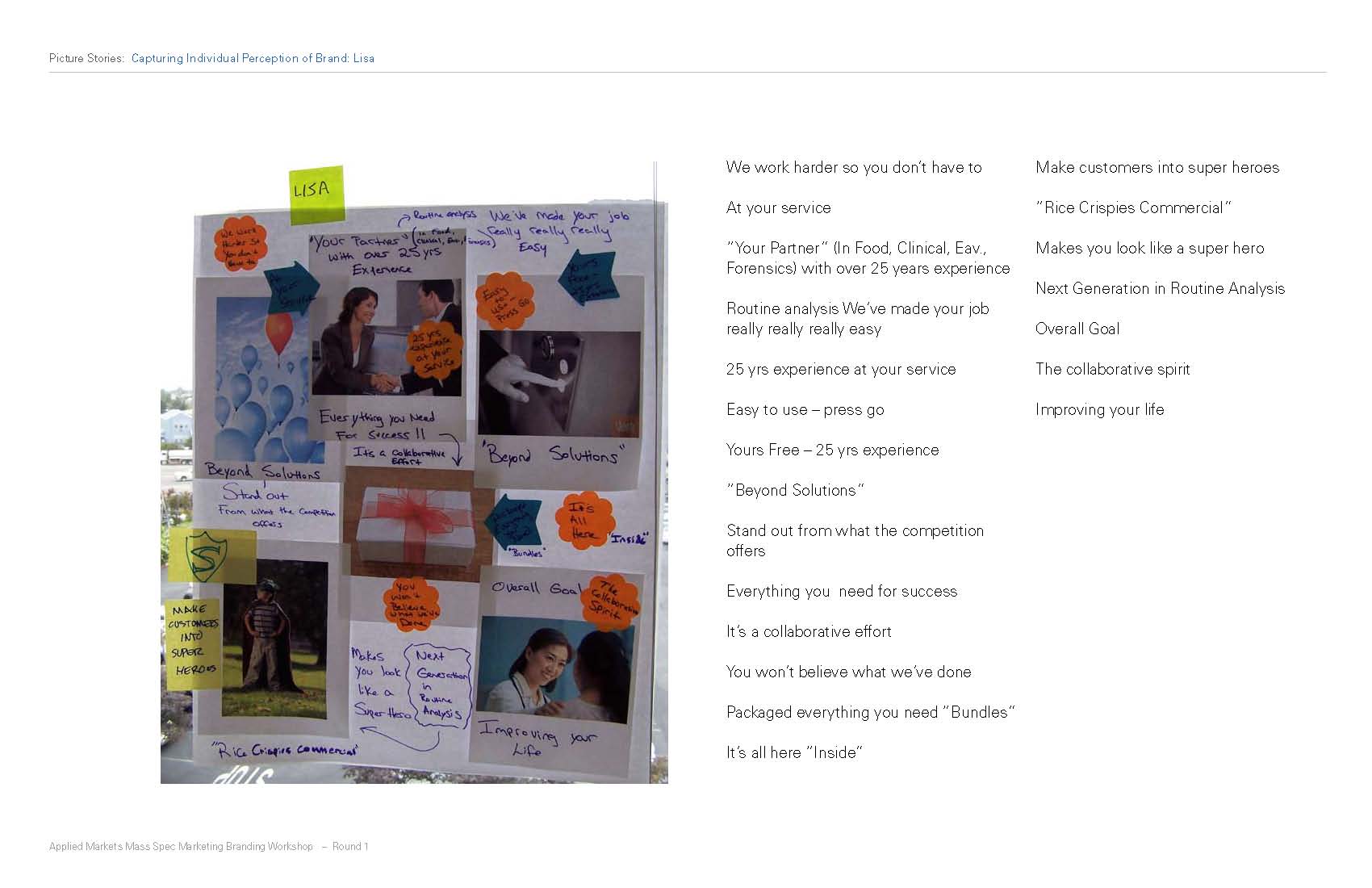
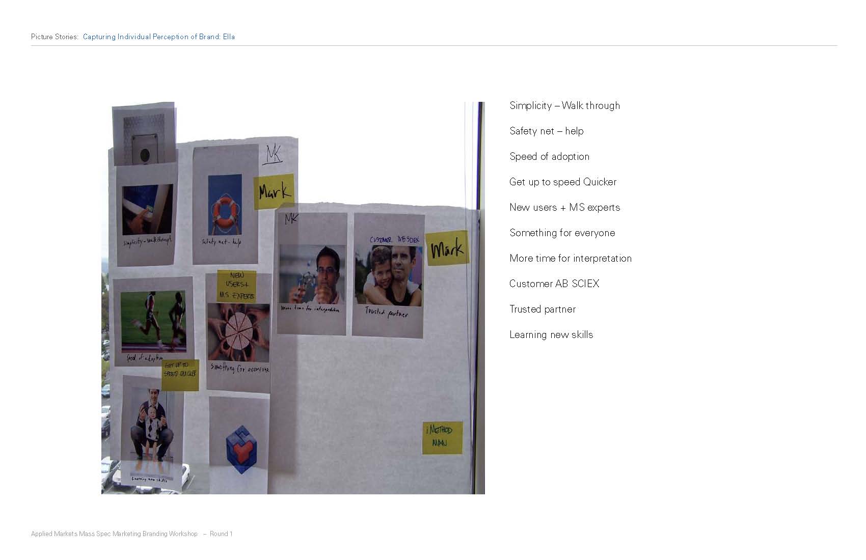
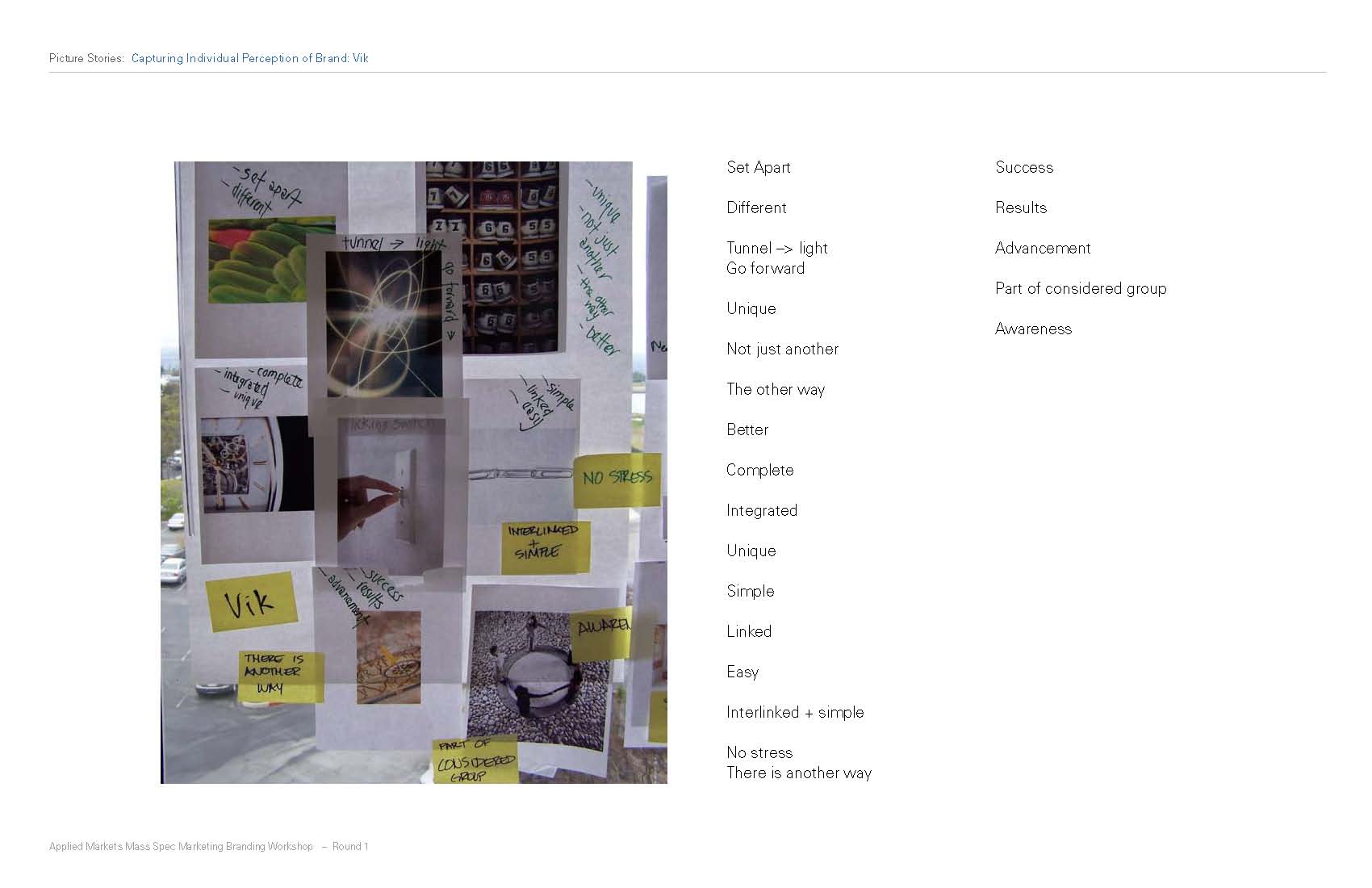
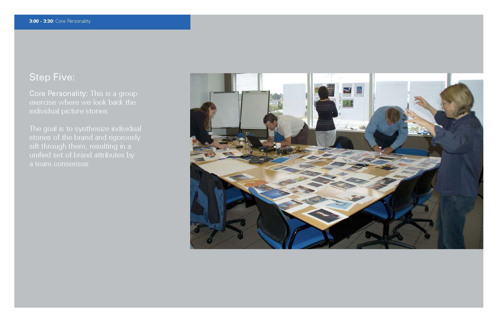
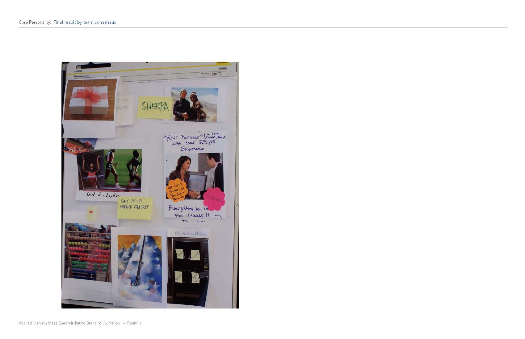
I took the results of the workshop and began working on the AMPSM storybook, which was a visual story about the brand. I started by sketching out simplified ideas and graphics that came to mind from the results of the workshop.
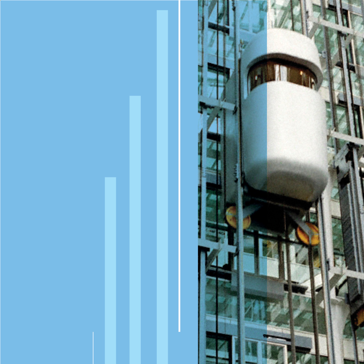
After I finished sketching, I started searching for additional imagery that I could combine with the graphic elements that I sketched out. When I had many images that worked with the themes, I began designing the storybook. This went through a few internal versions before I handed it over to James.


From there James took the storybook and modified it before presenting it to the marketing managers. This became the roadmap for the AMPSM brand.


The first project that I was to apply the details of the storybook to were ads for the launch. We worked with a copywriter to come up with some headlines that were in line with the story book. Below are my rough sketches.
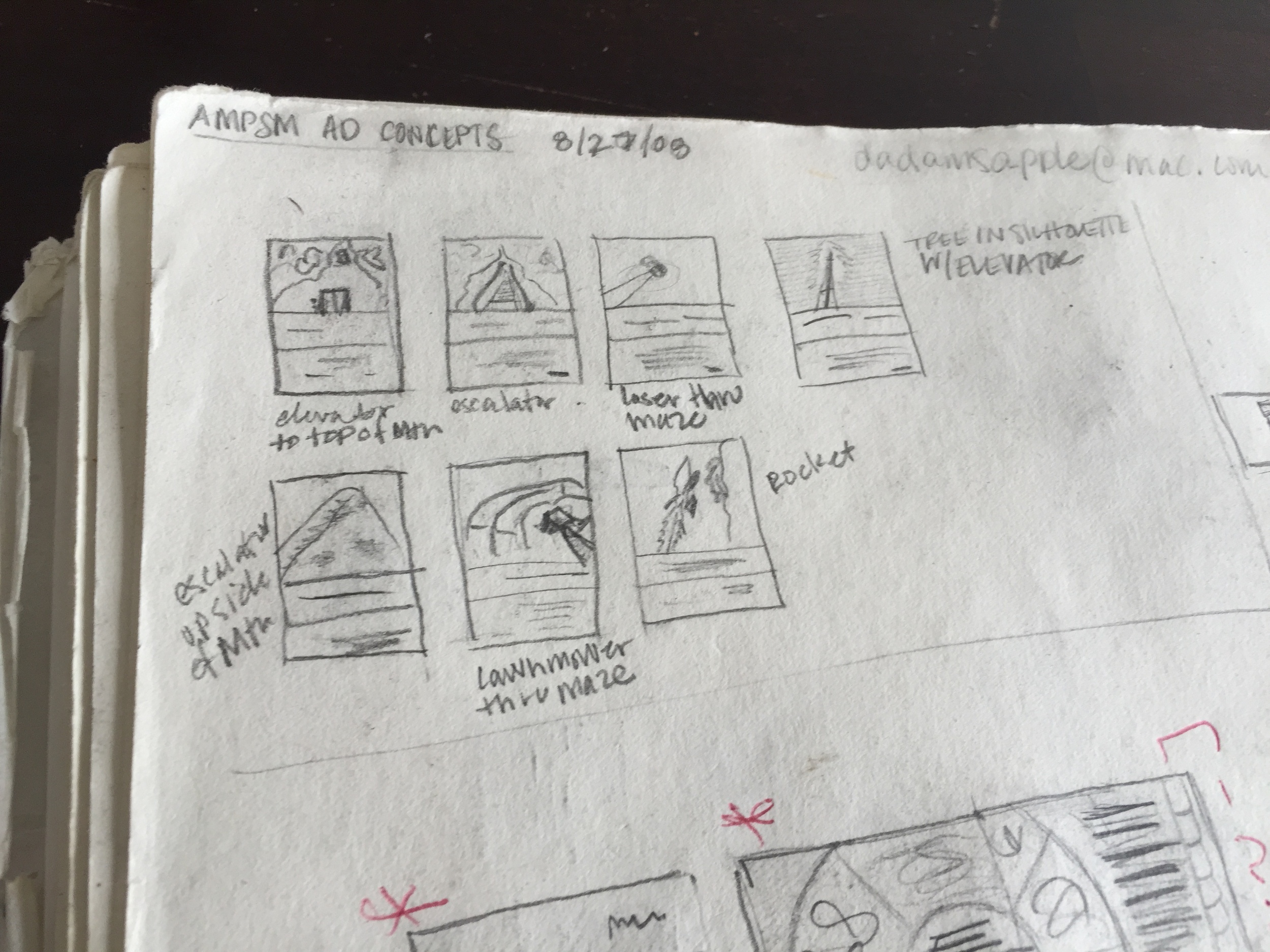
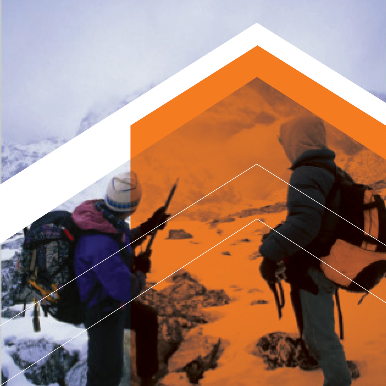
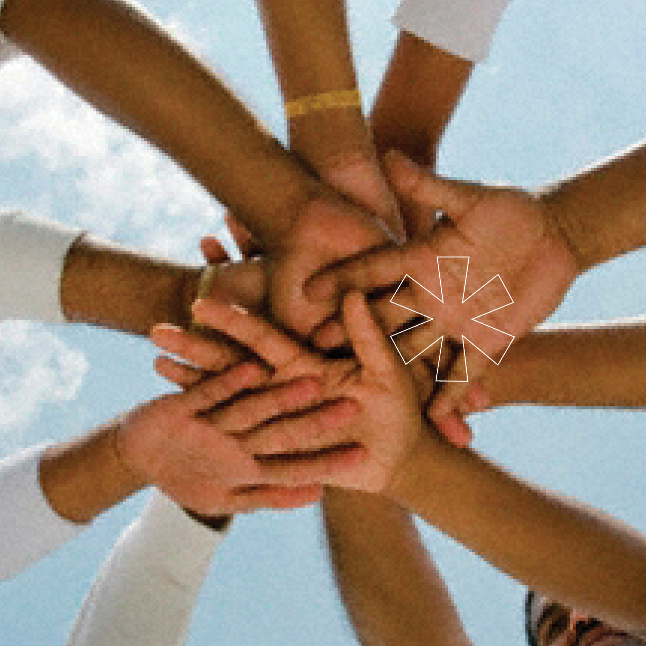
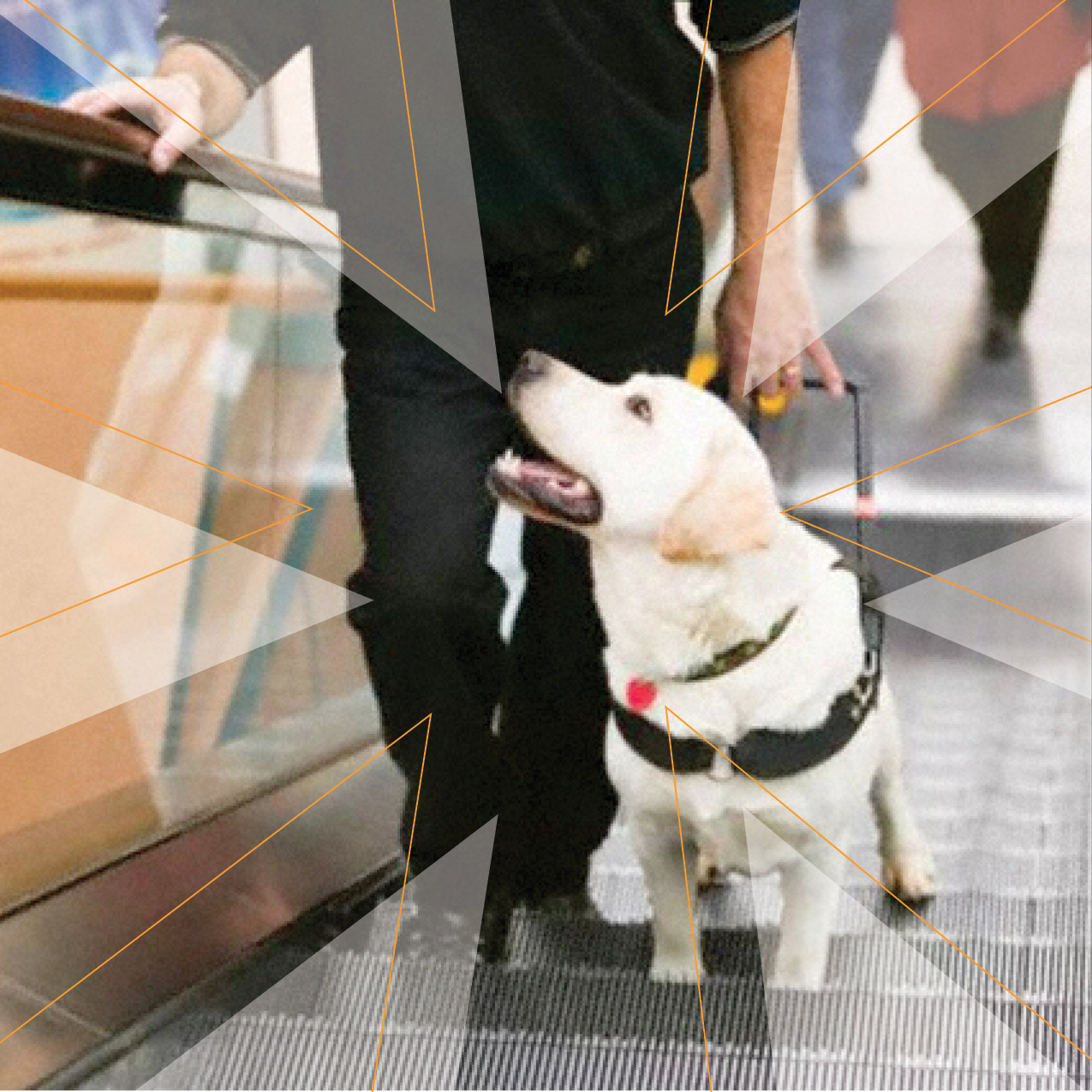
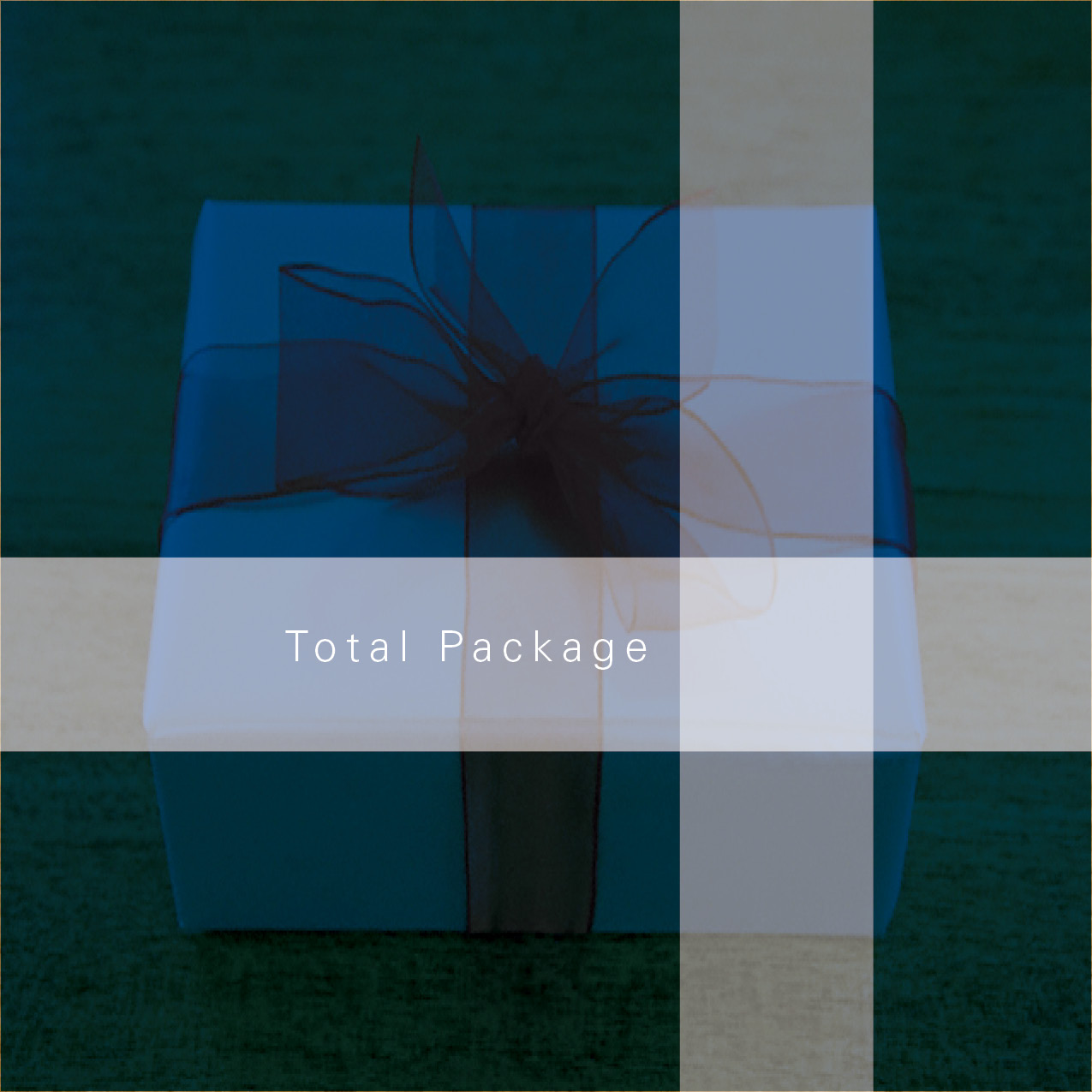
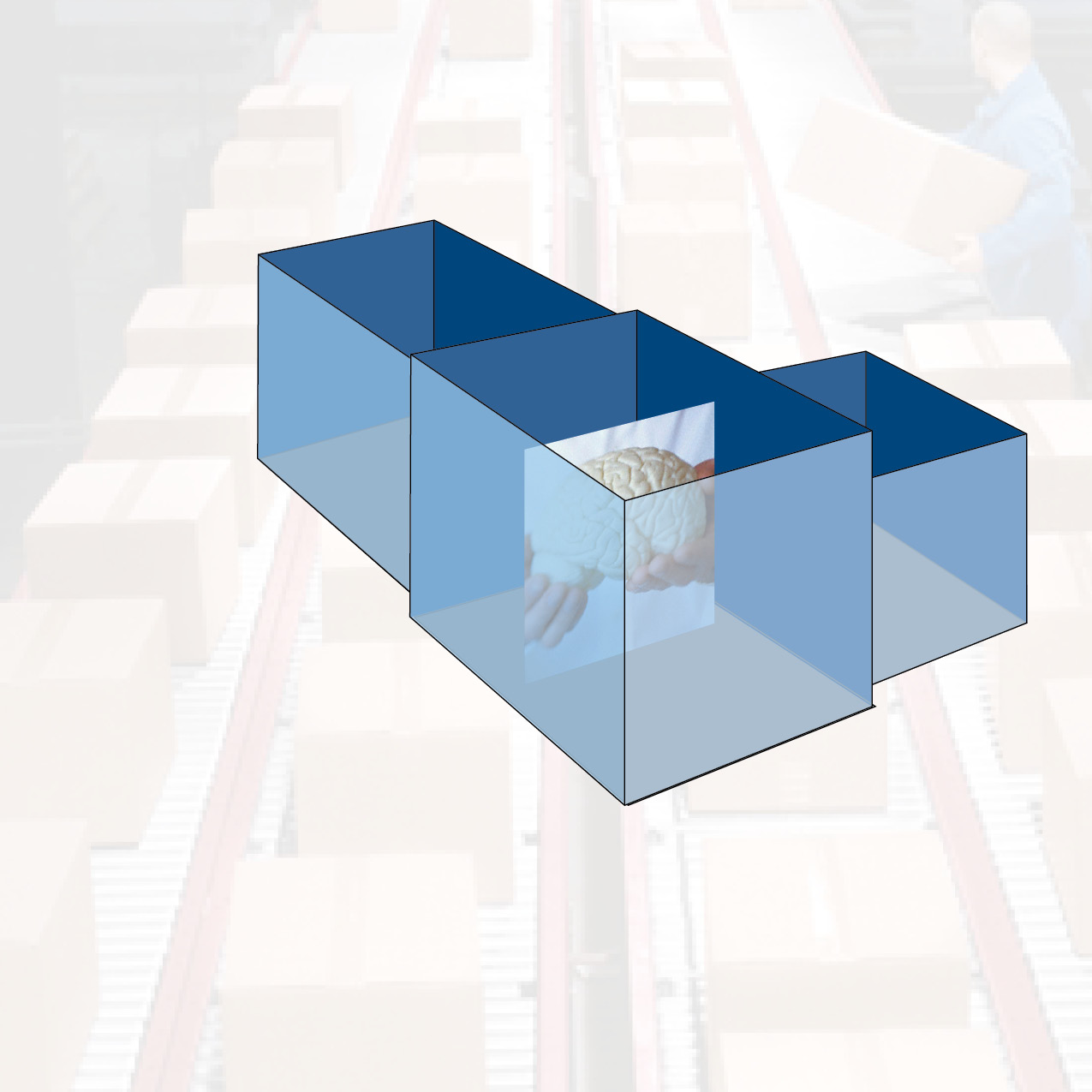
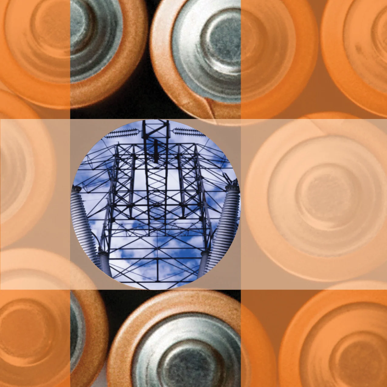
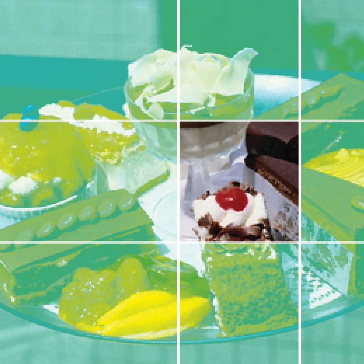
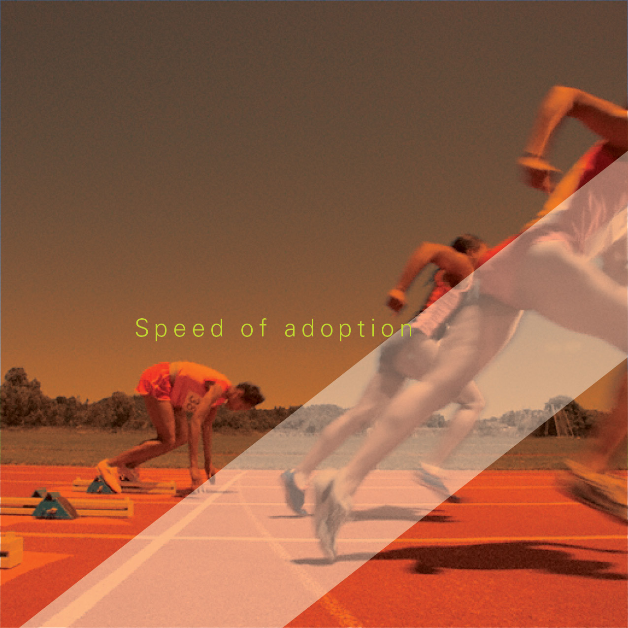
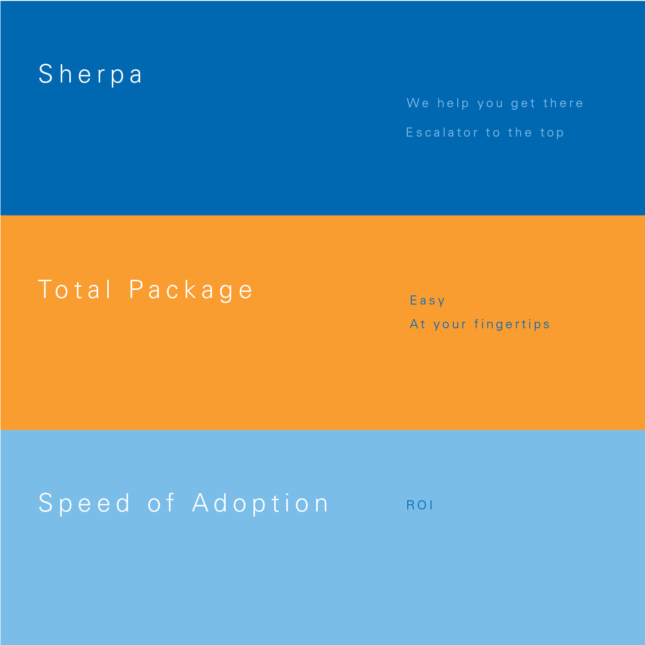
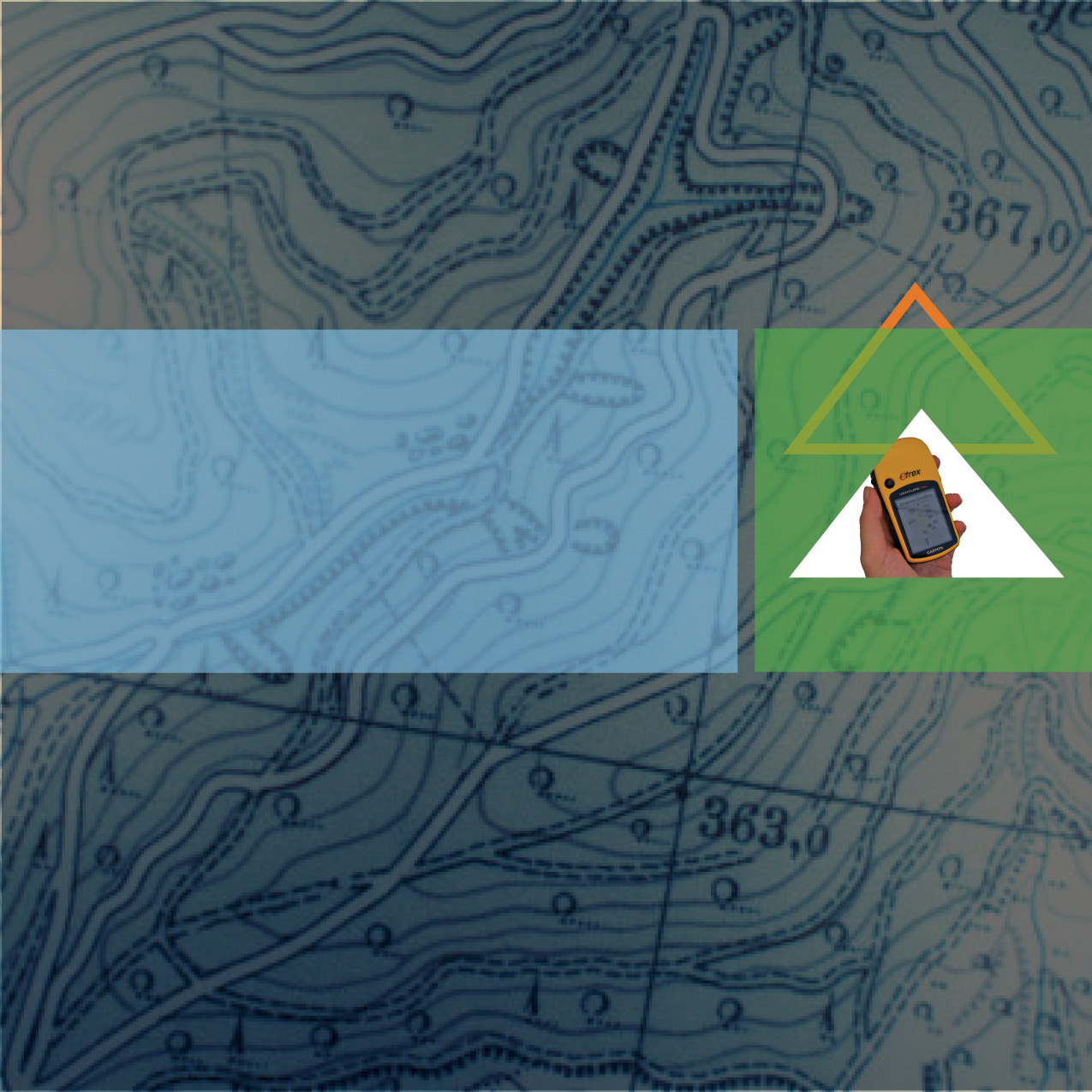
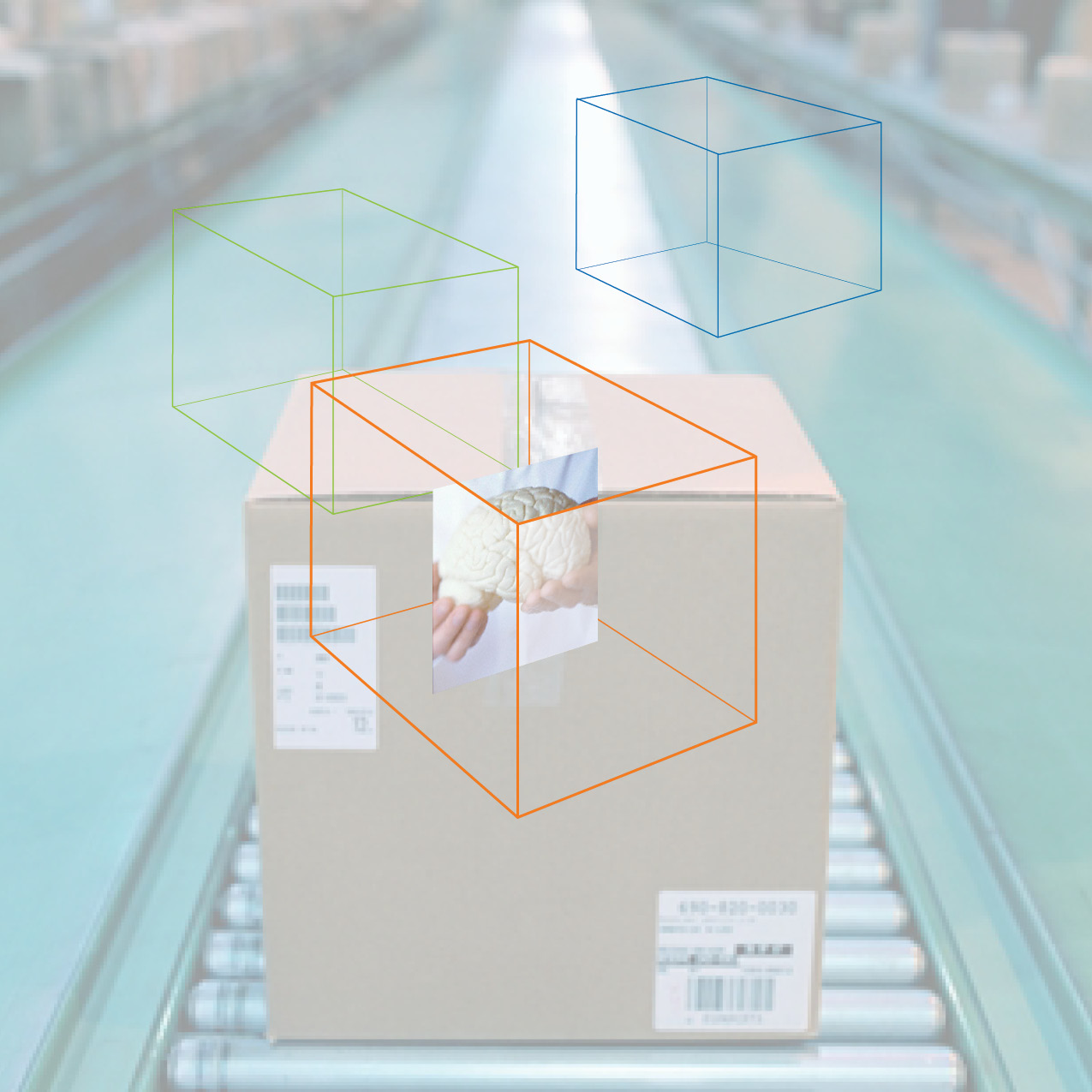
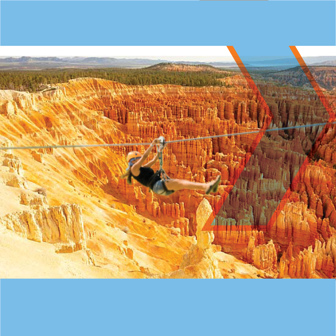
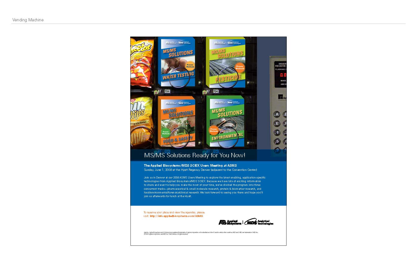
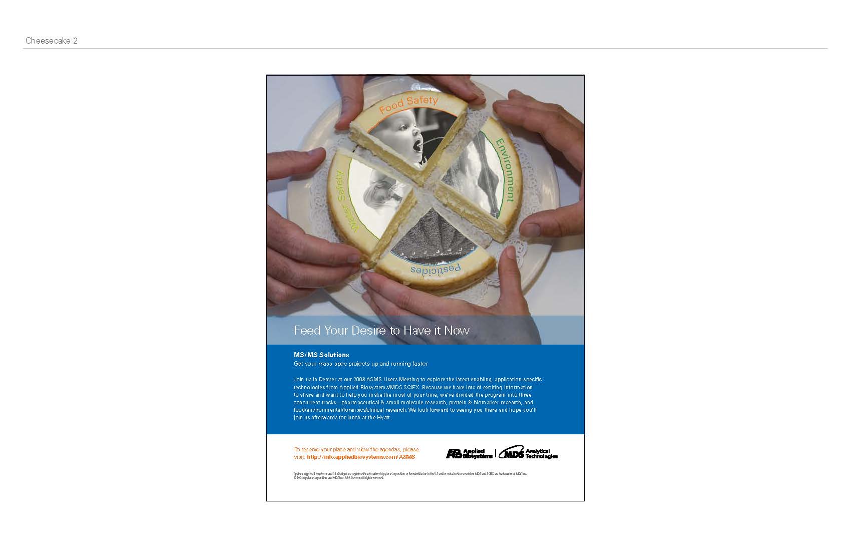
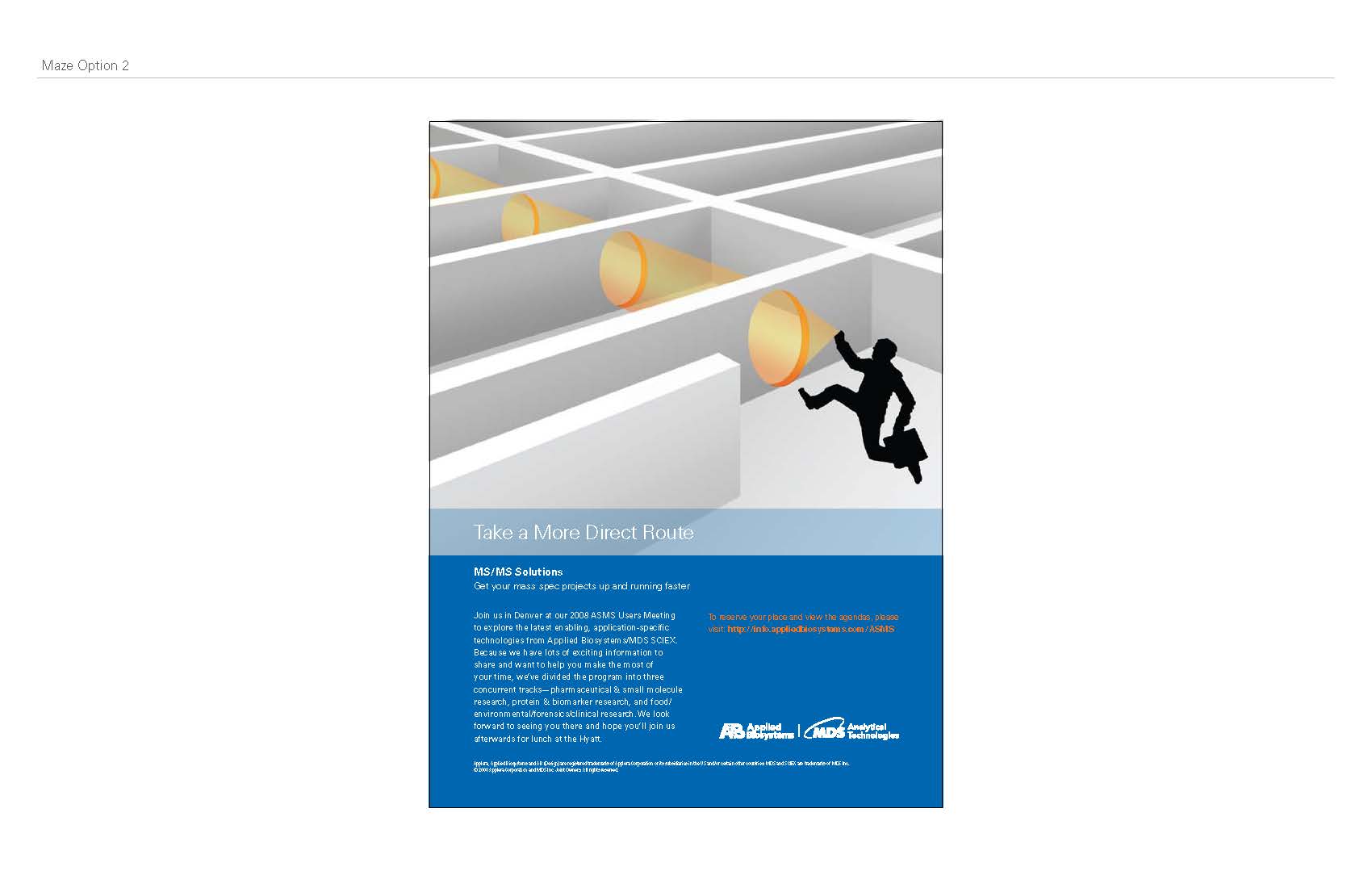
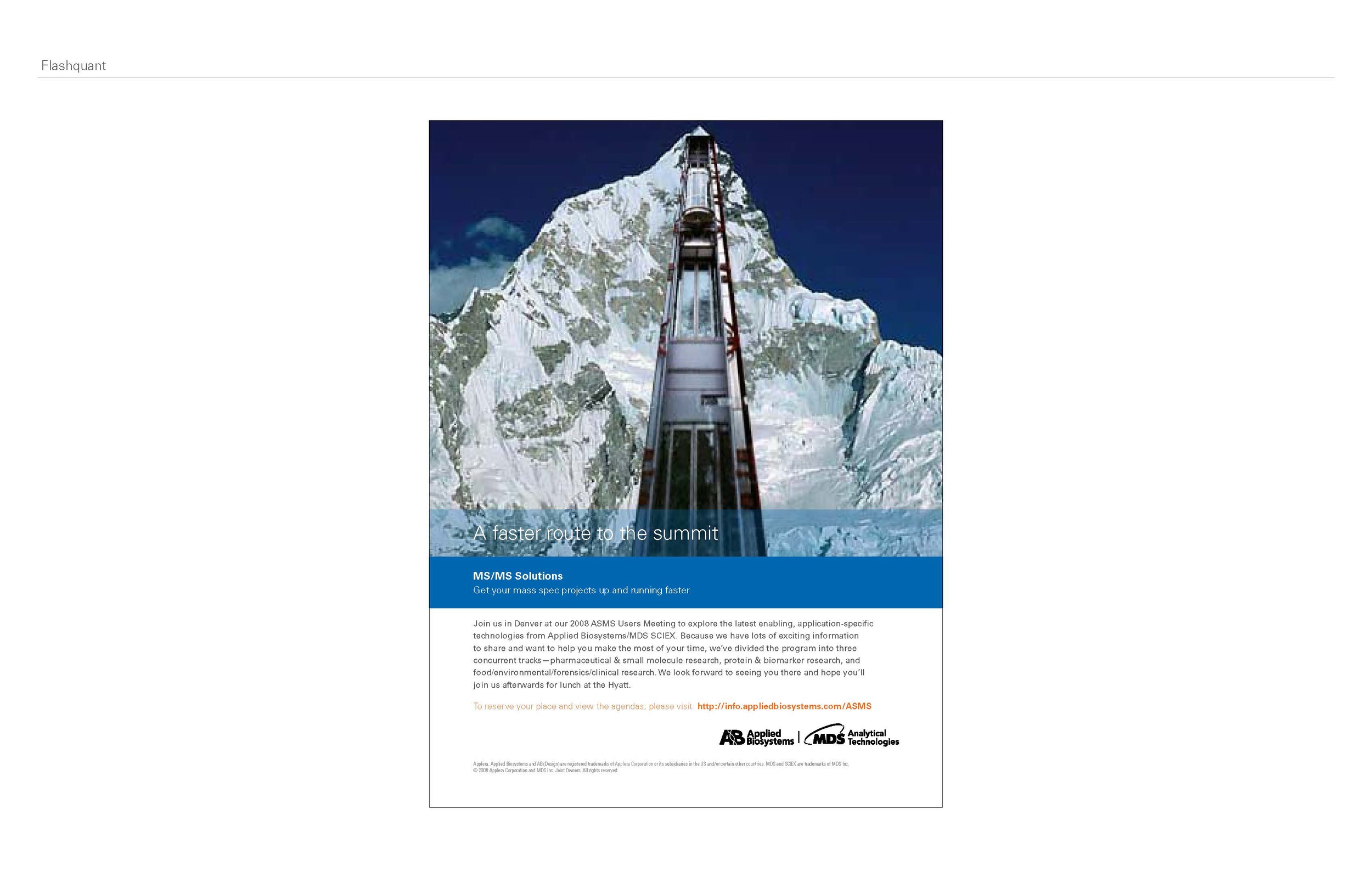
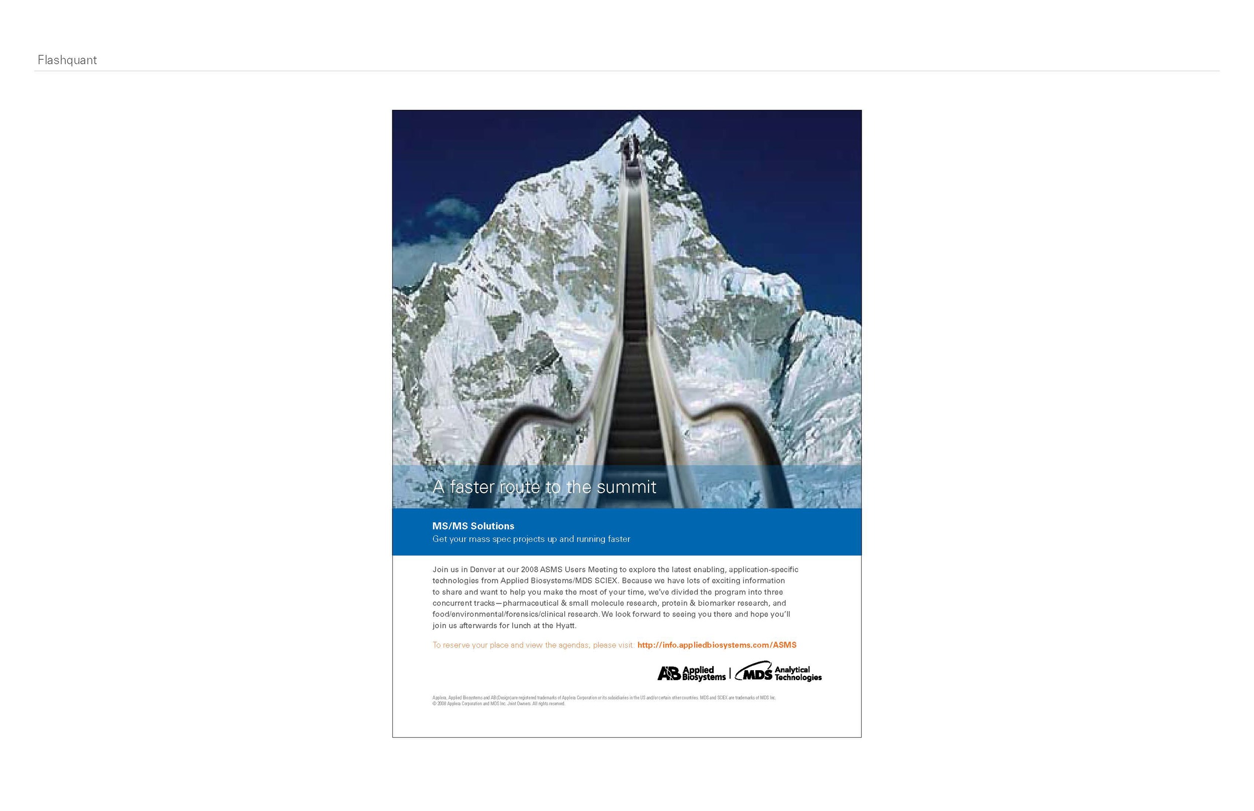
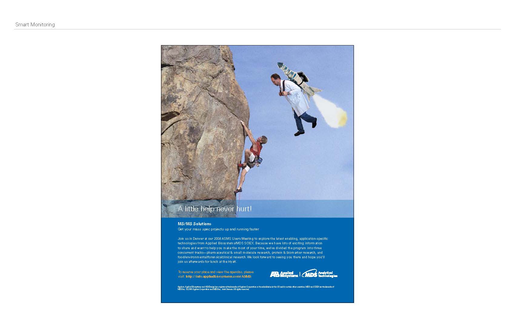
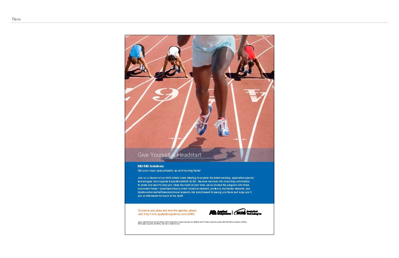
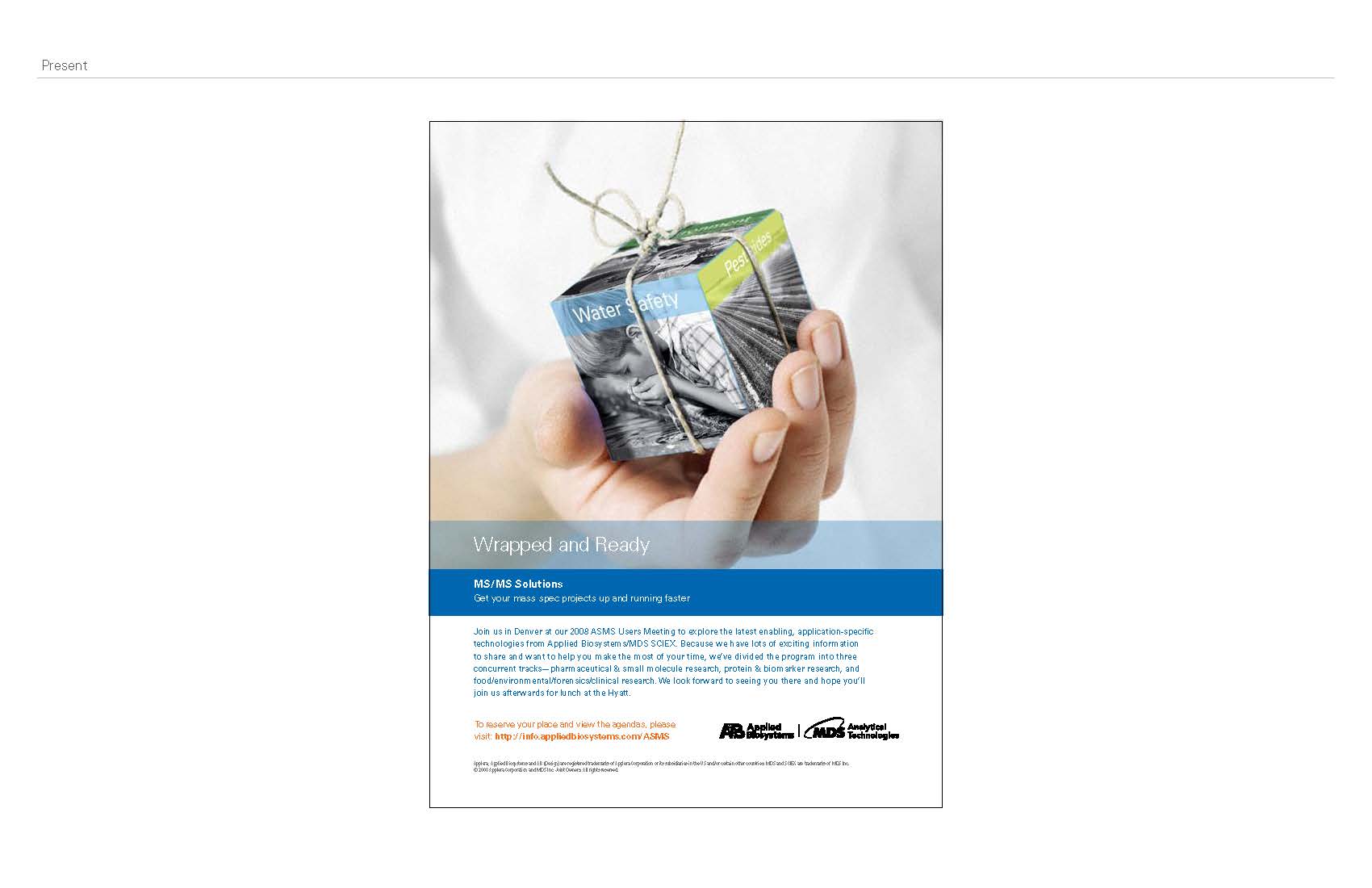
For the ad presentation below I came up with visuals, some found, some created, based on the headlines from the copywriter. My designs were for the cake ad, the maze ads, the elevator and escalator to the summit, the jet pack, the runner and the package, while James designed the vending machine ads.
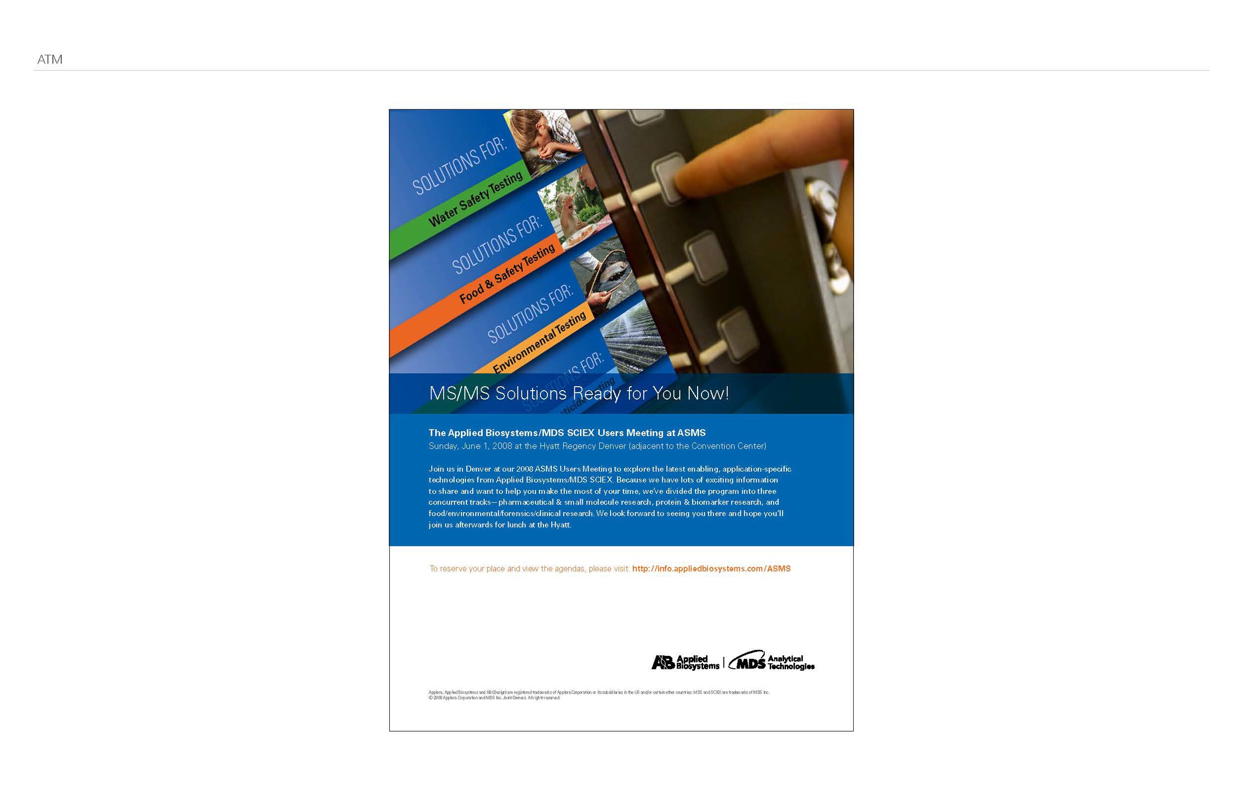

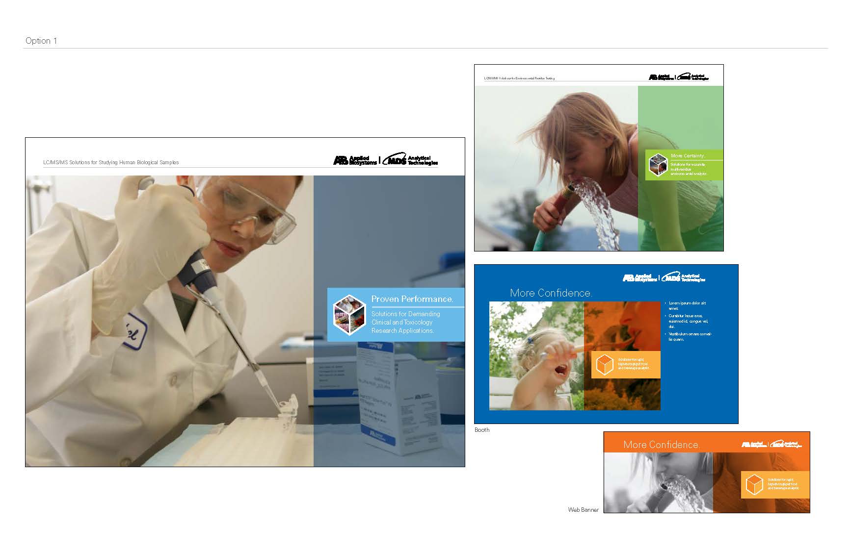
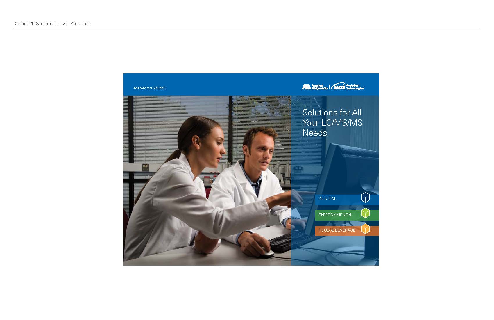
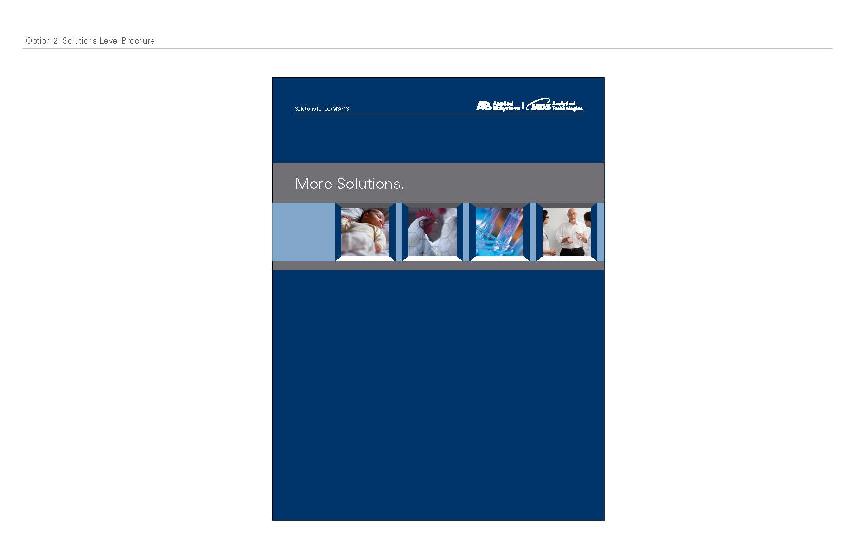
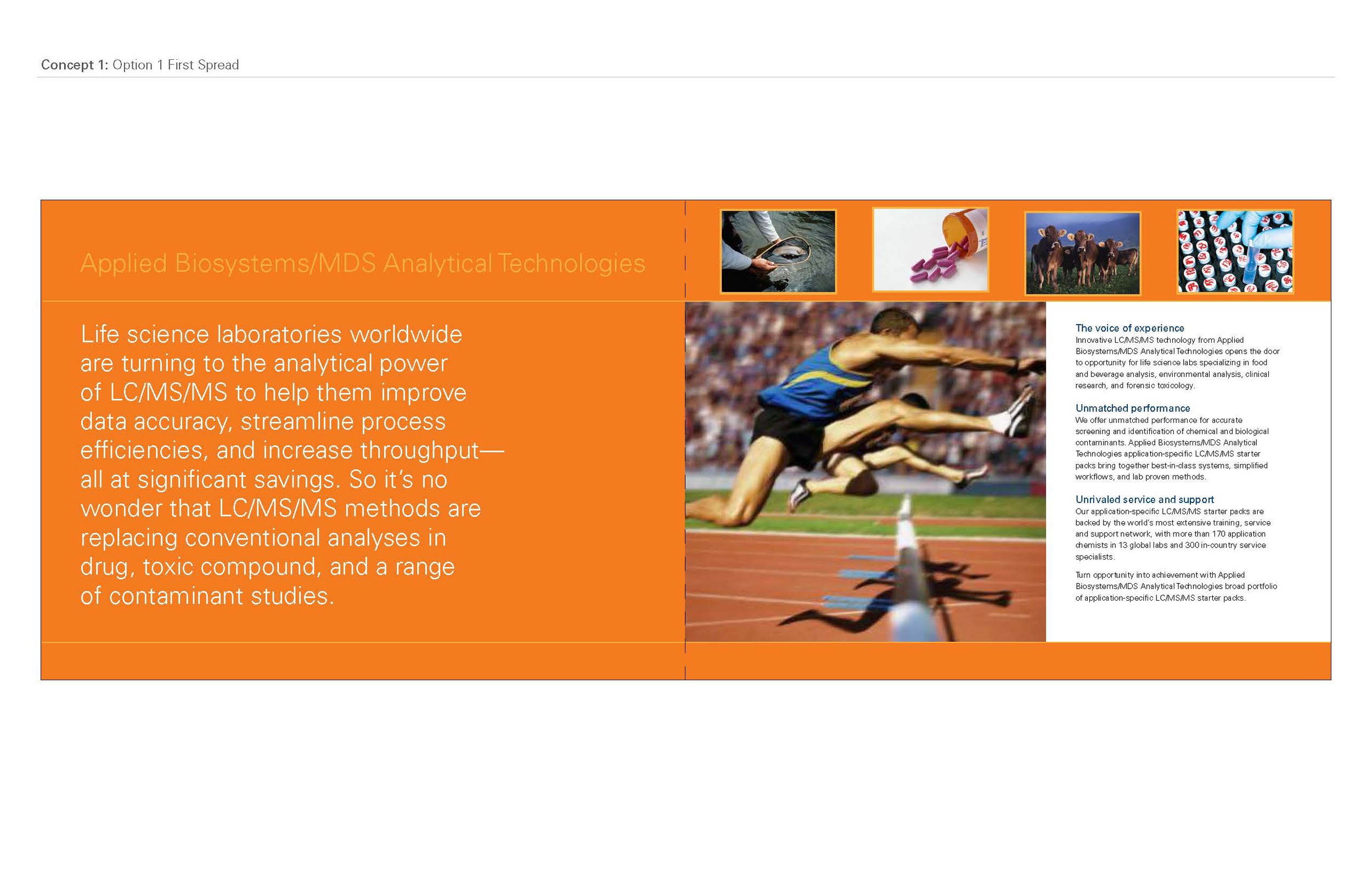
While the marketing managers were discussing the ad presentation, I started working on the look and feel for collateral pieces. We decided to keep it pretty close to the existing brand, but added details from the storybook.
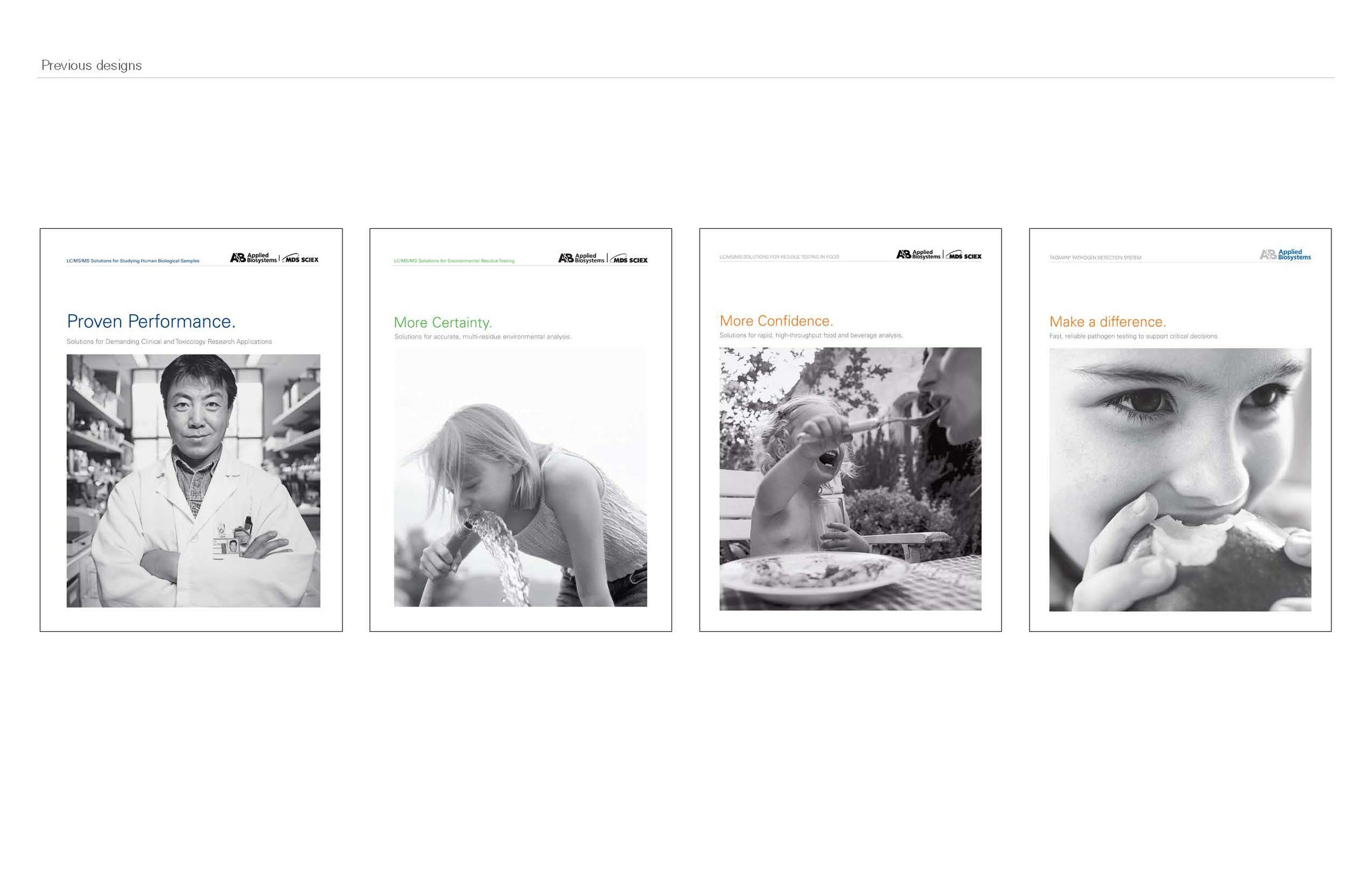
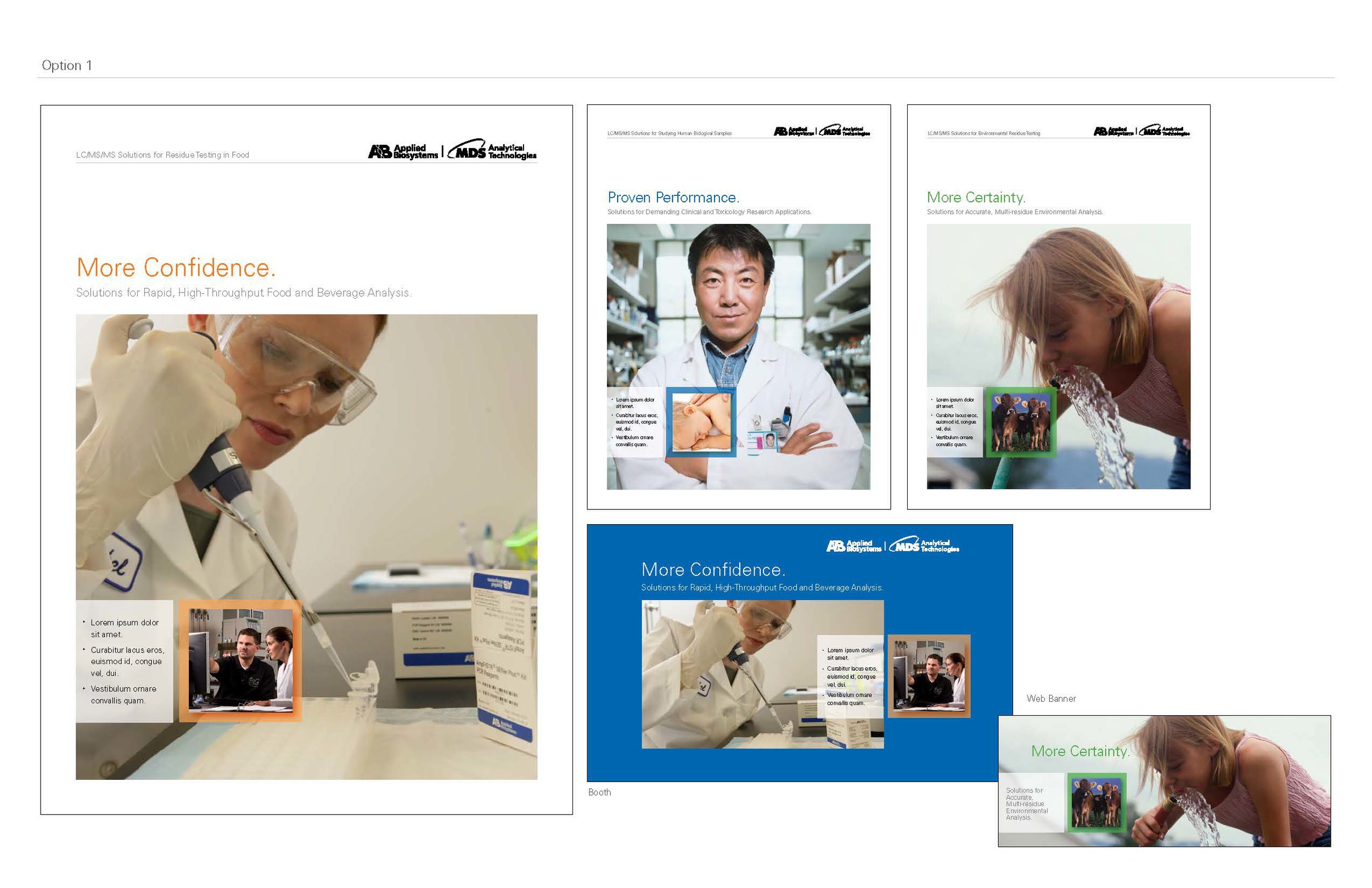
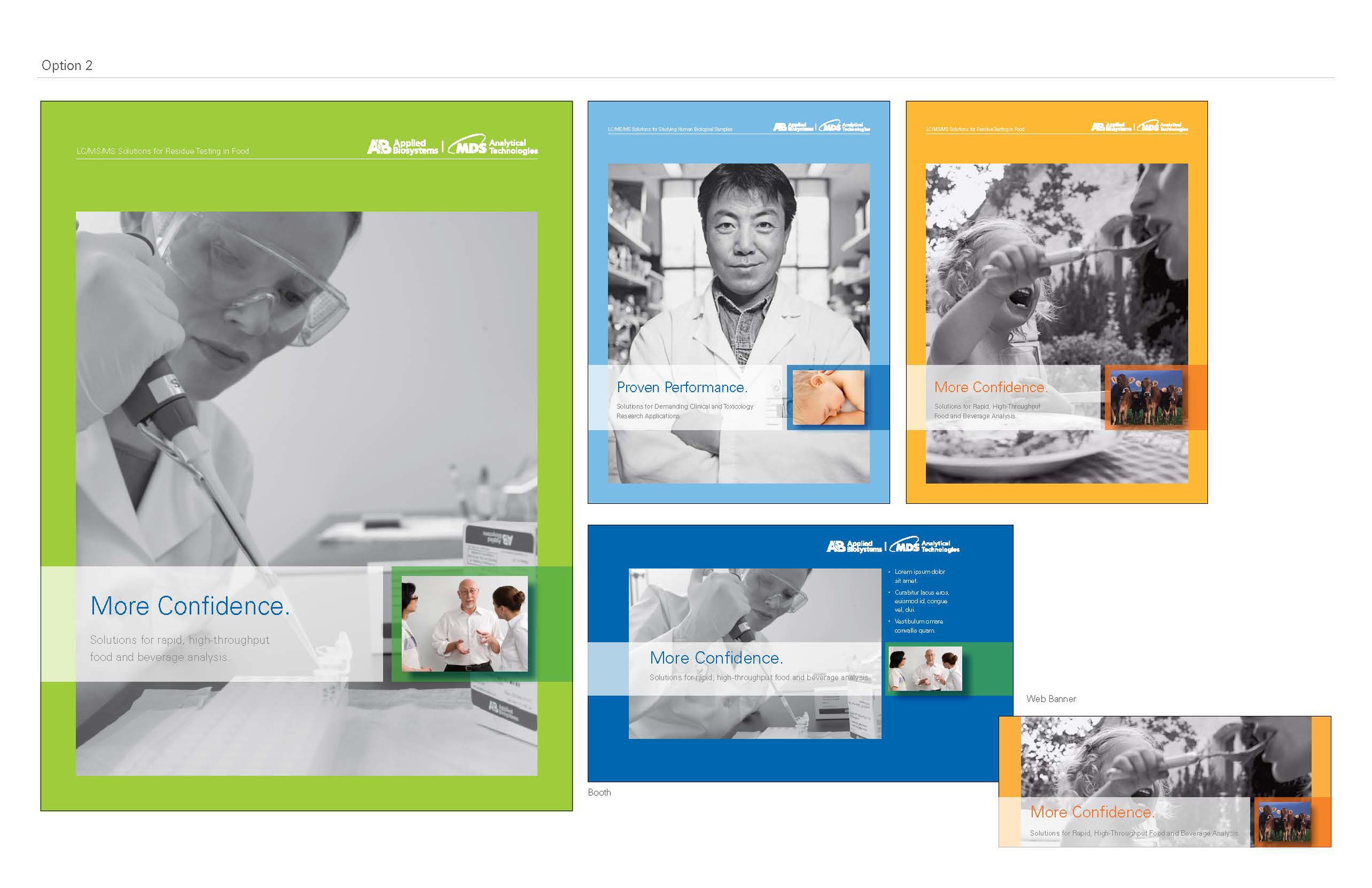
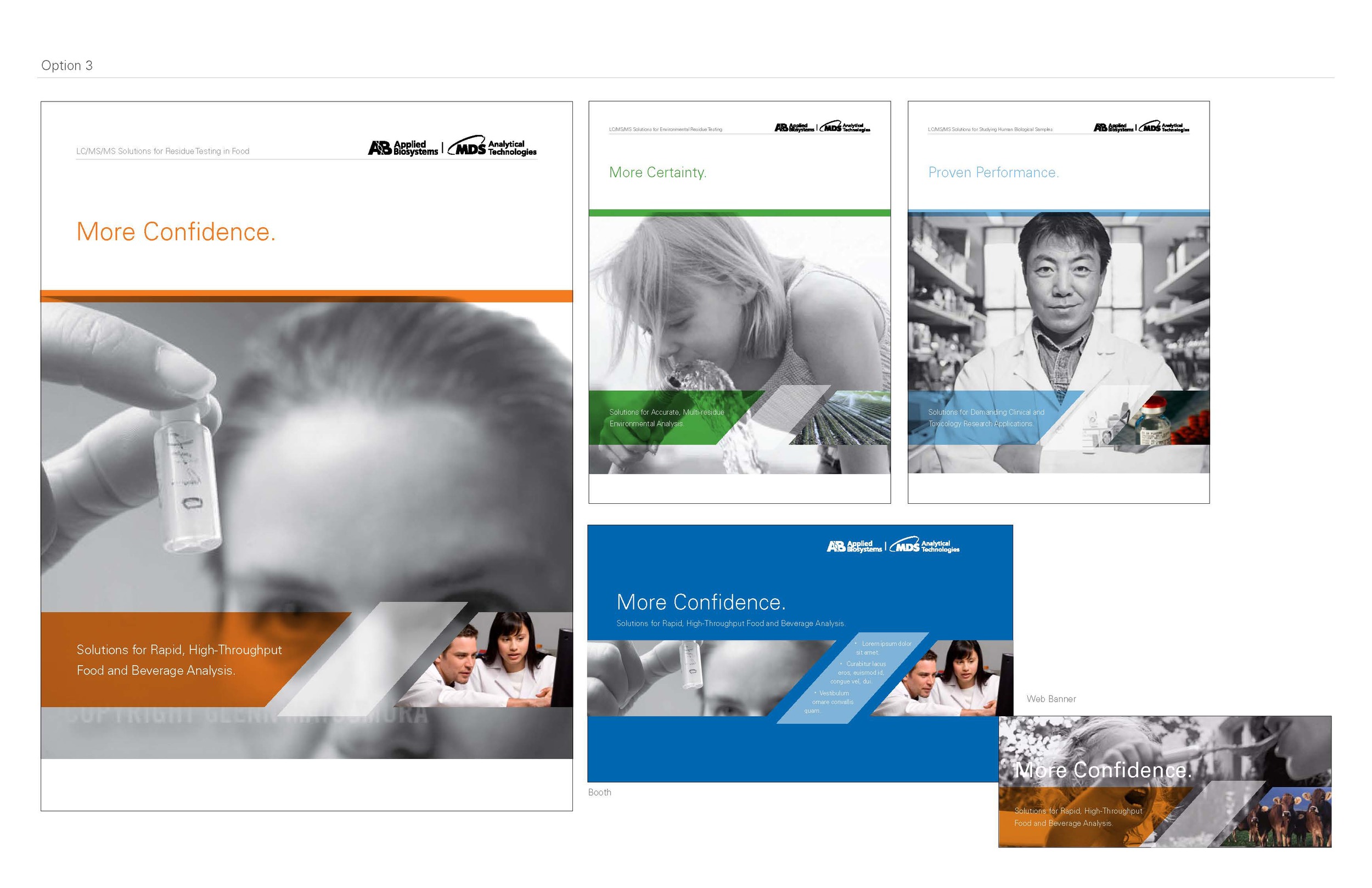
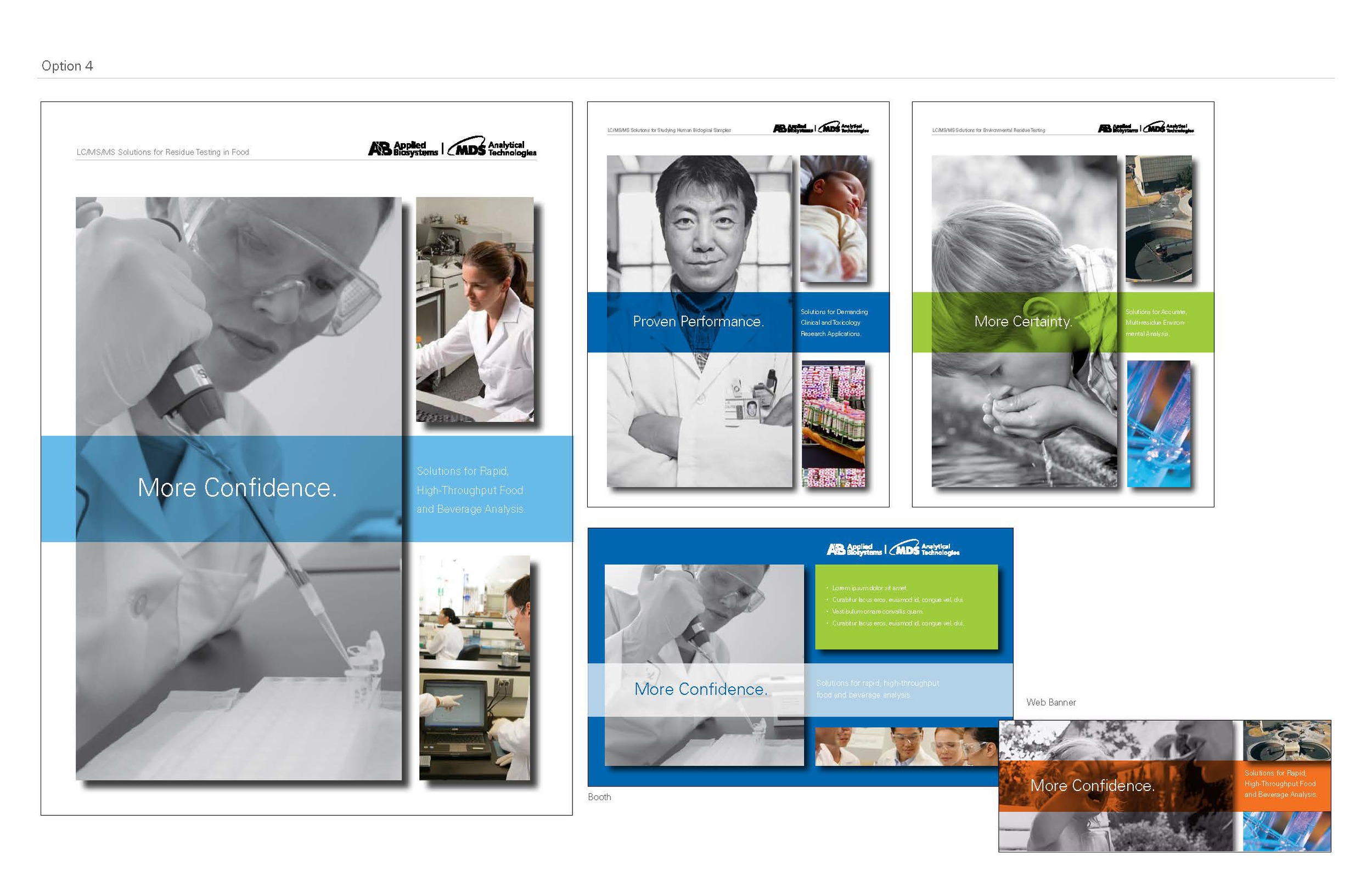
The marketing managers sat on this for a month or so, before coming back wanting to see more of the storybook in the designs. So, still keeping relatively close to the existing brand, I refined the look and feel.
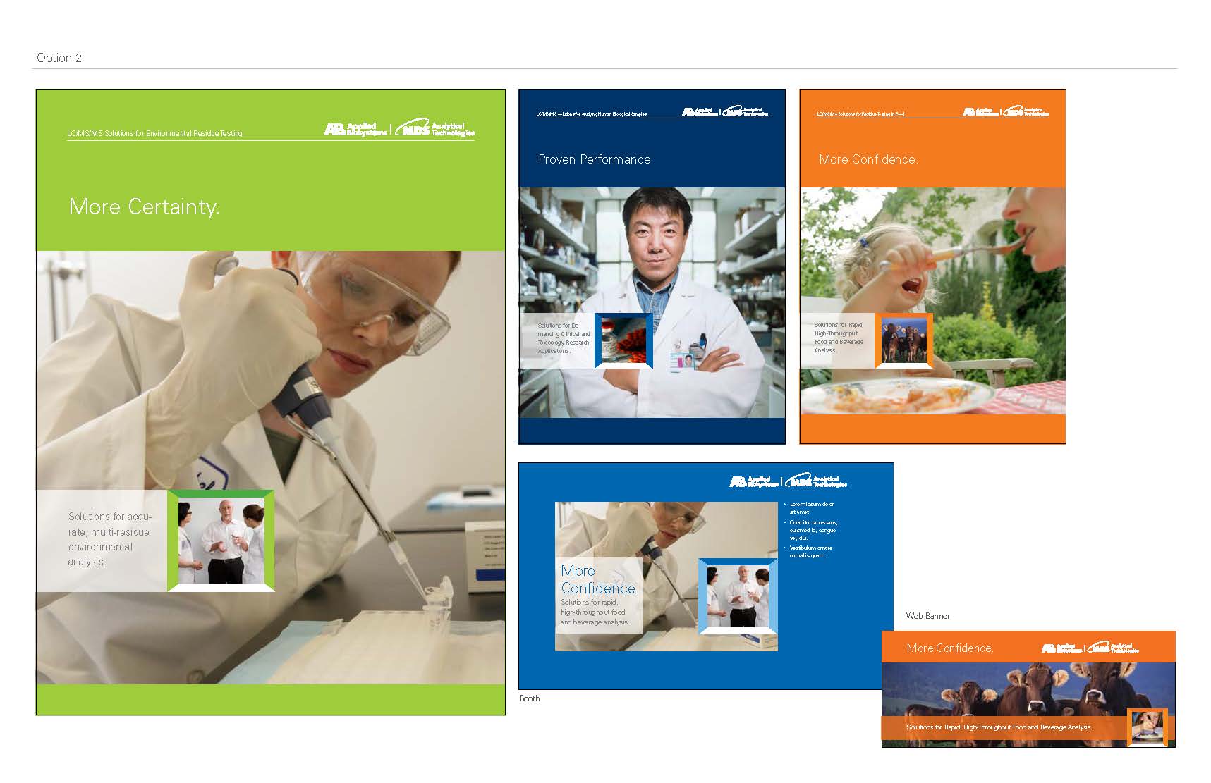
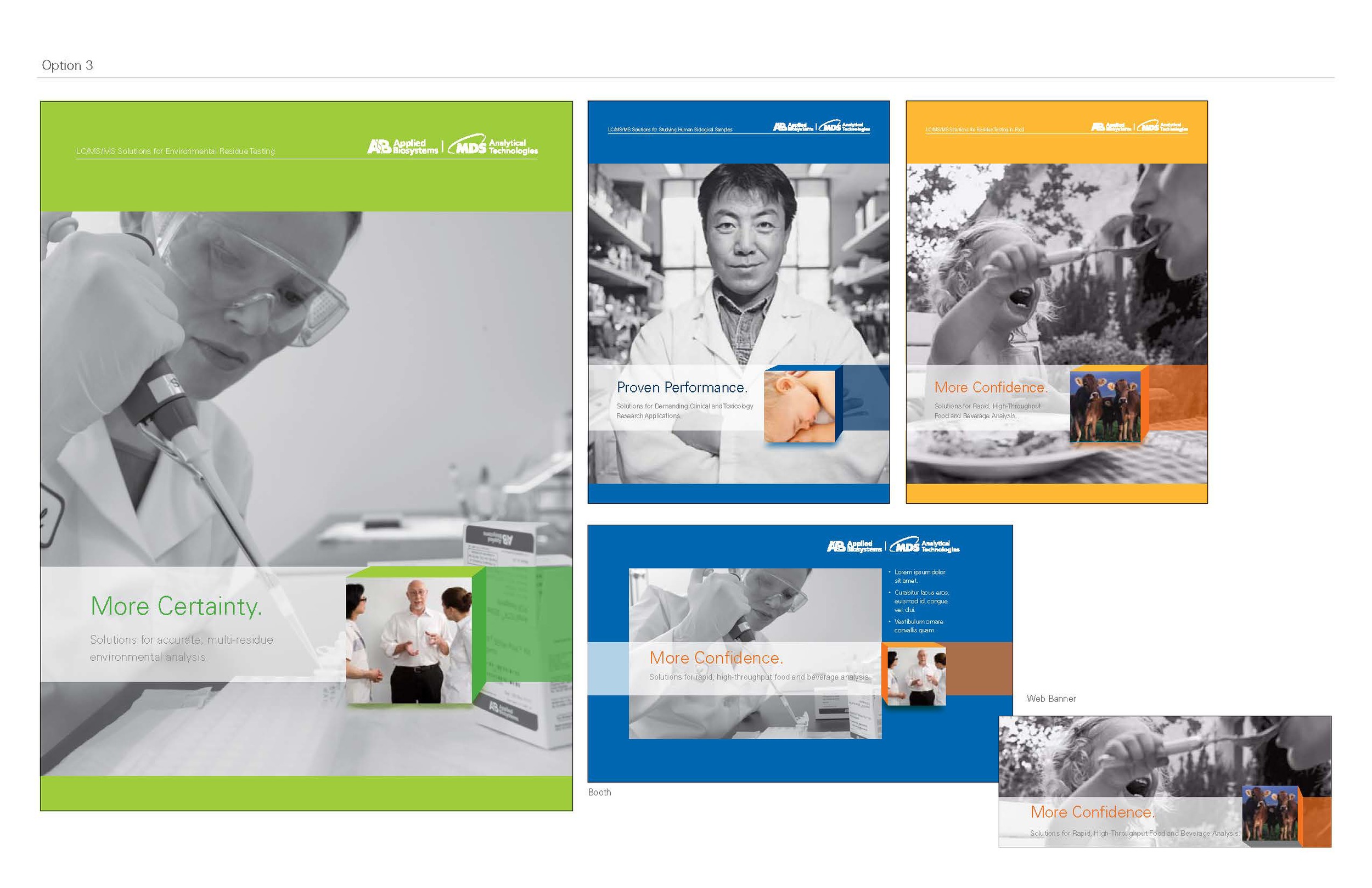
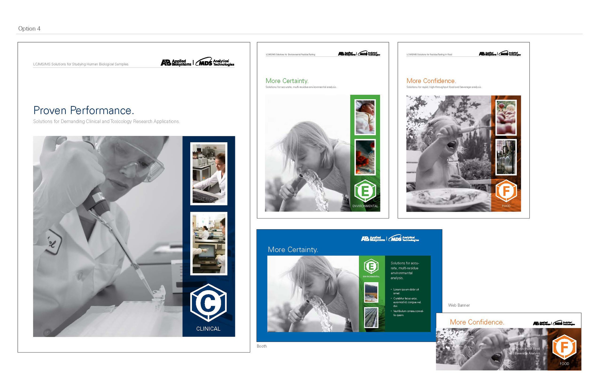
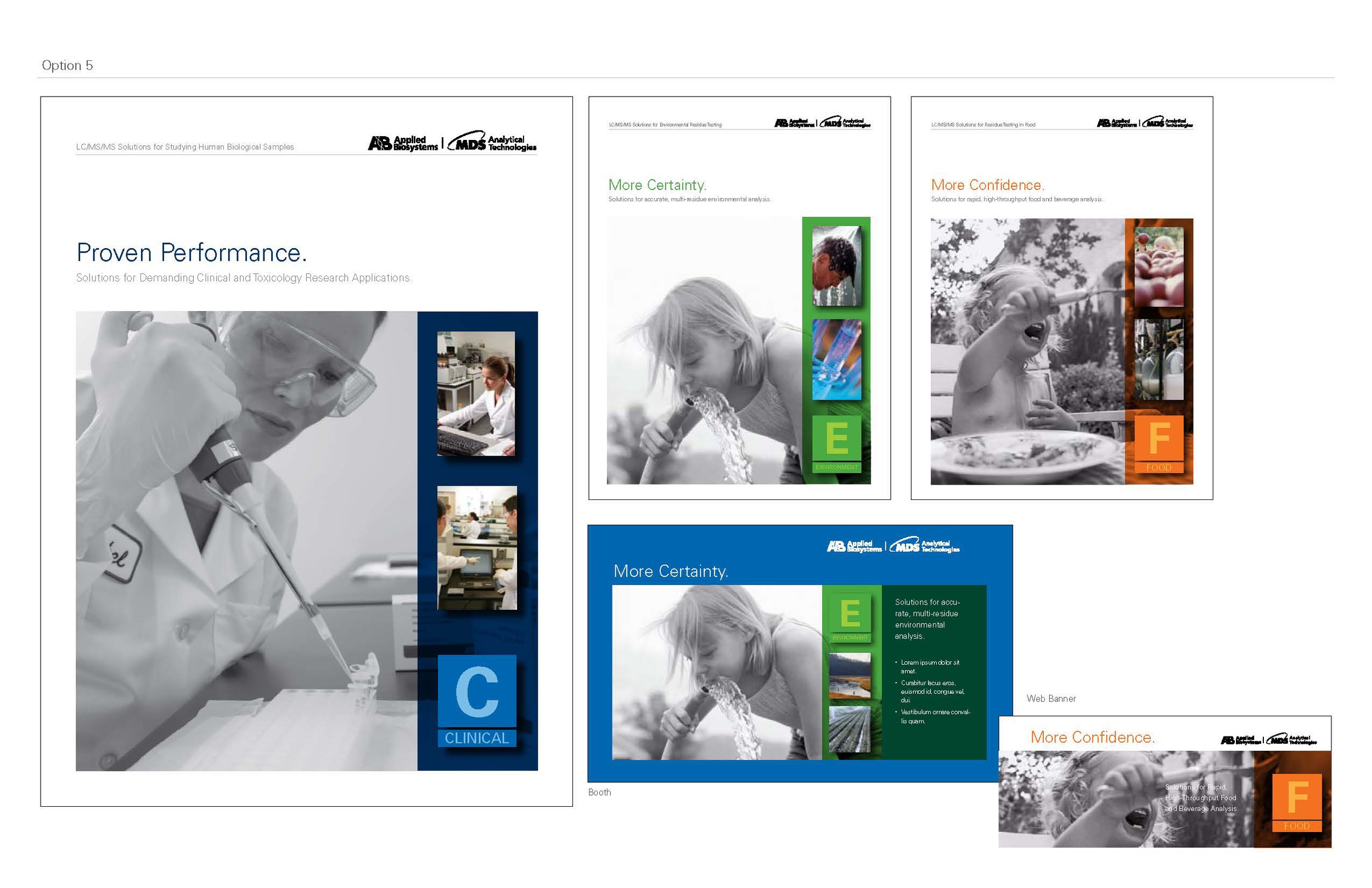
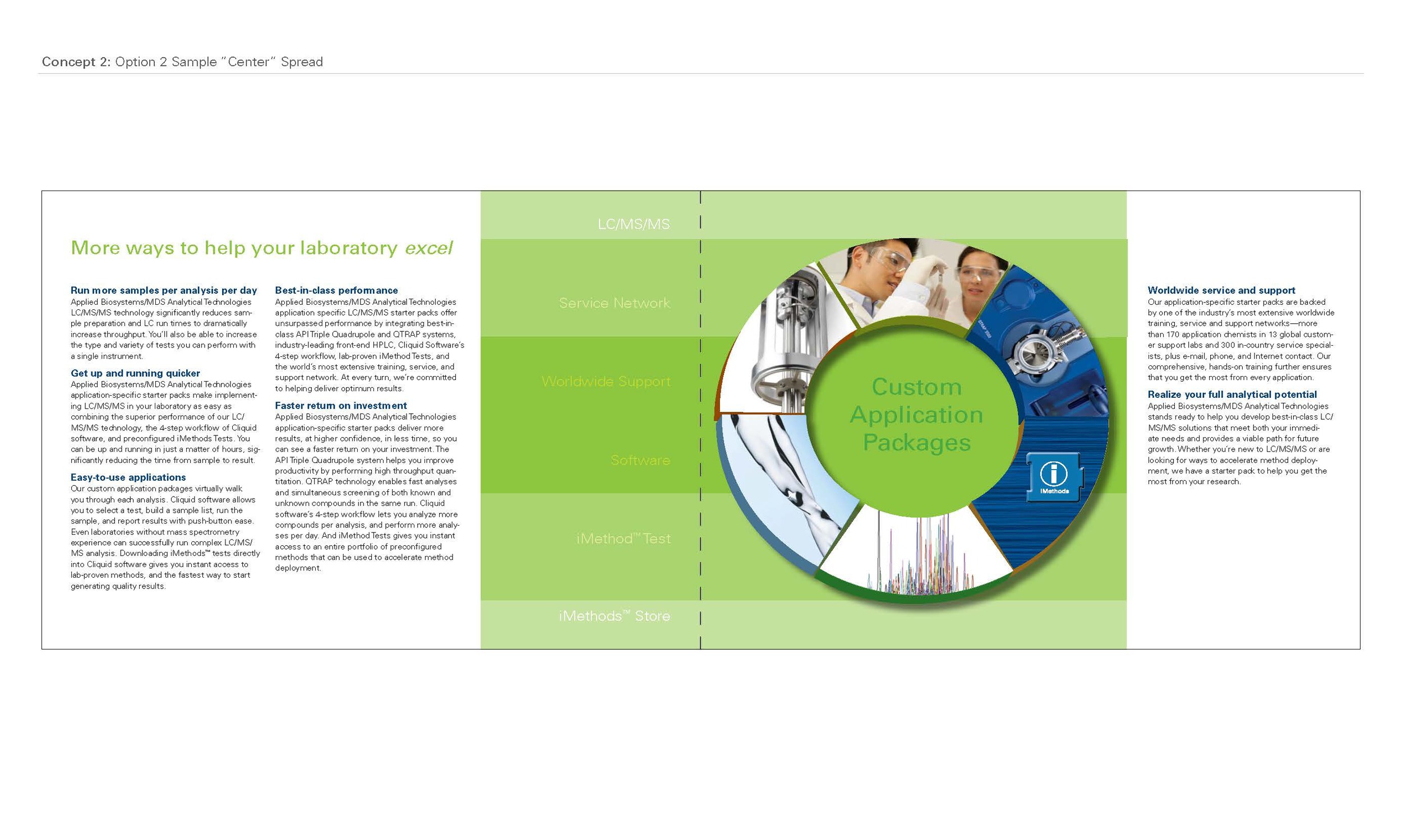
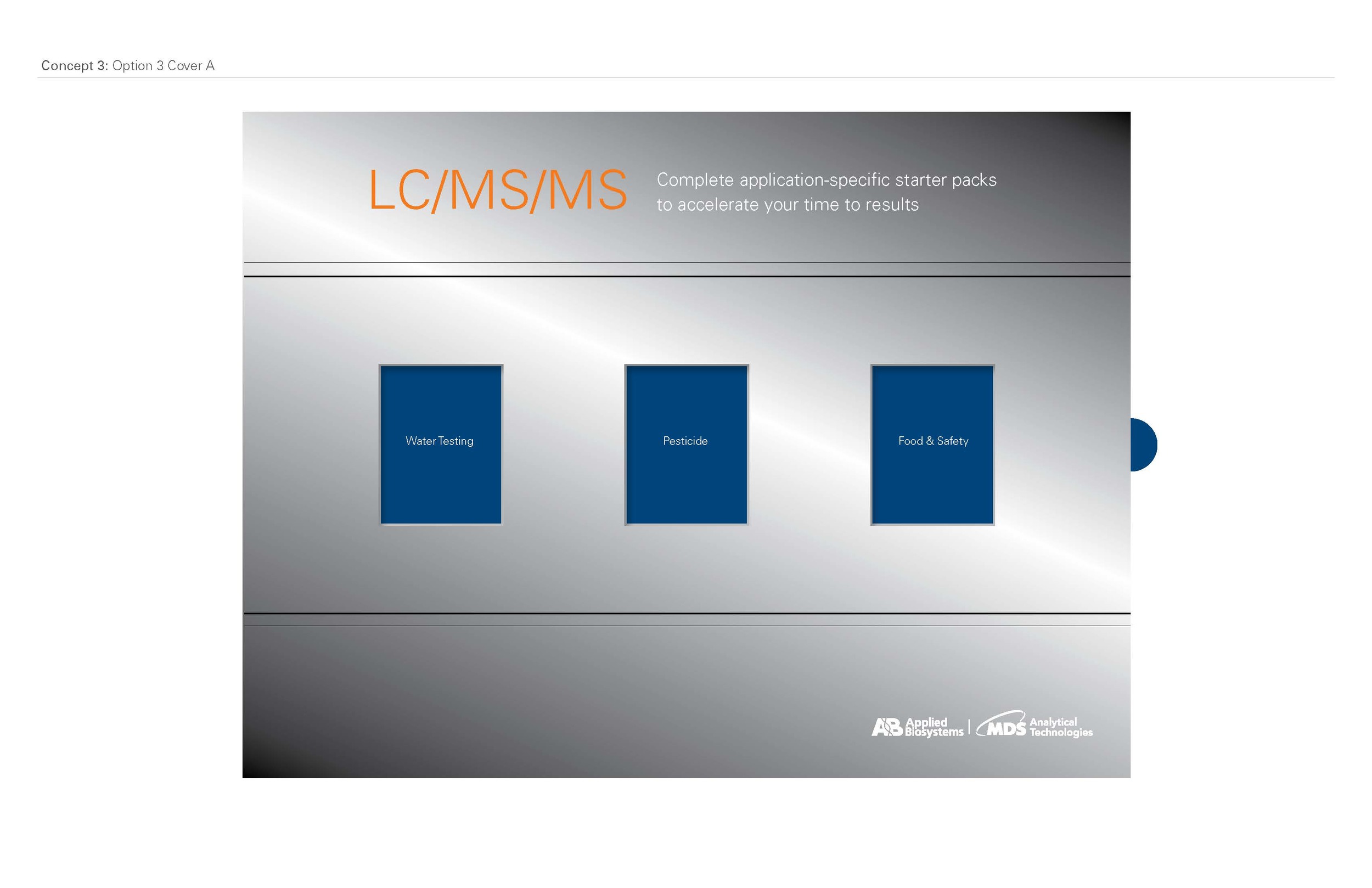
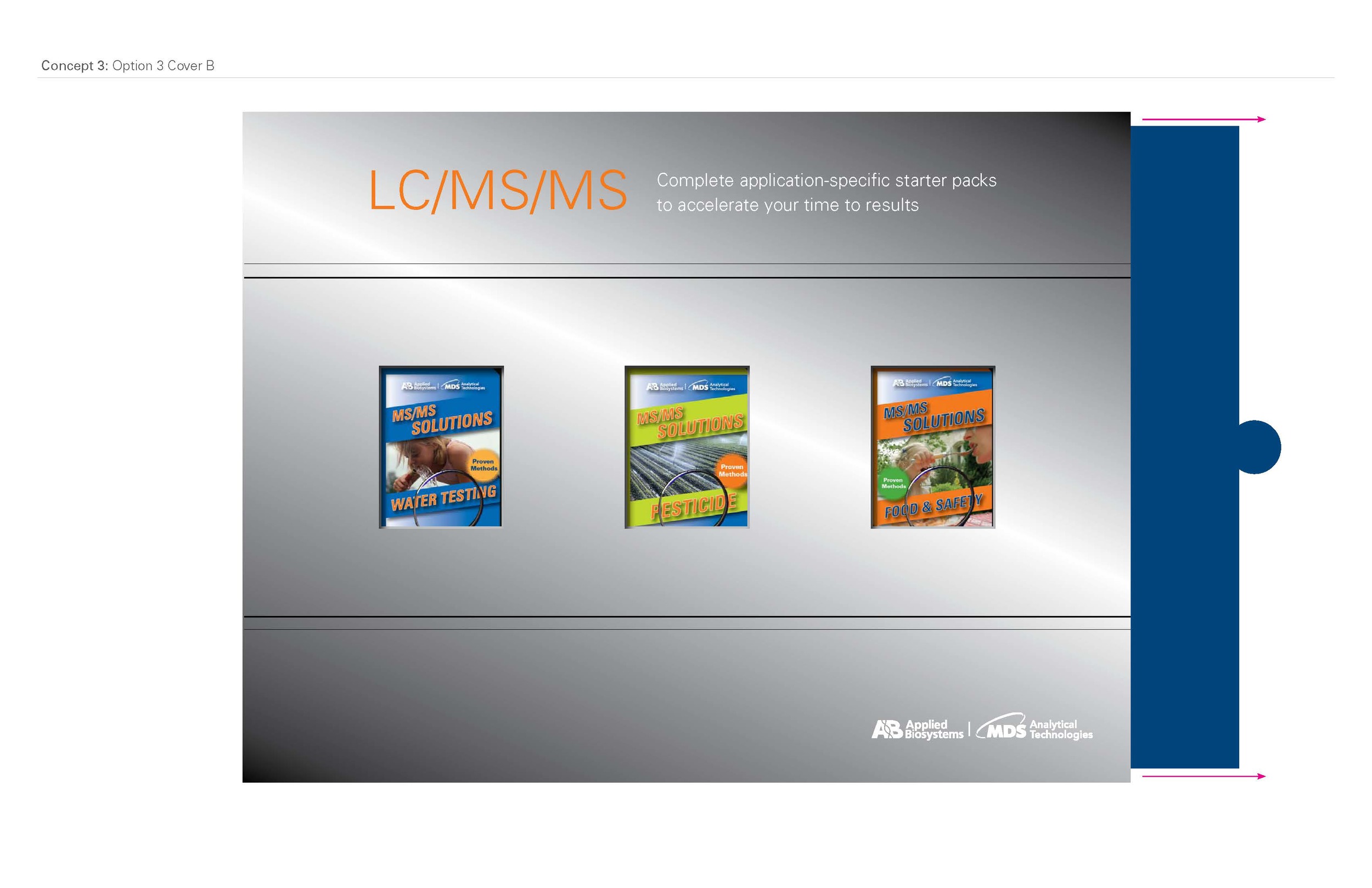
After seeing the second presentation they decided that they really wanted something really different, so it was back to the drawing board. They wanted even more of the storybook in this brochure, as well as the characteristics of the ads, so I revisited the sketchbook. The cake image from the ads reminded them of a wheel that one spins to win a prize, so I played with the idea of a wheel, representing choice. I kept the idea of the athletes and fast moving visuals, and also suggested a vending machine idea with various peek-a-boo options. I enjoyed trying out various form factors in my ideation process.


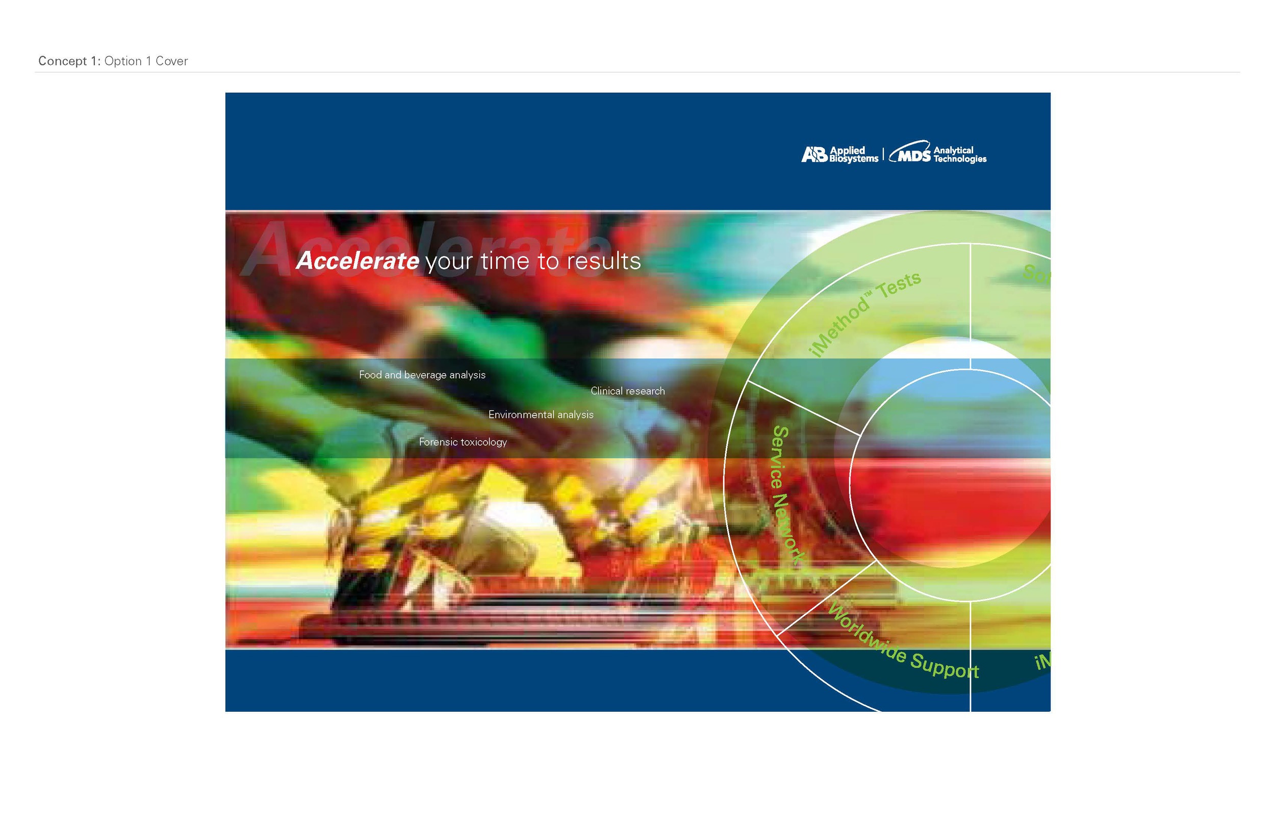
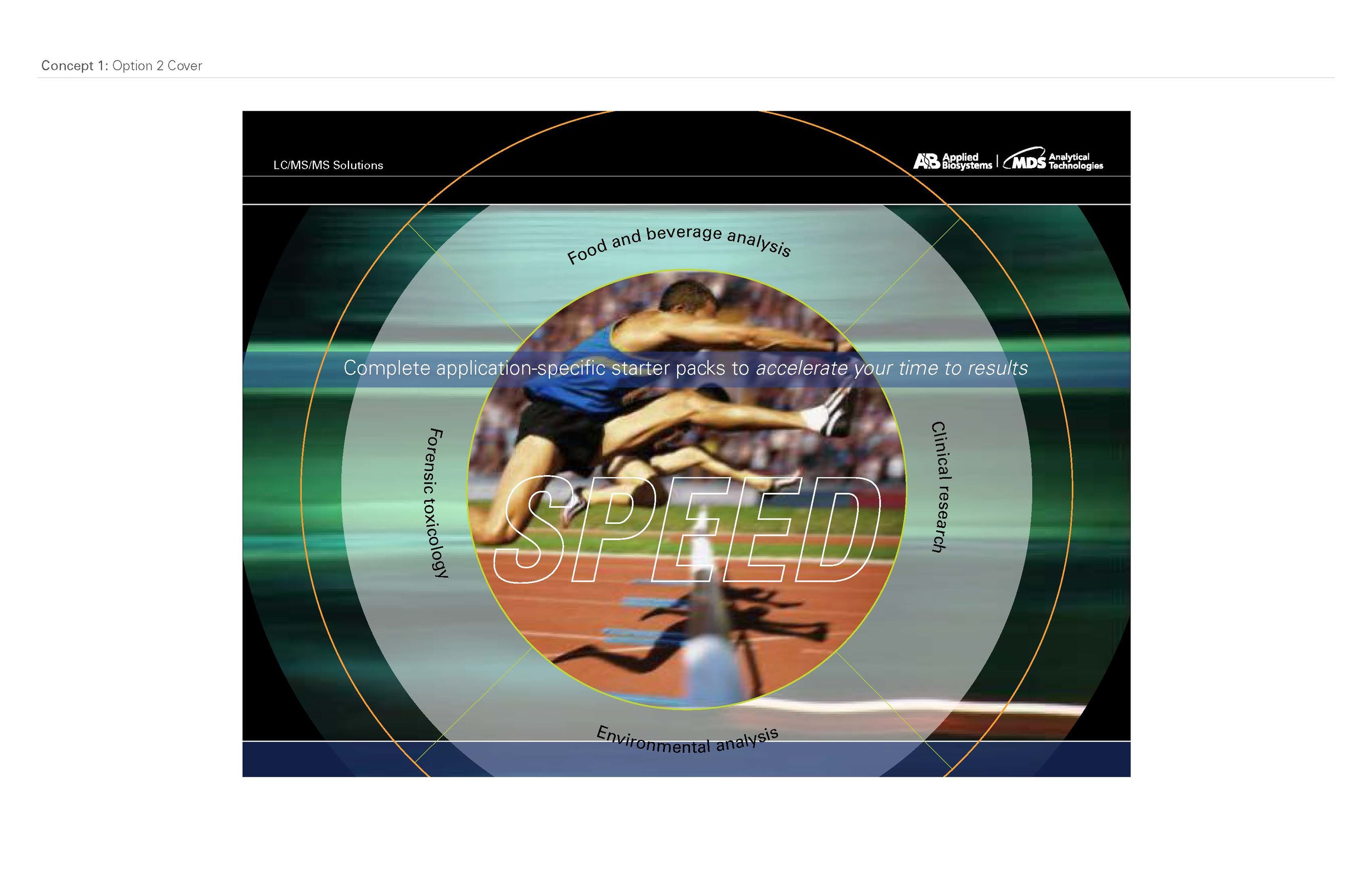
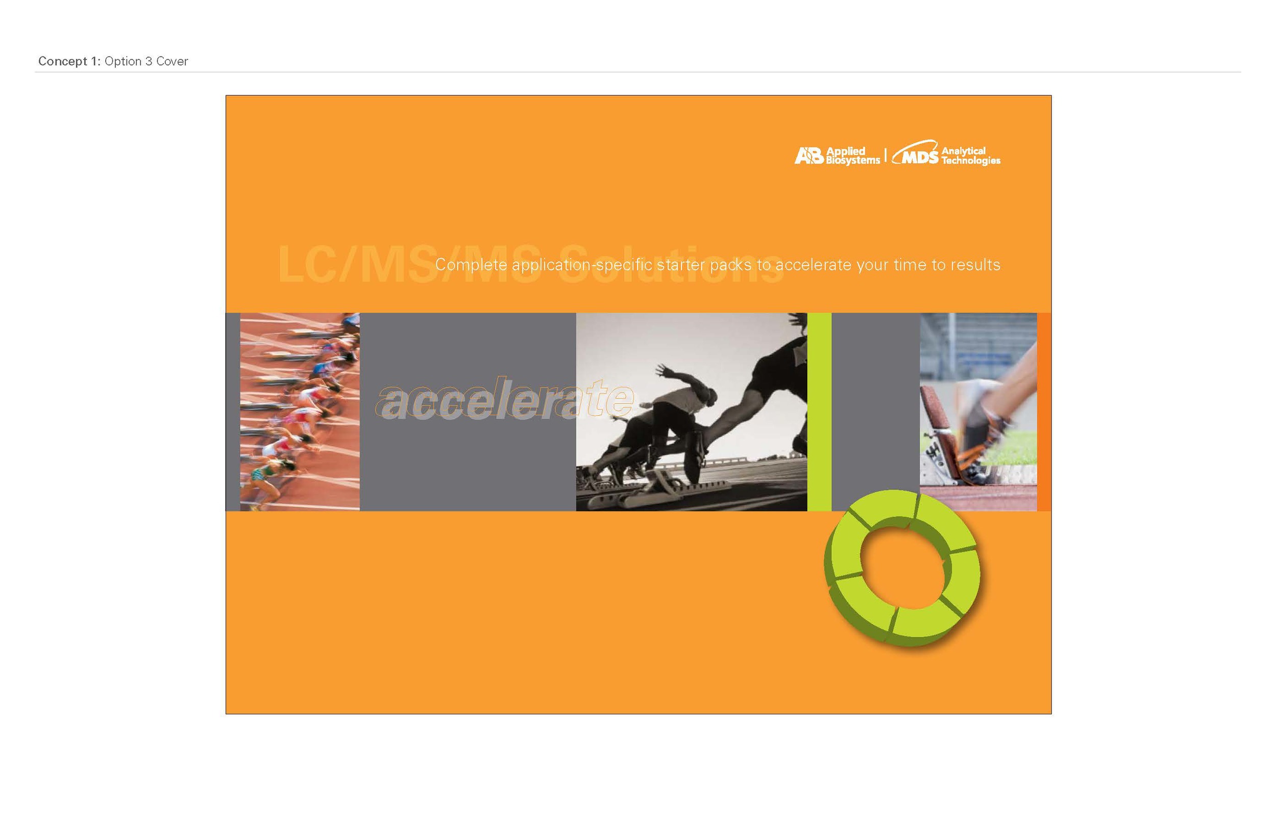
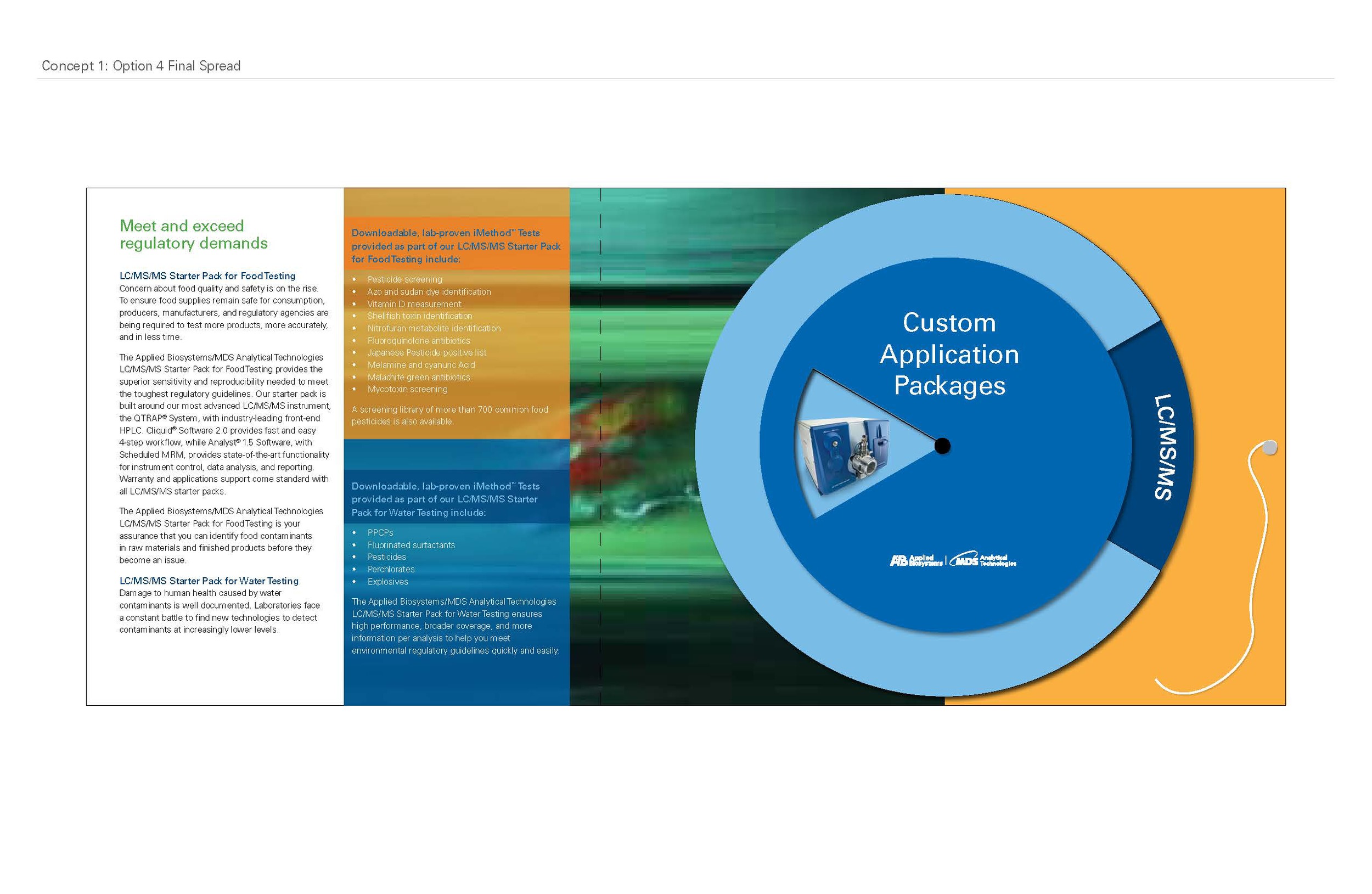
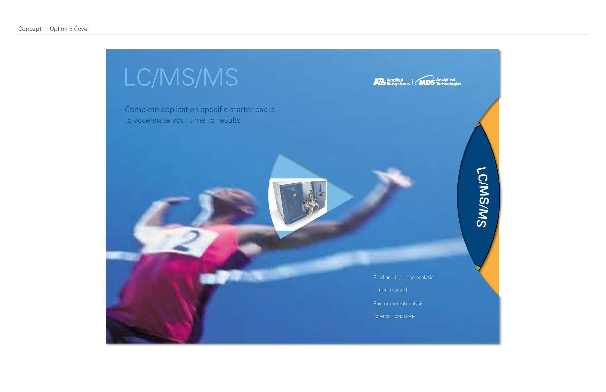
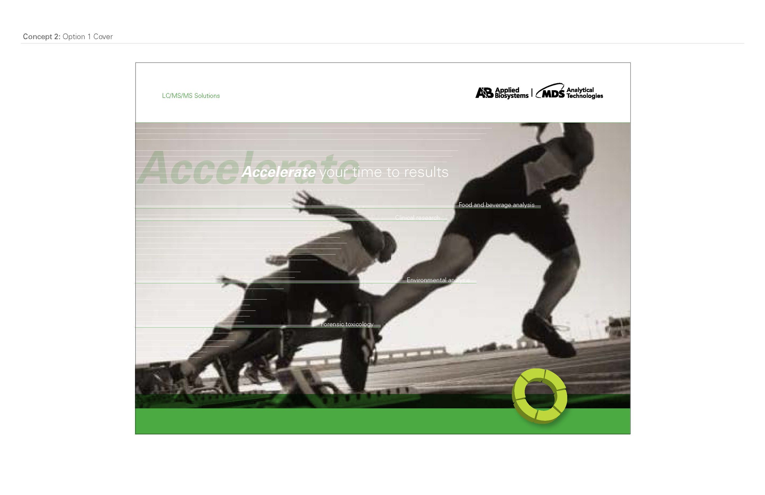

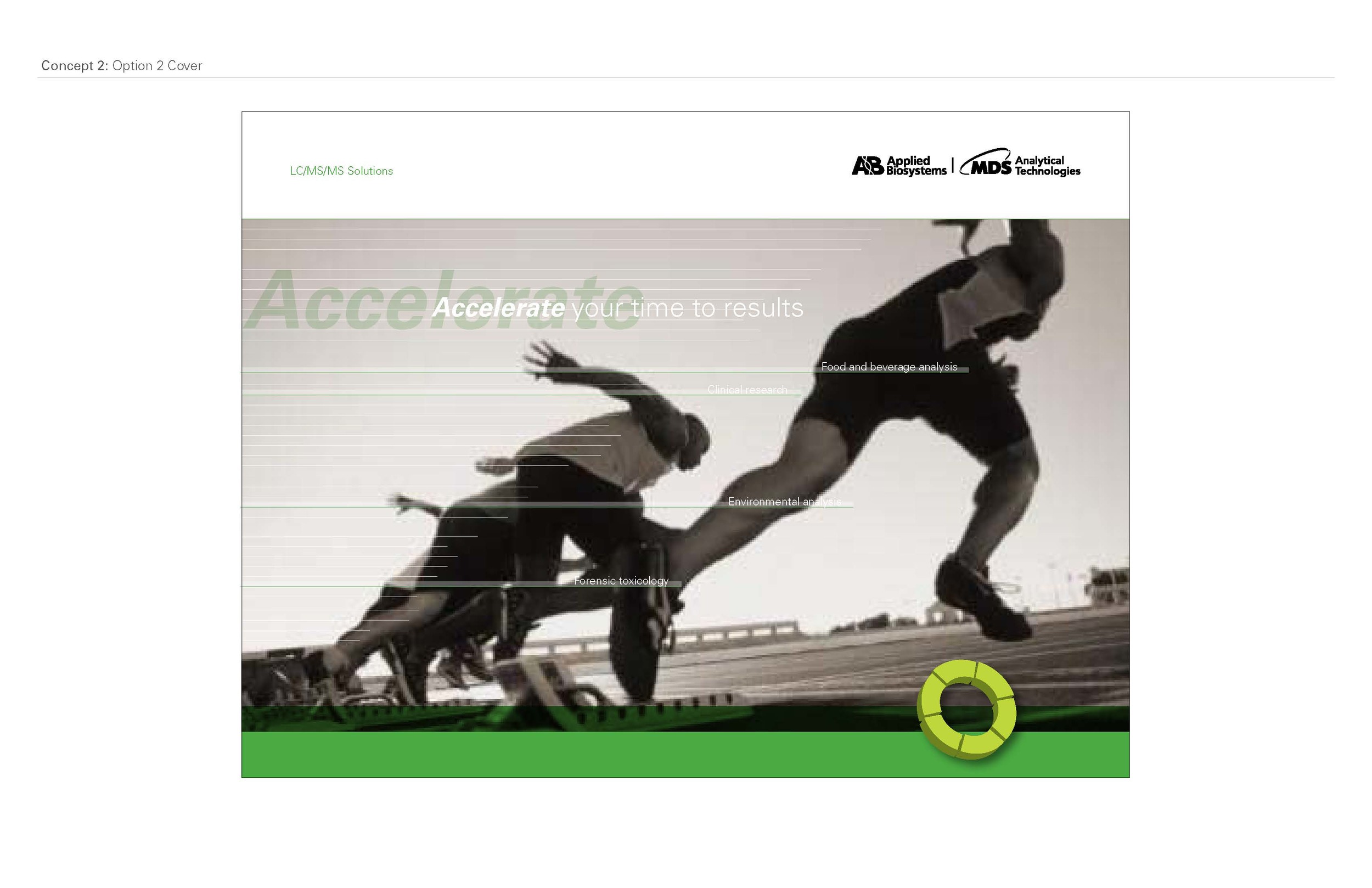
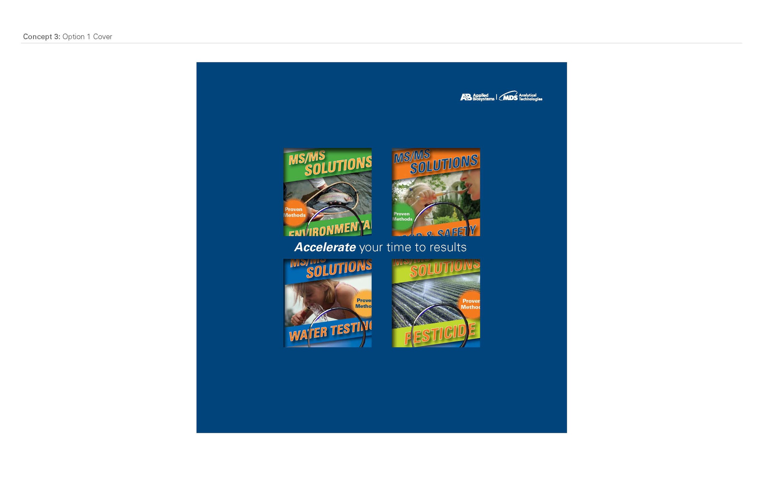
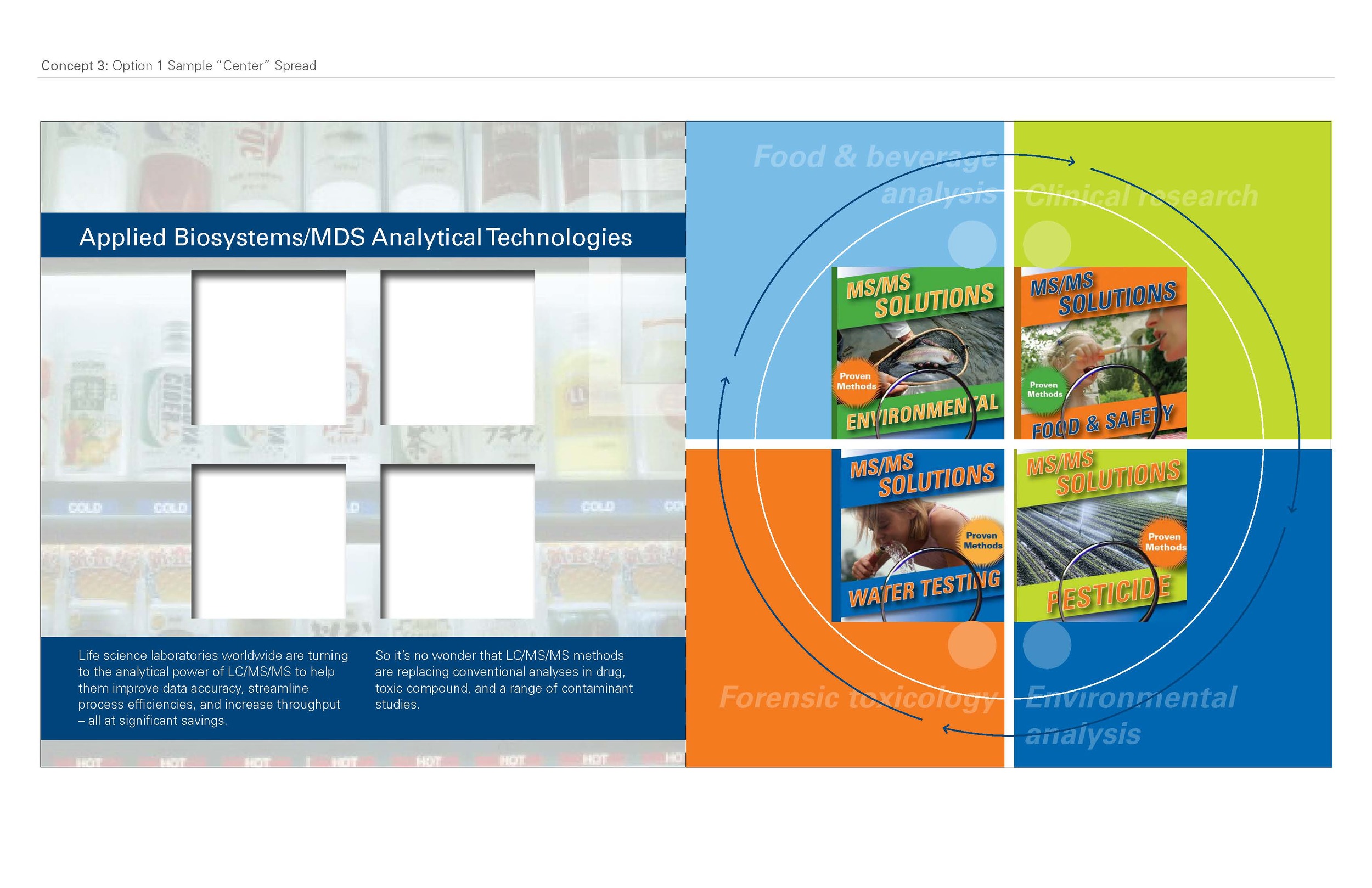
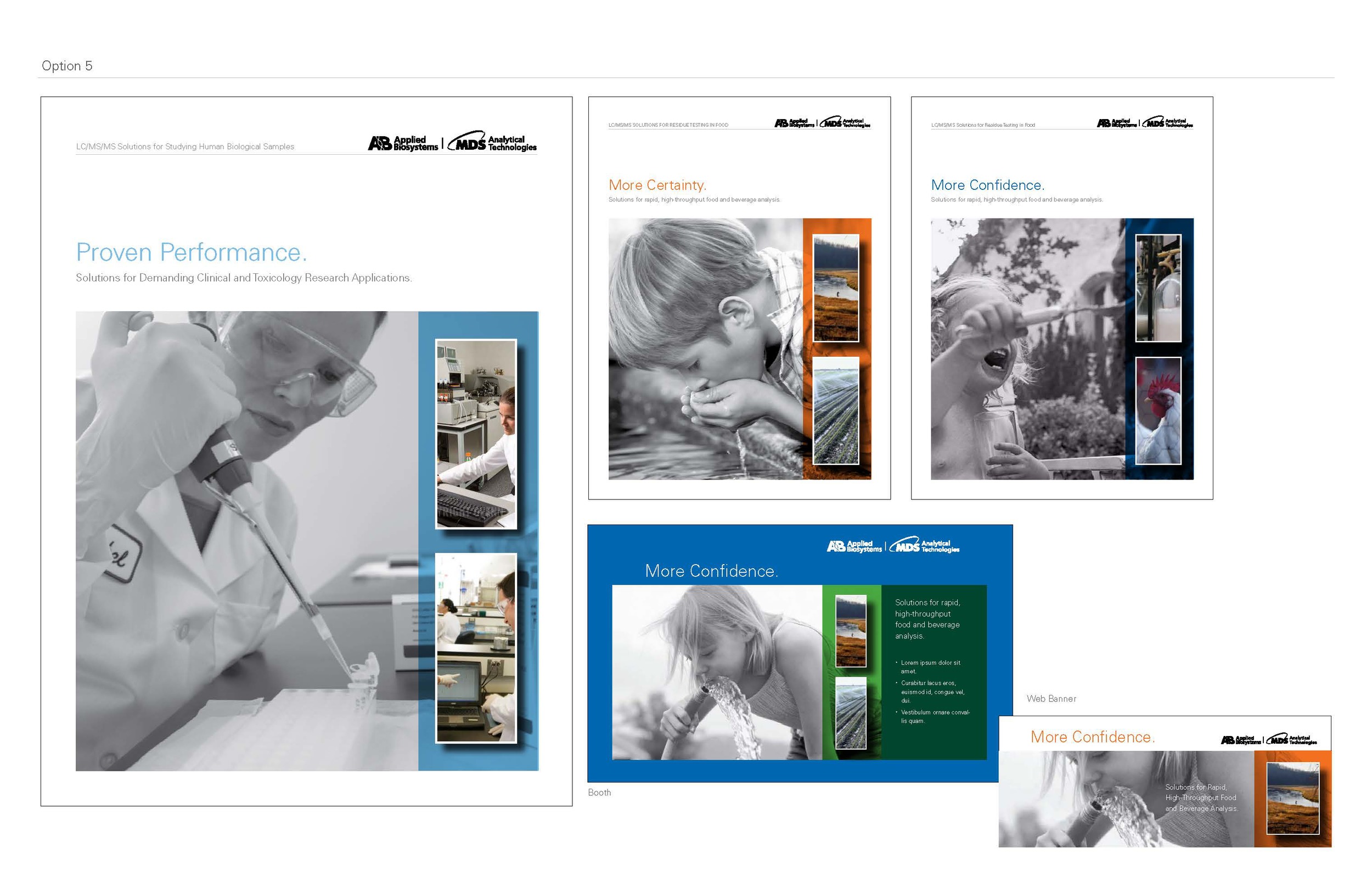
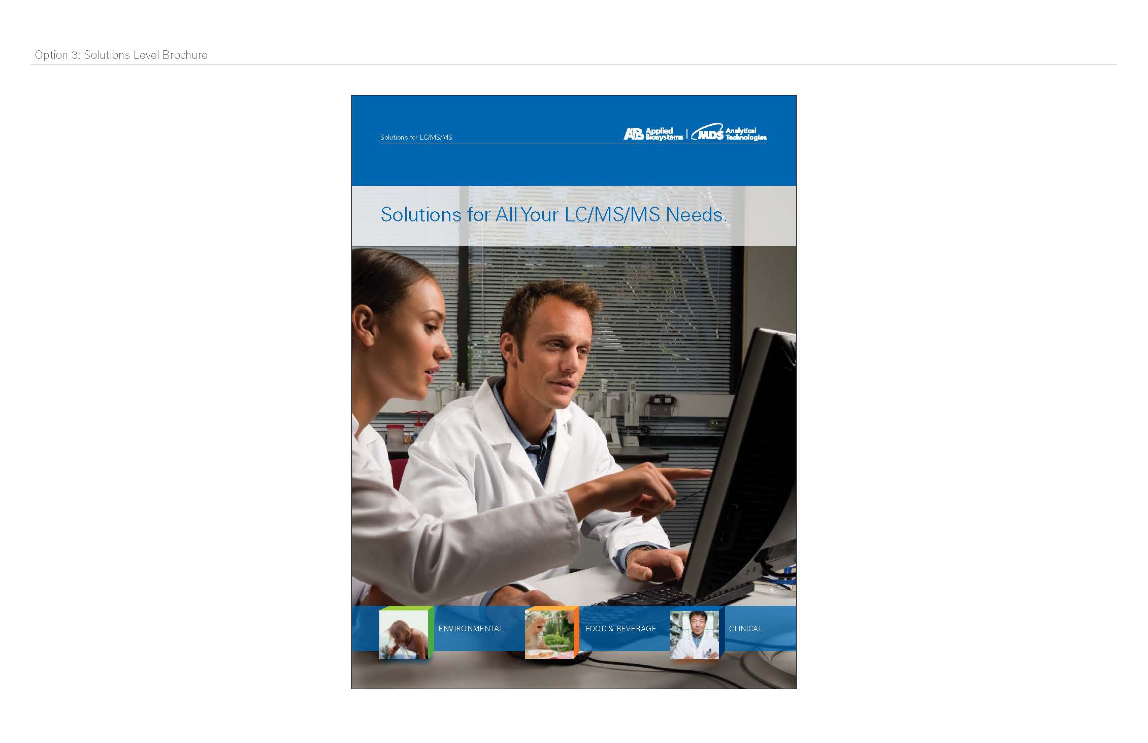
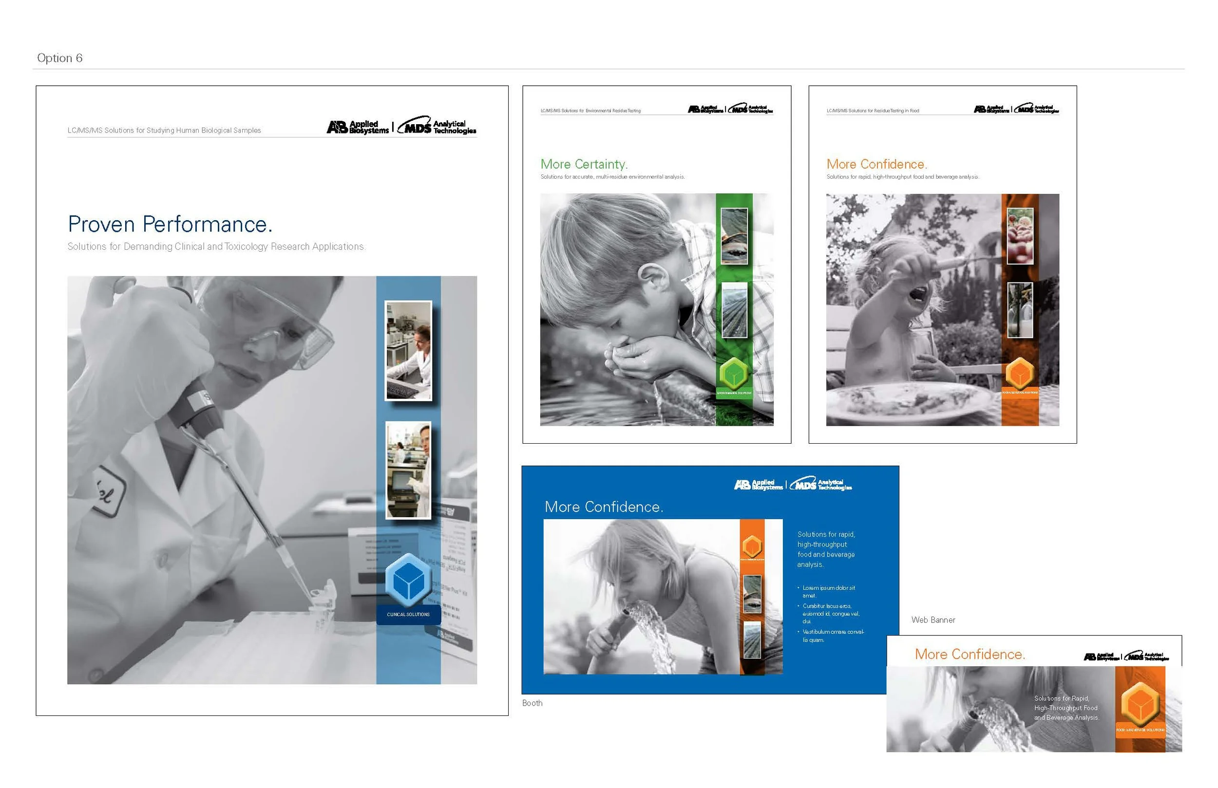
This presentation they sat on for a while. I thought they forgot about it by the time it came back to me. They loved the wheel, but wanted to show speed without a photograph. So I started creating images that were lines, similar to what you would see if you photograph a car driving by.
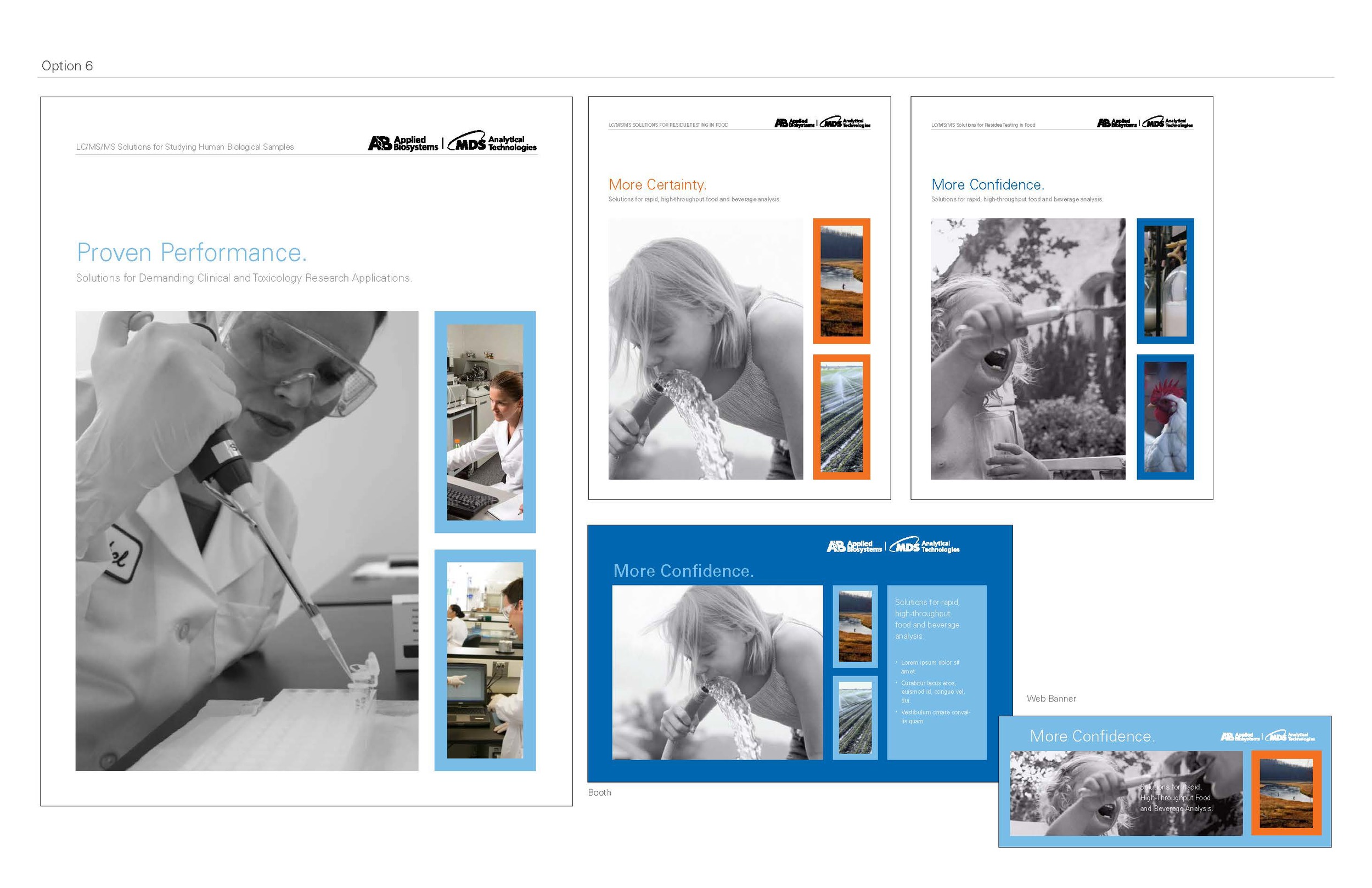
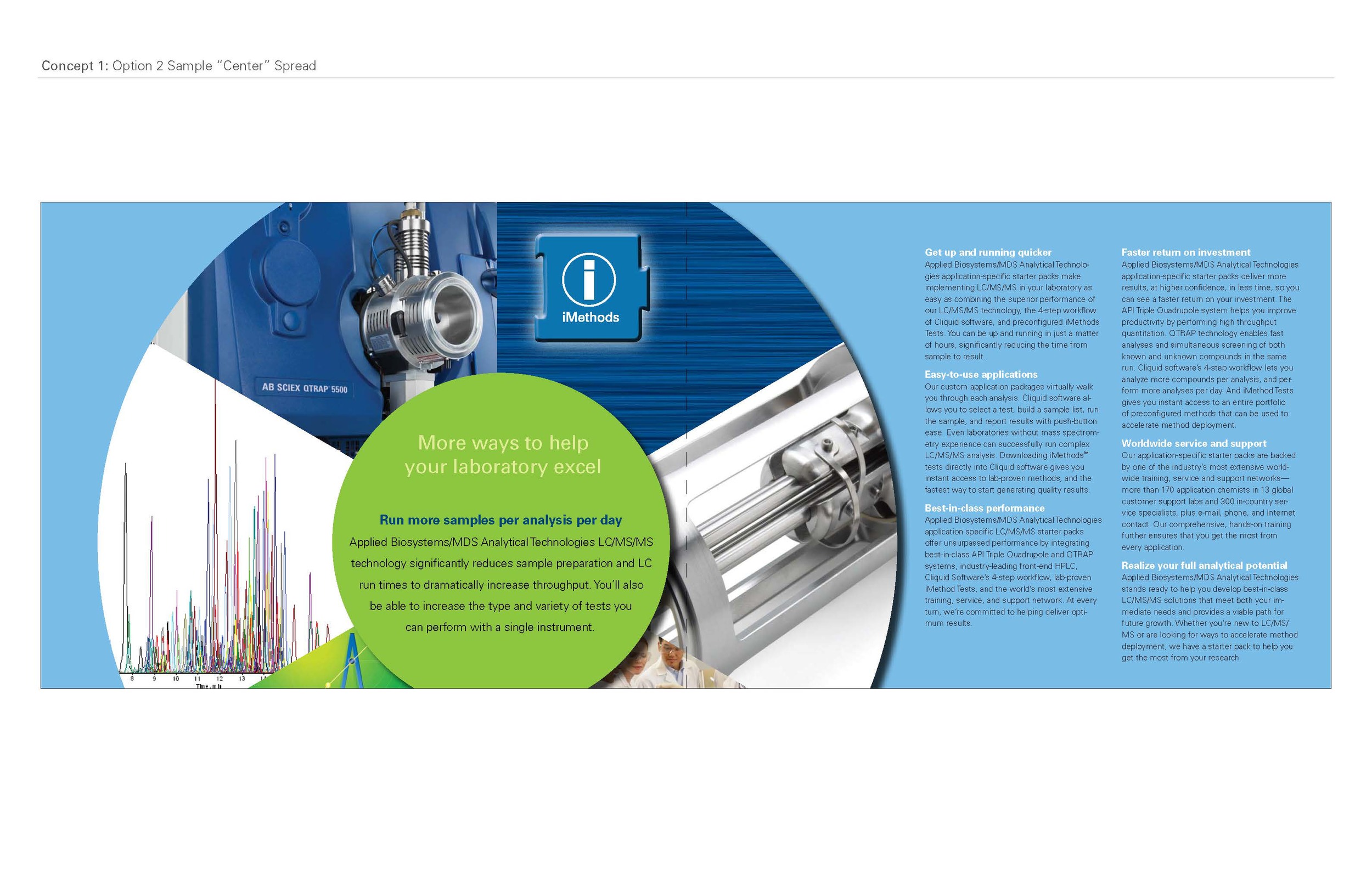
This is the final look of the brochure.
Though I thought it should look like this! :-)
After the brochure was finished, it was time to design all of the collateral that would go with it, as a media kit. Folder, flyers, and a binder with tabs. The last piece was the booth property for a tradeshow.

Folder with inserts
One of six tradeshow booth properties