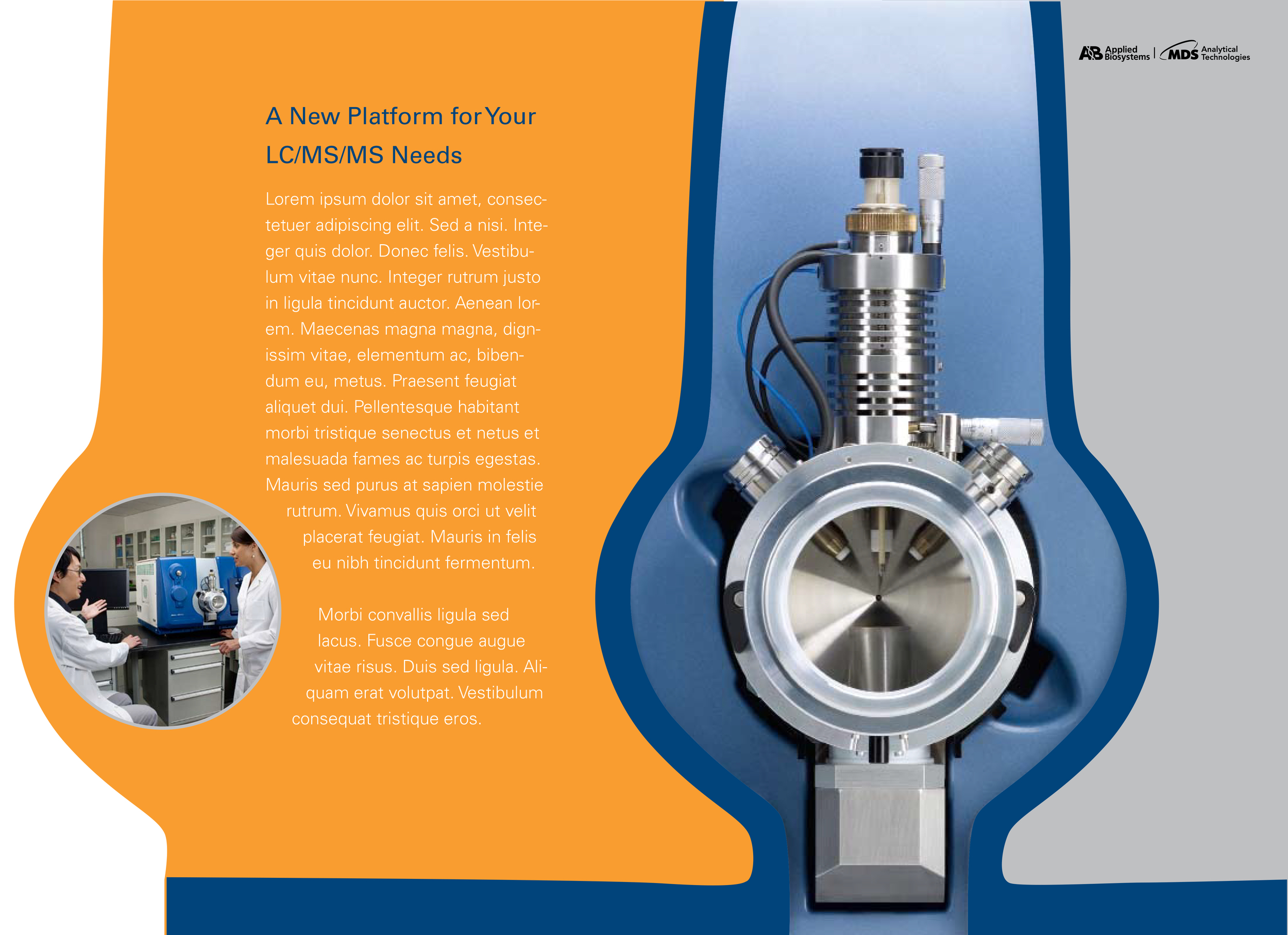
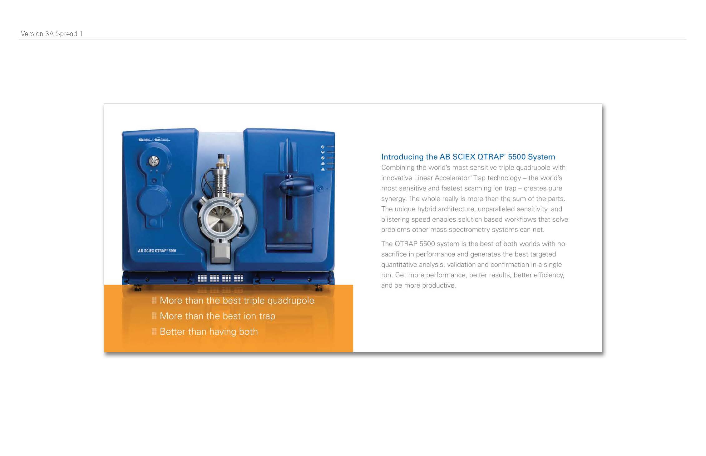
While I was at Applied Biosystems, my team was constantly working on pushing the brand. We did explorations and brand workshops. When a new product was being launched, we had to brand it. This included an overall look and feel for printed material. My team consisted of James Stoecker (Design Director), Amy Vest (Designer) and me. James started the project by asking me to create a mood board, based on the characteristics of the product. Because it was such a departure from the look of the previous systems, I thought it would be interesting to give small glimpses of what was in store for the consumer; playing off of the shapes.


After the initial moodboard review, we brainstormed ideas that could take the concepts in the moodboard and turn them into brochures. Amy and I split up and came up with some preliminary concepts for the brochure. Below are some of the concepts that I came up with.
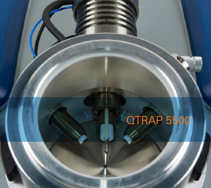
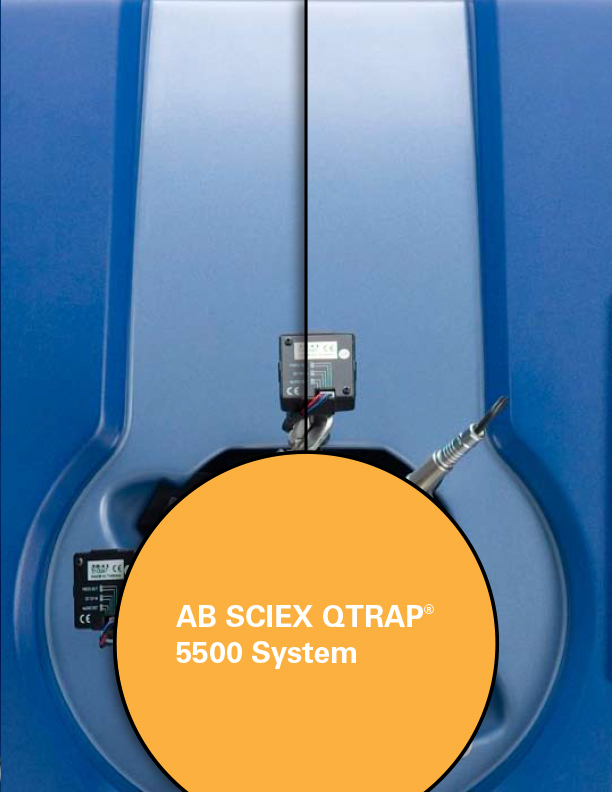
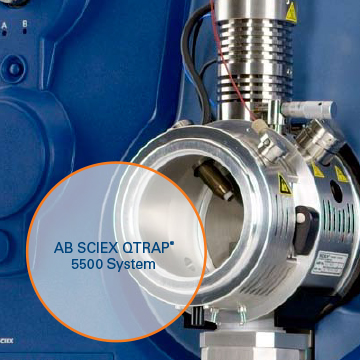
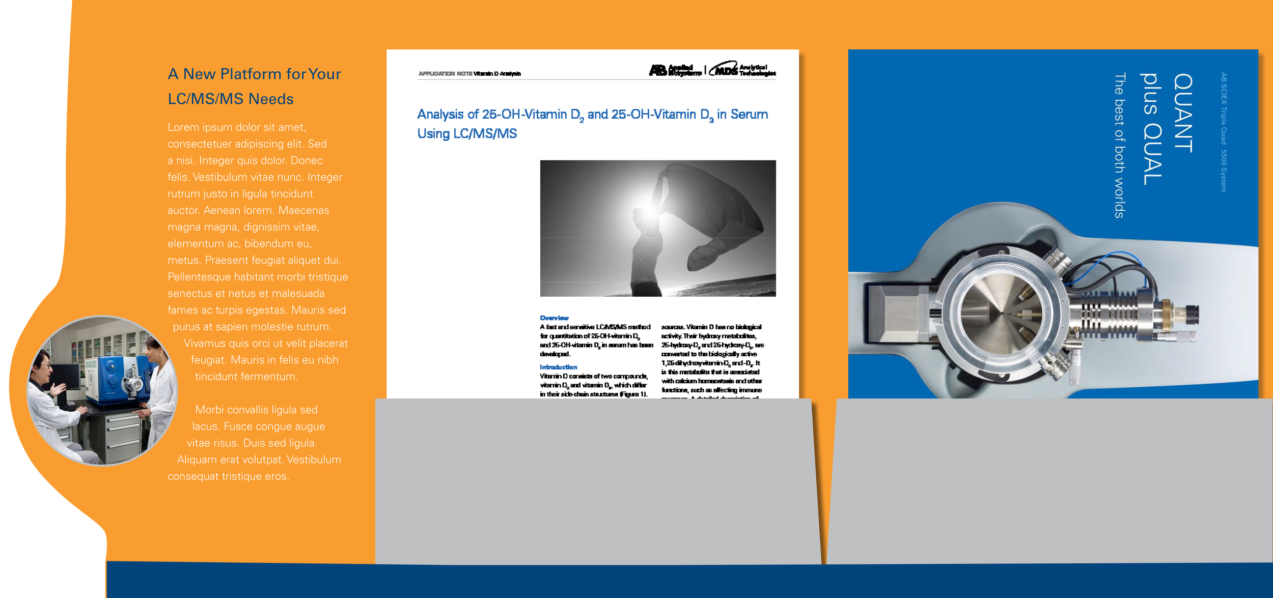
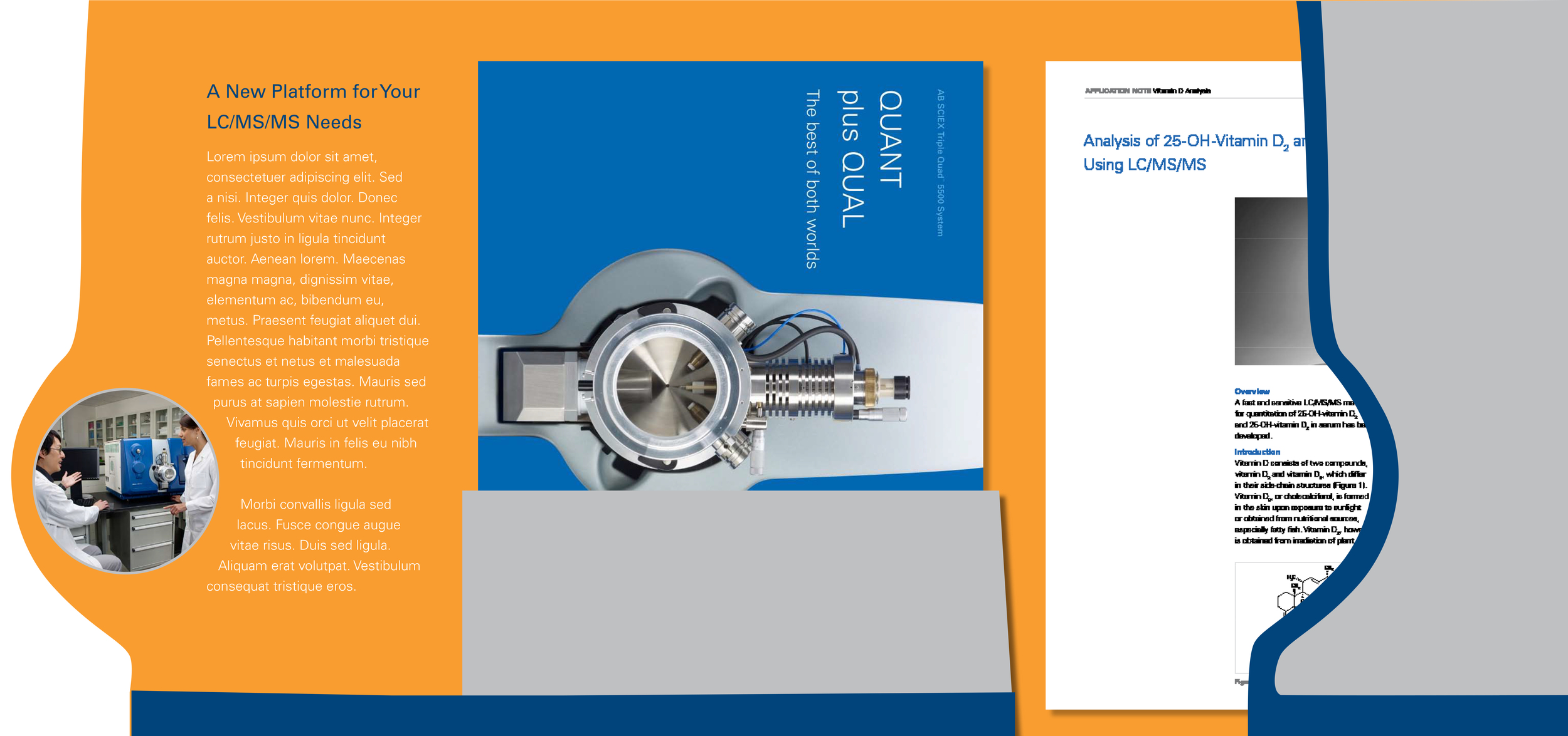
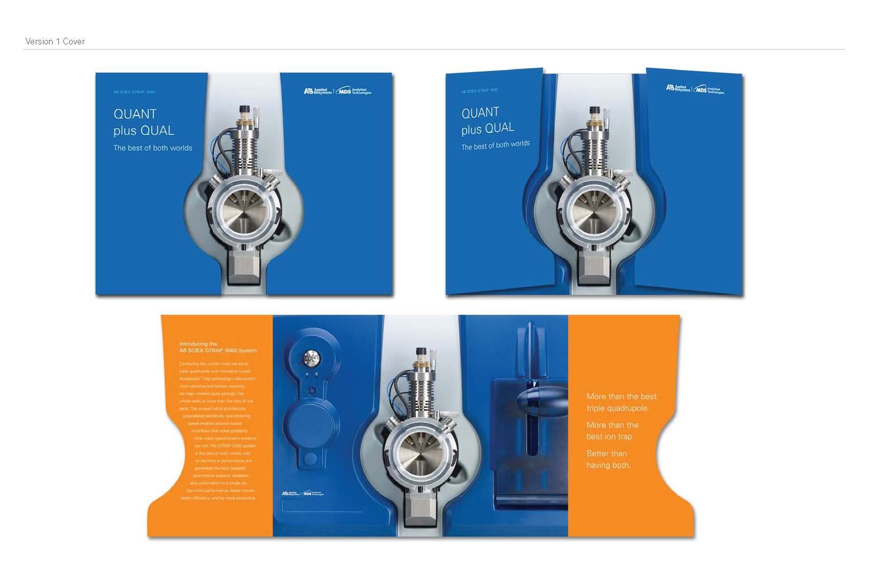
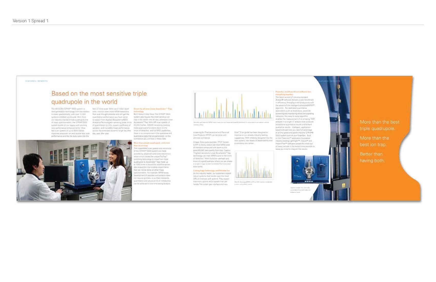
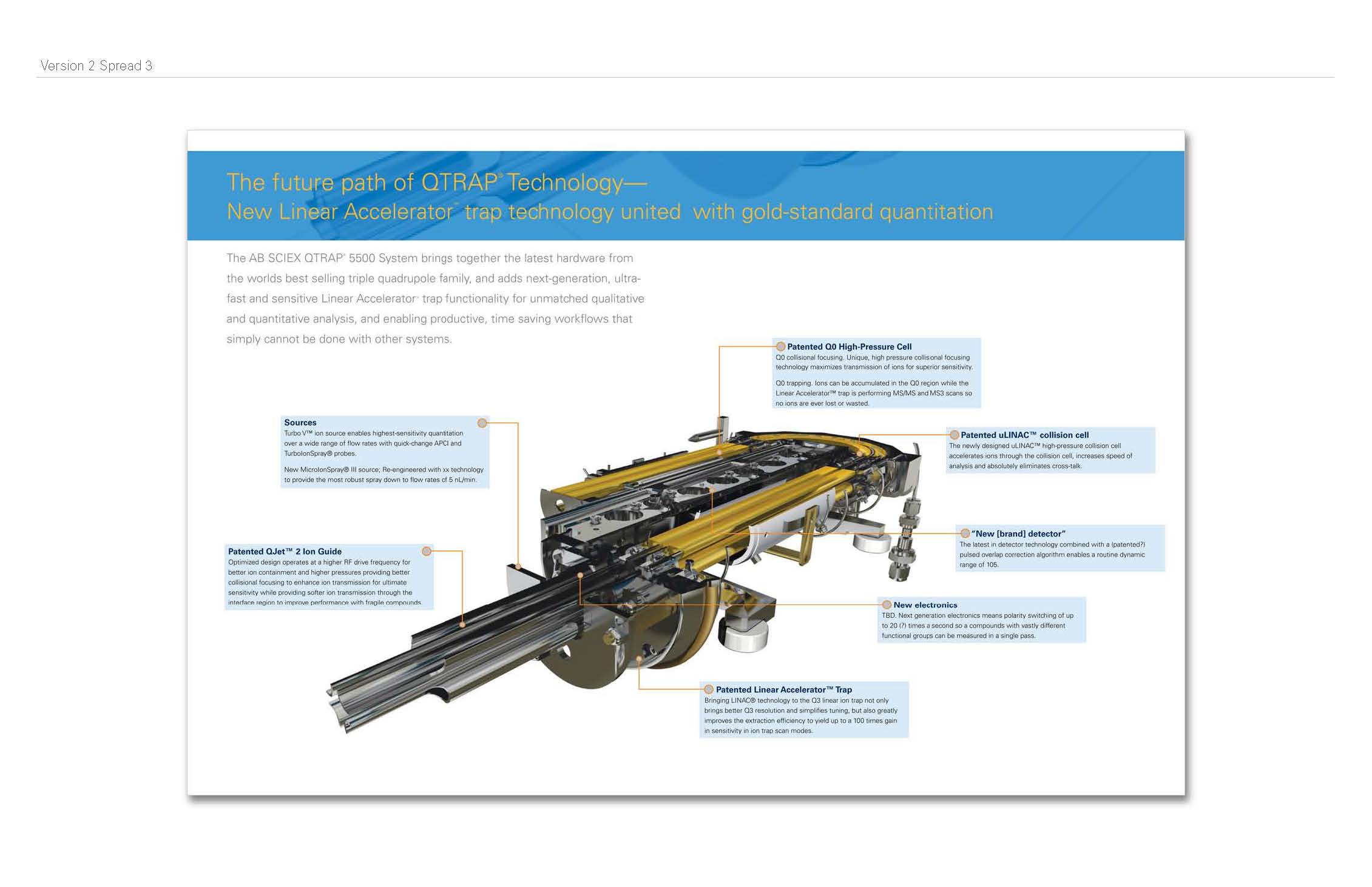
Diecut brochure, playing off of the shape of the source.
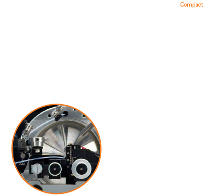
Mini Brochure and case, playing off of the idea that it comes in a compact size, yet it's powerful.

When we presented out concepts, James decided to move forward with all three concepts; my two as well as Amy's. She took over my diecut version and changed it up a bit, and I focused on the mini brochure, but I didn't not move forward with the case. Instead I created a paper prototype to show how it would look with one for the QTRAP and one for the Triple Quad.
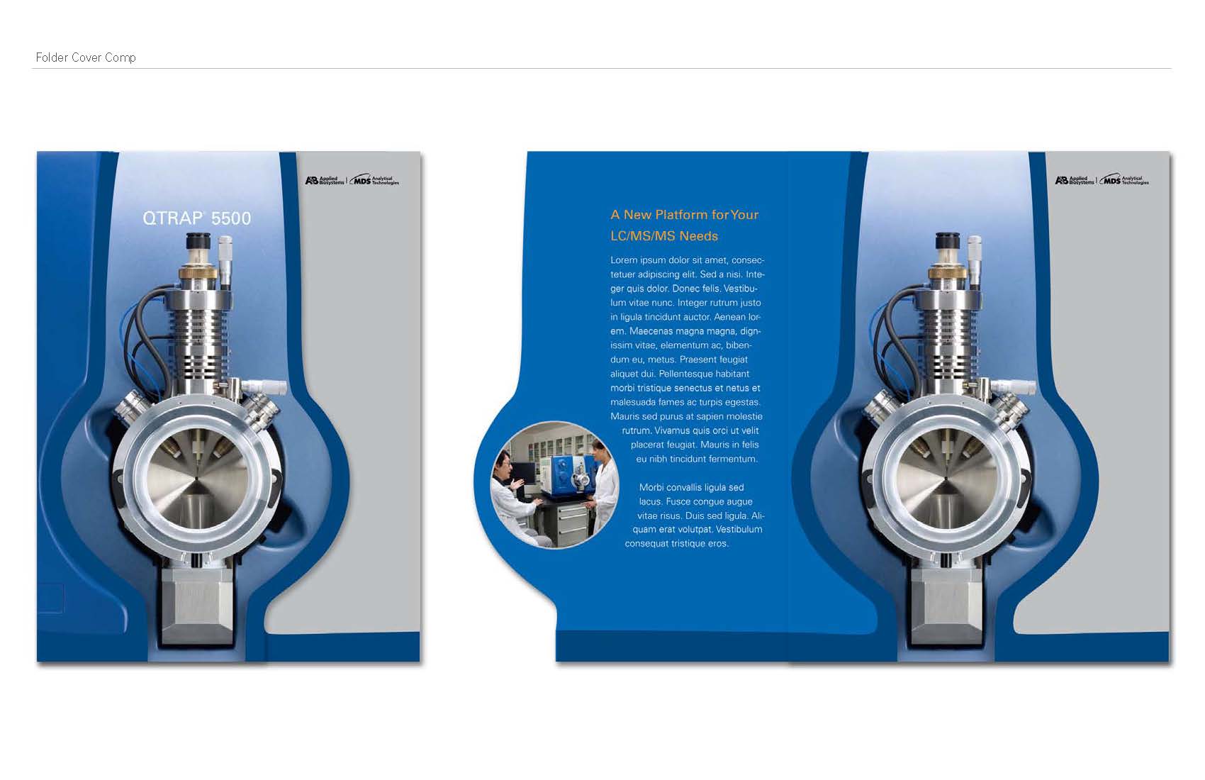
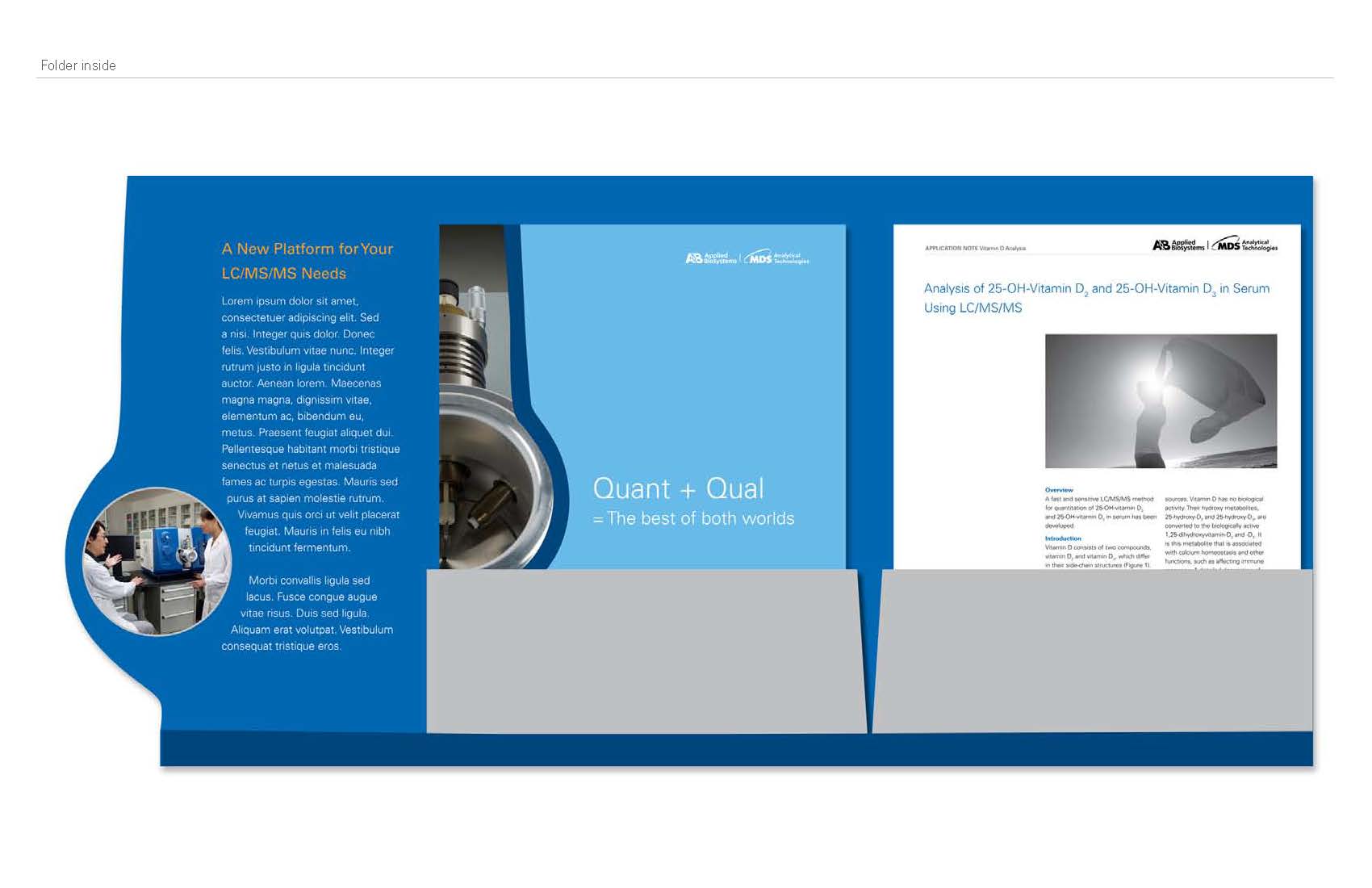
After I created my prototypes, and we were ready to create the presentation, I came up with some concepts for a folder.
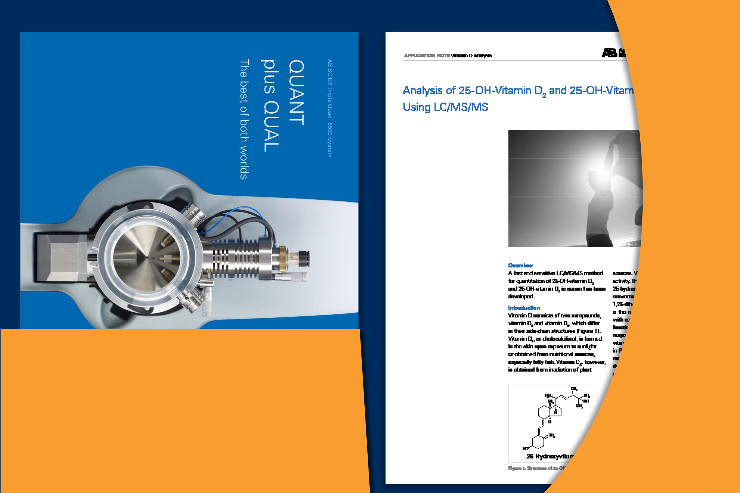
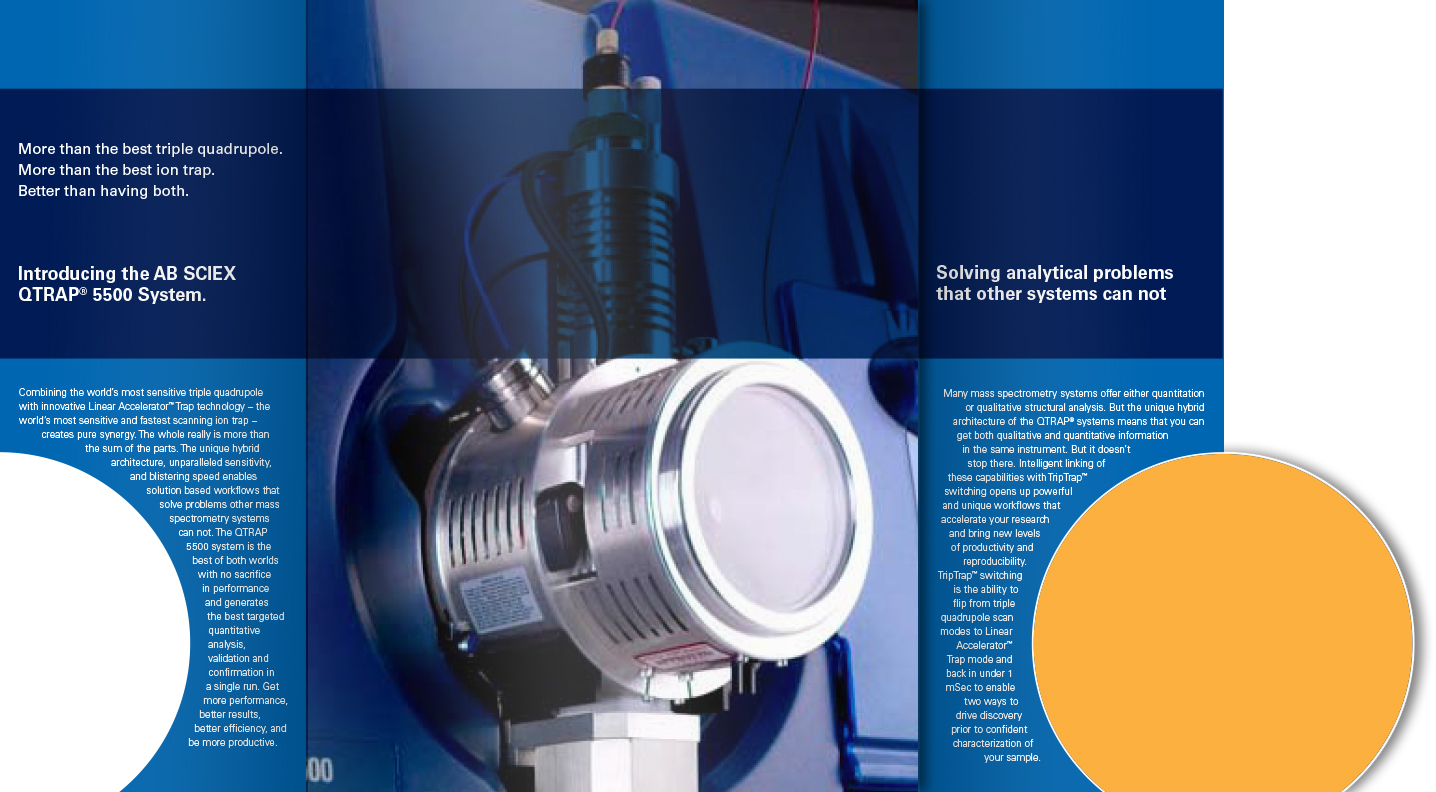
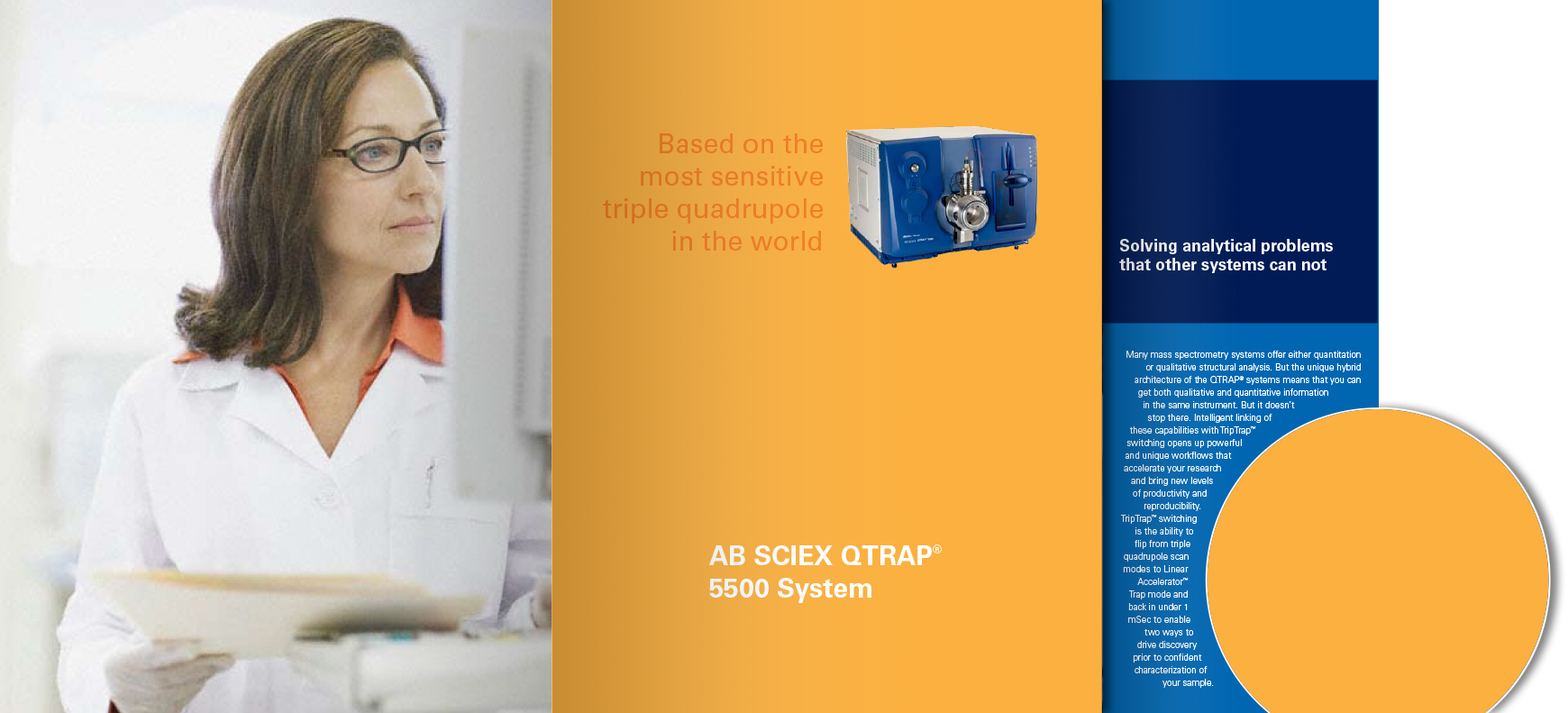
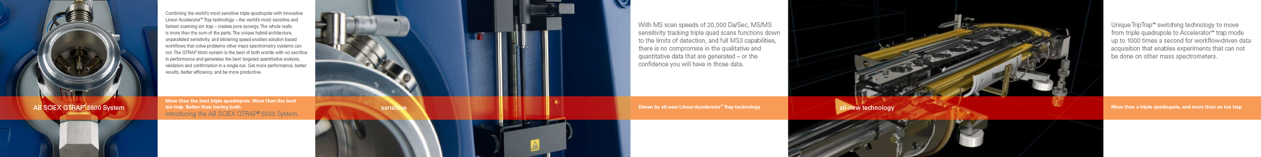
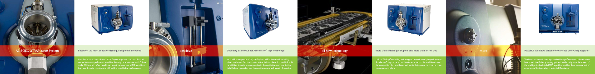
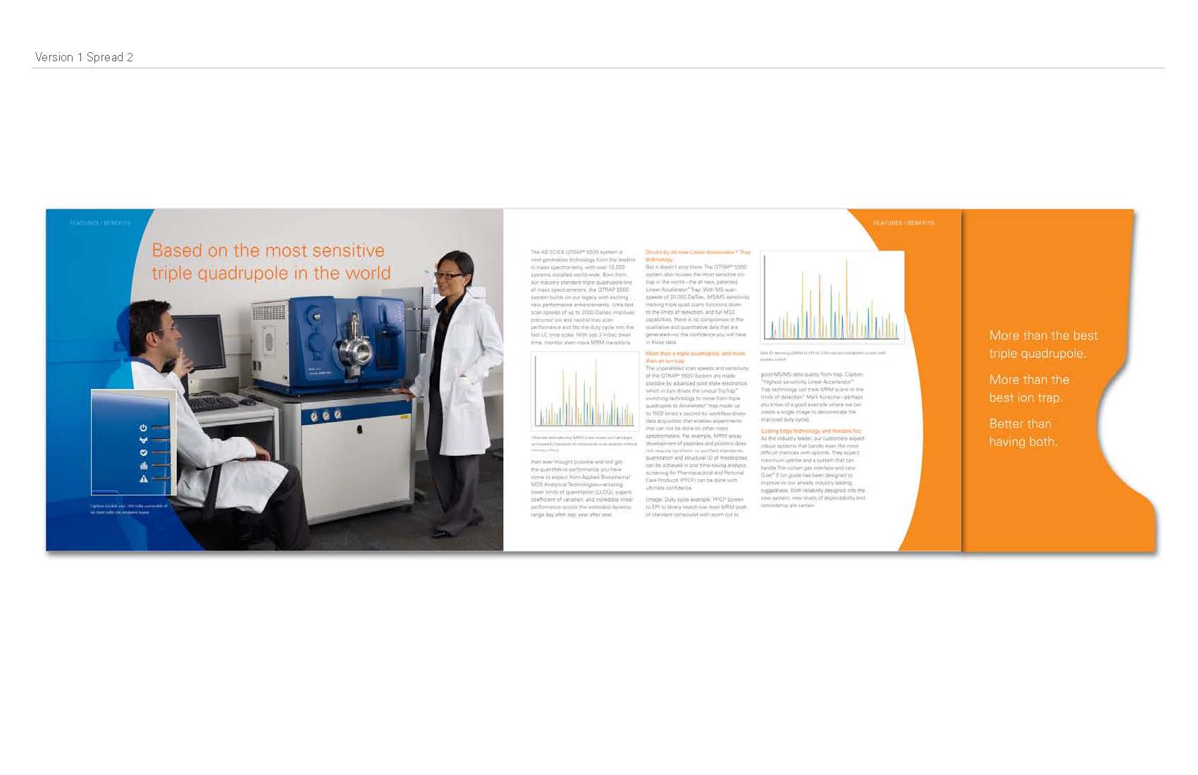
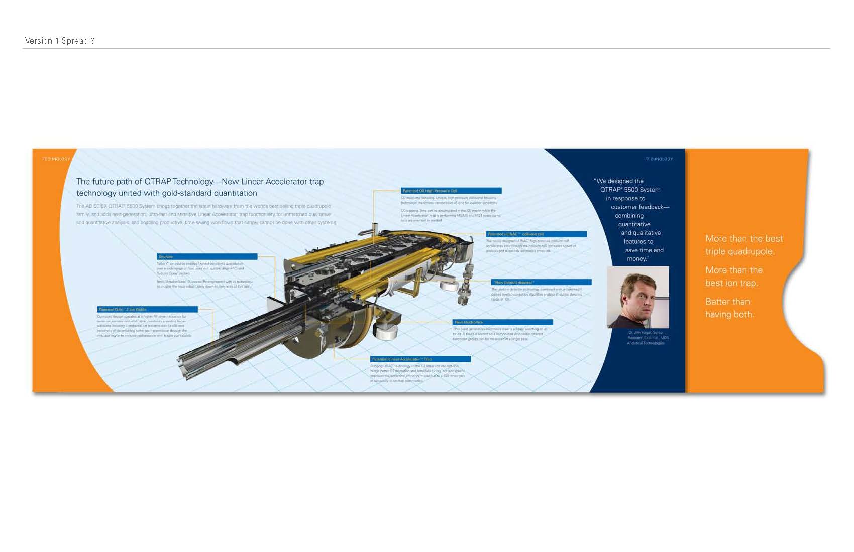
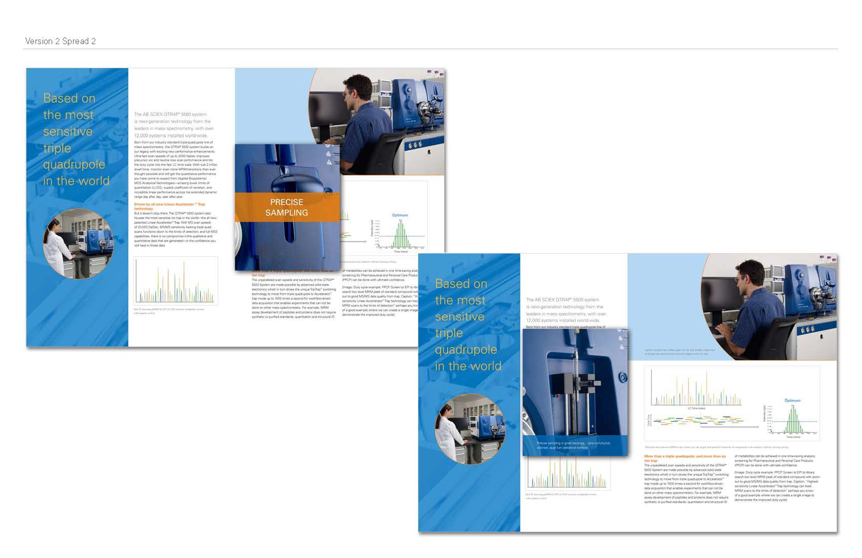
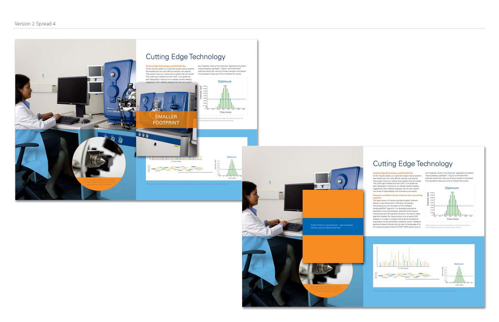
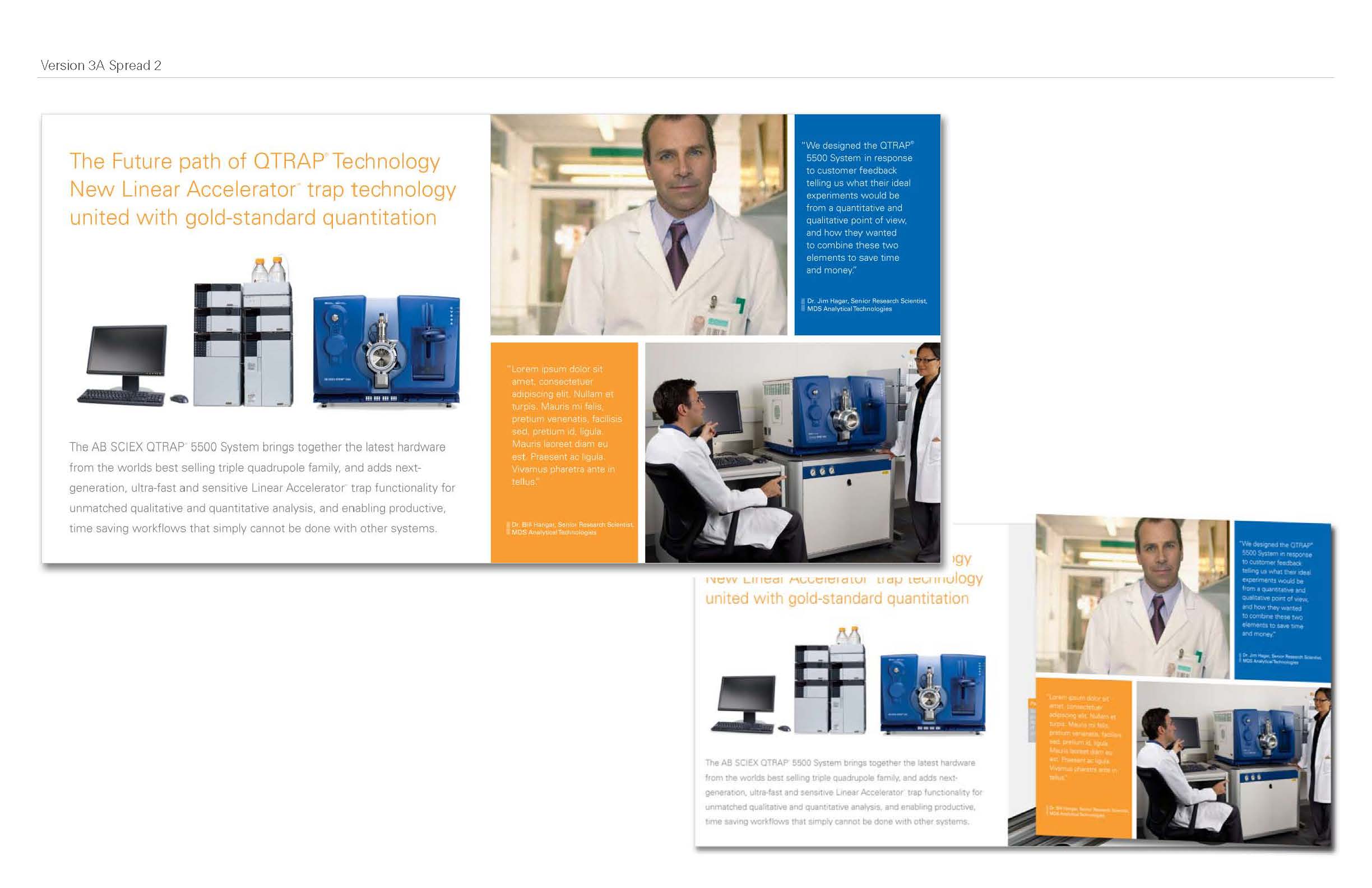
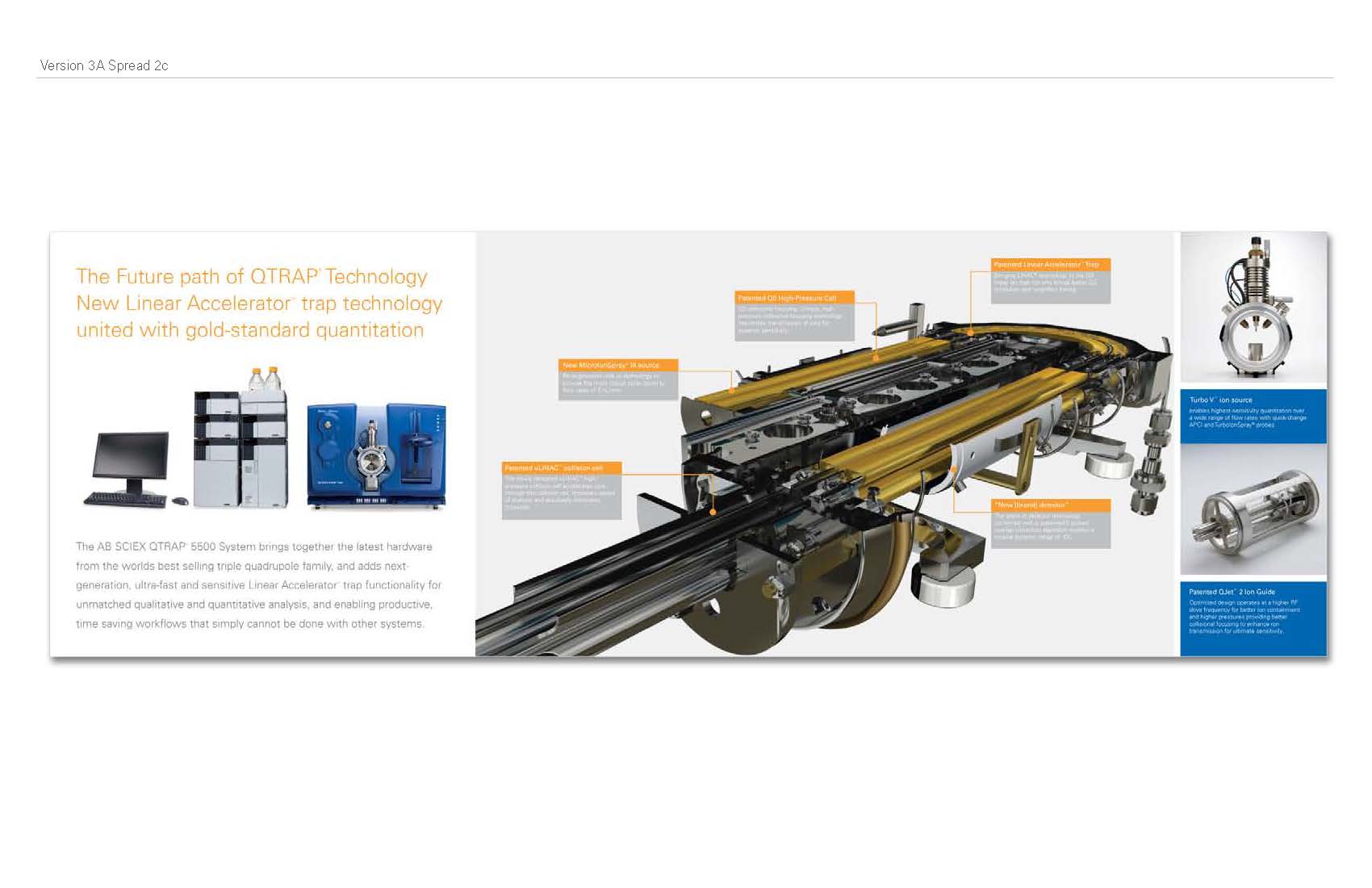
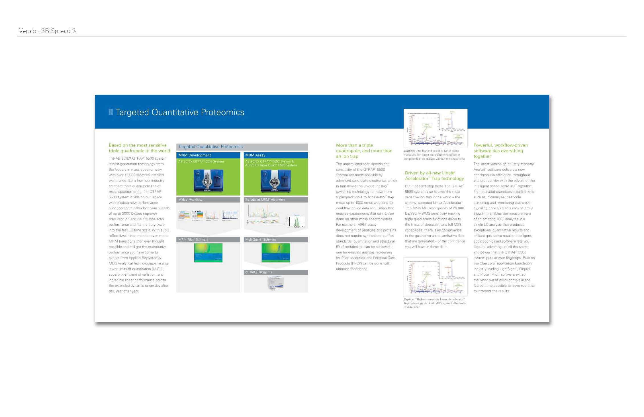
And from there we created the final presentation: The first two (below) were Amy's designs. The first was a die-cut, gate-fold cover, horizontal design, the second had a peek-a-boo aspect where smaller pages that had big messages were between the letter-sized pages.
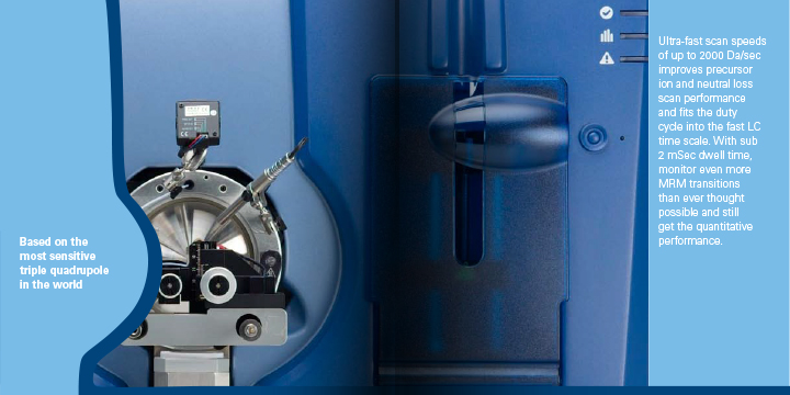
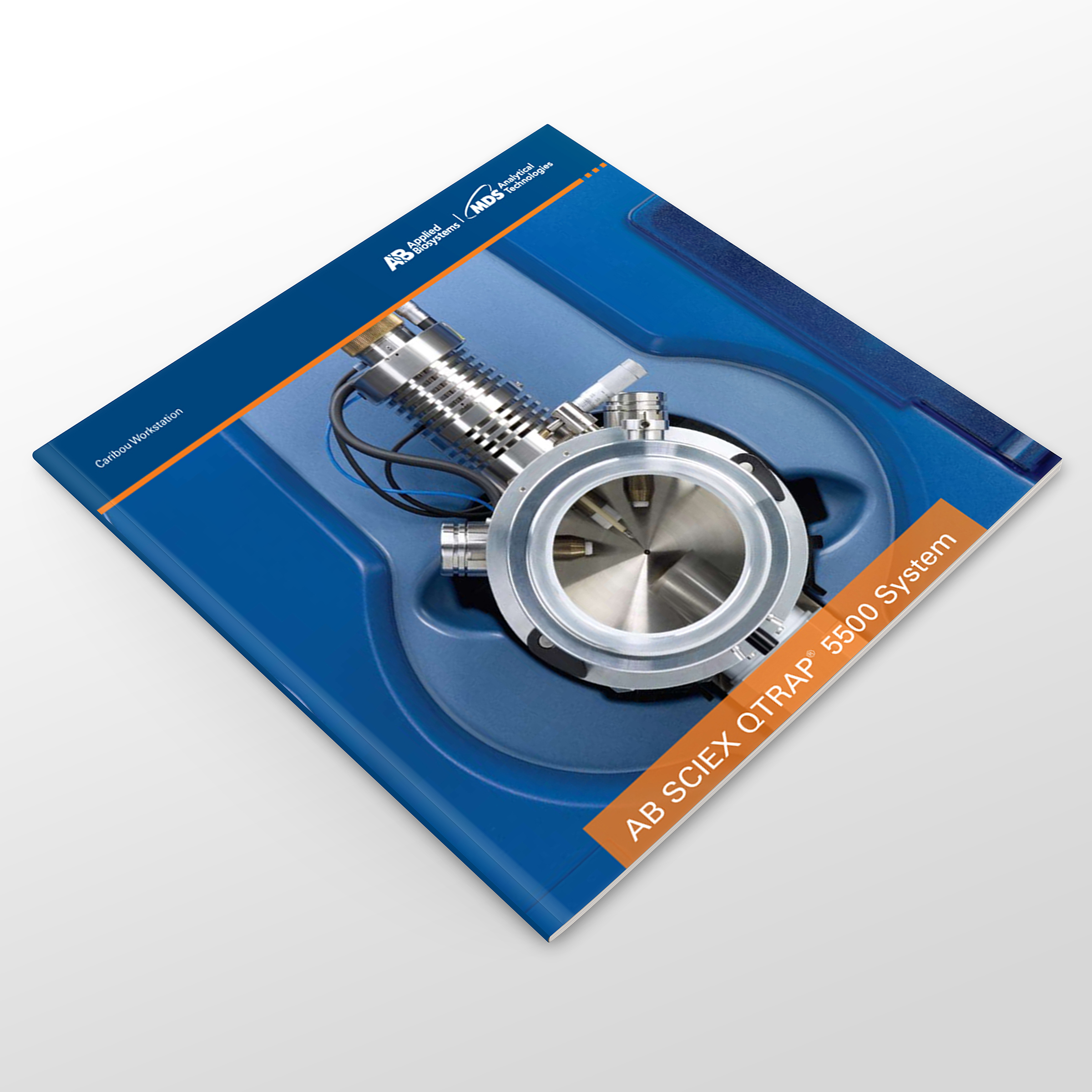
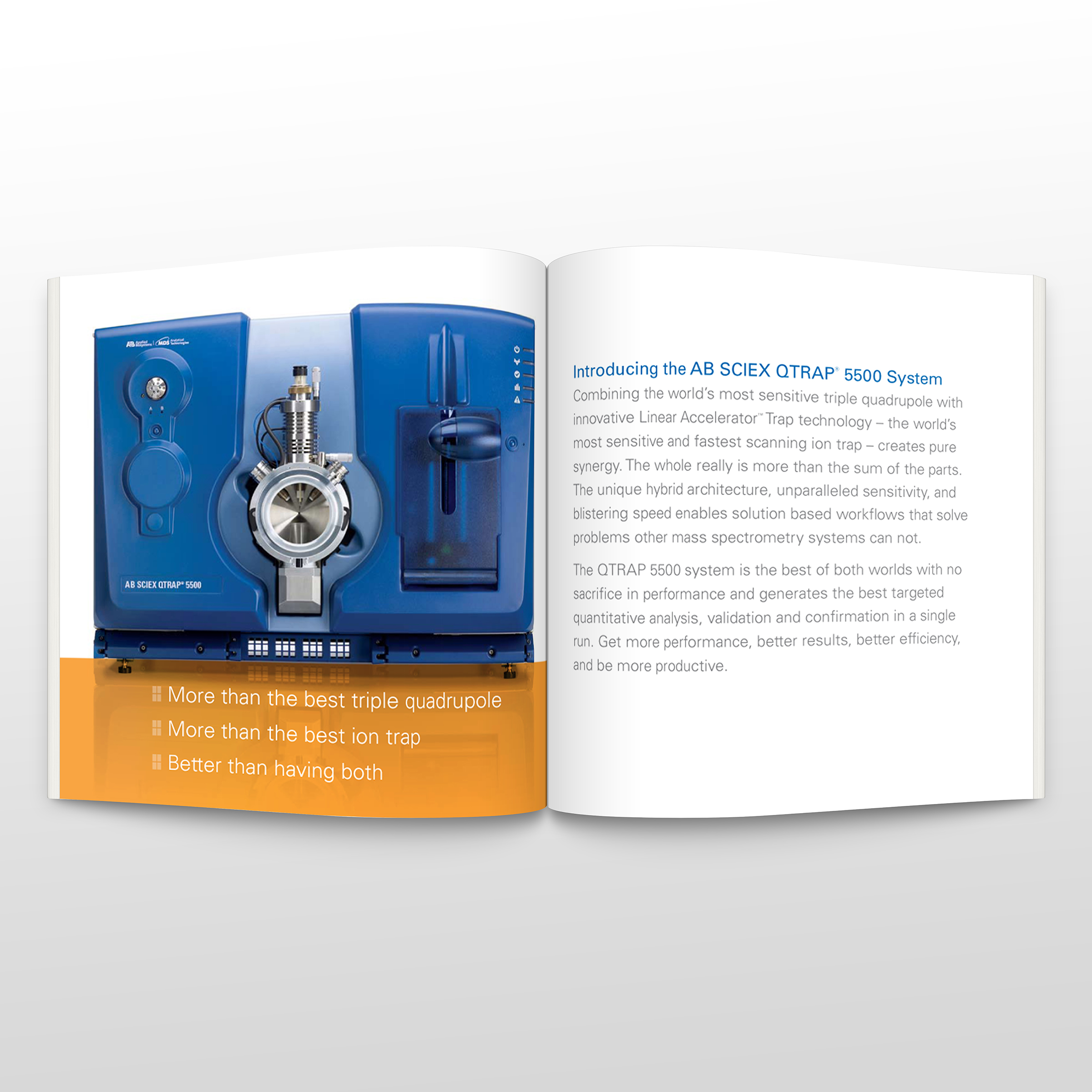
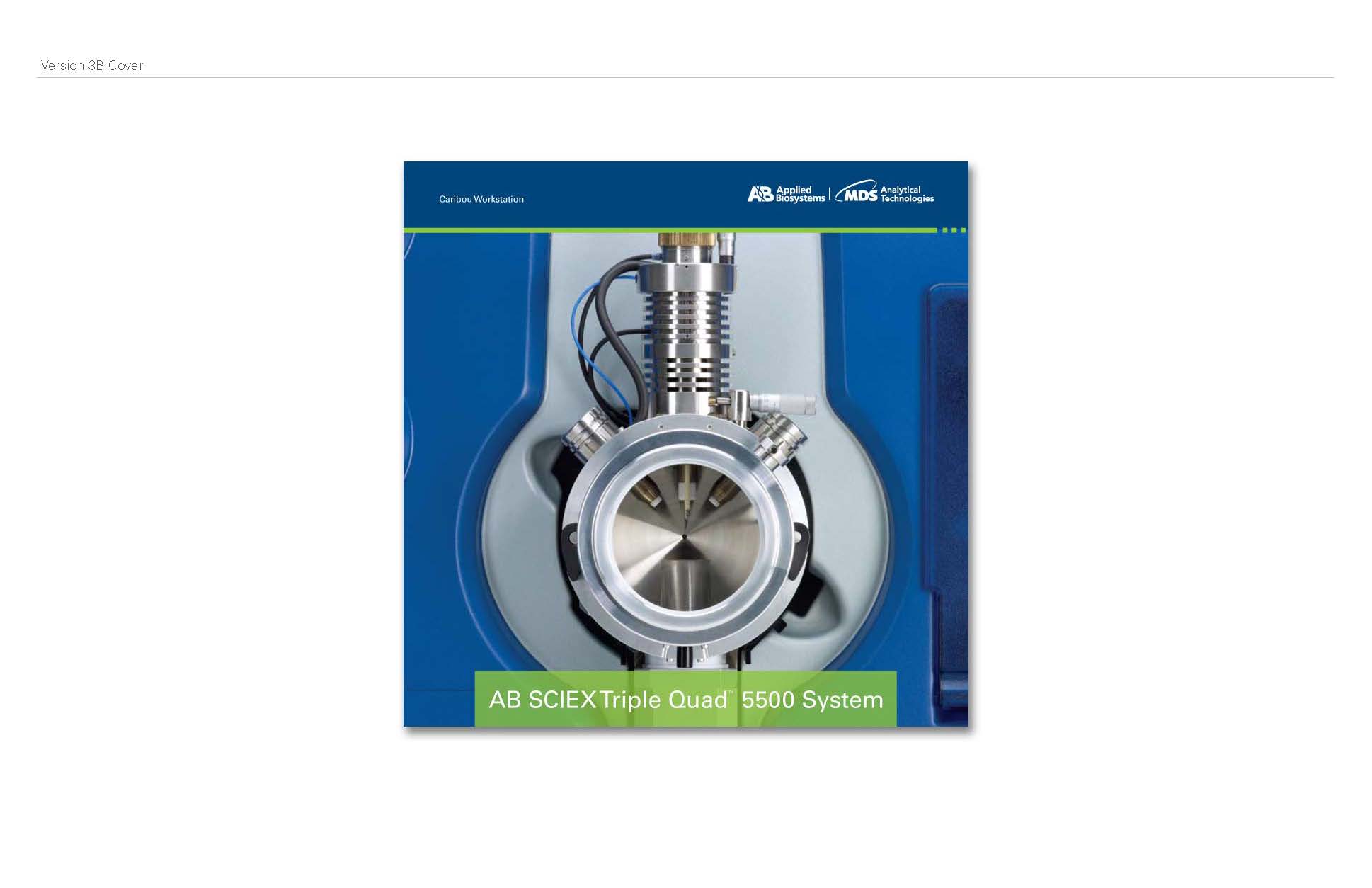
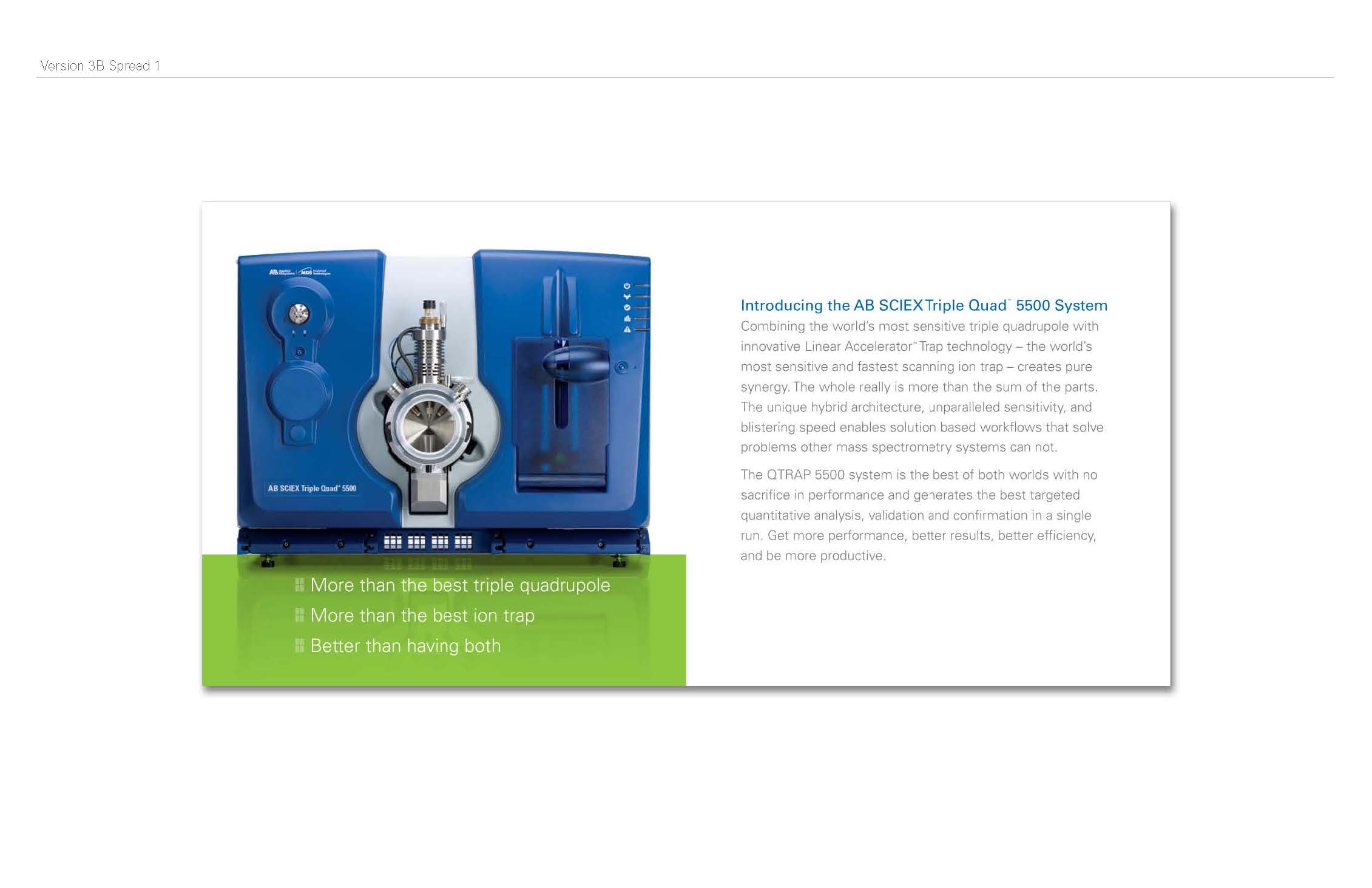
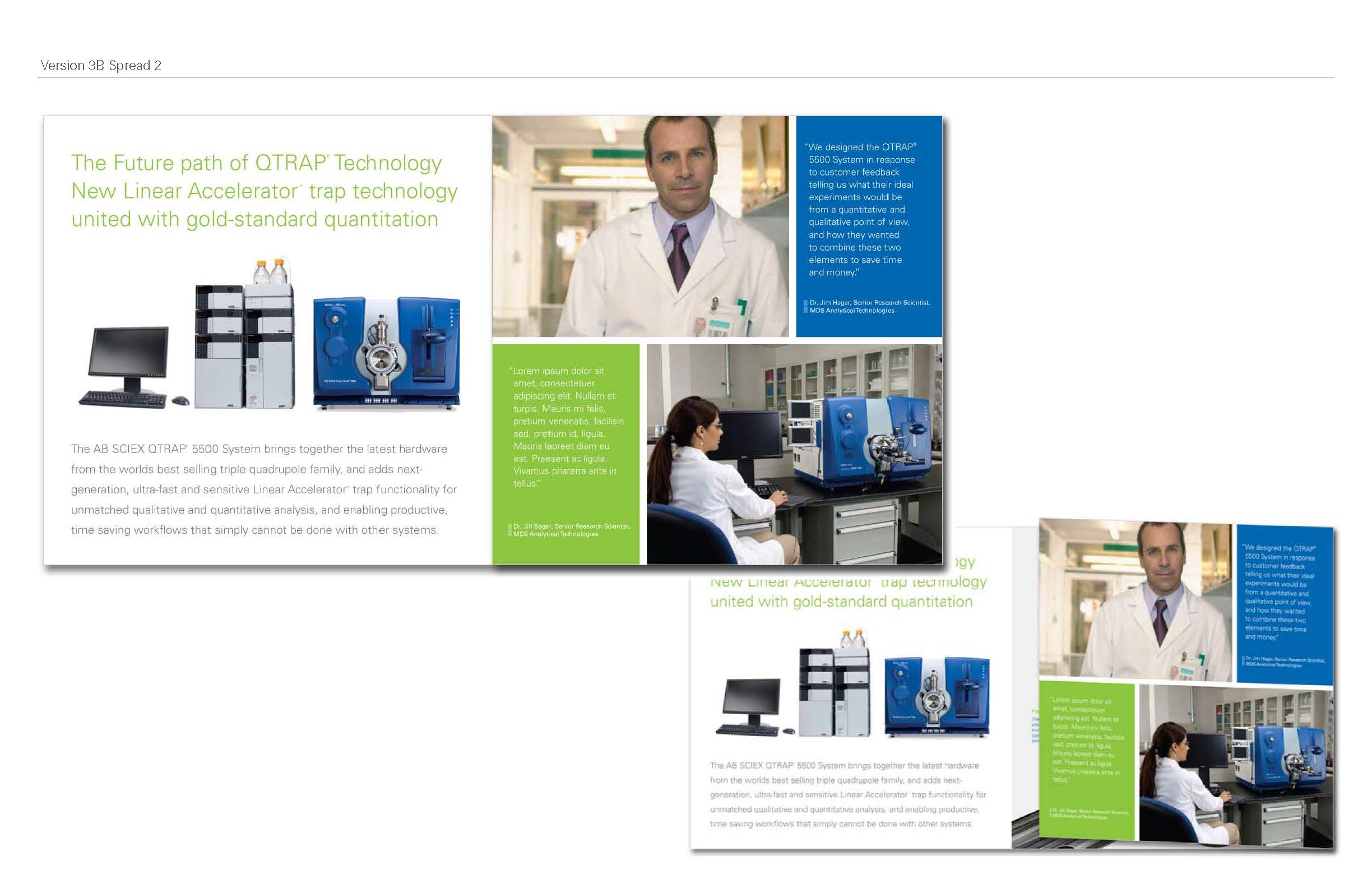
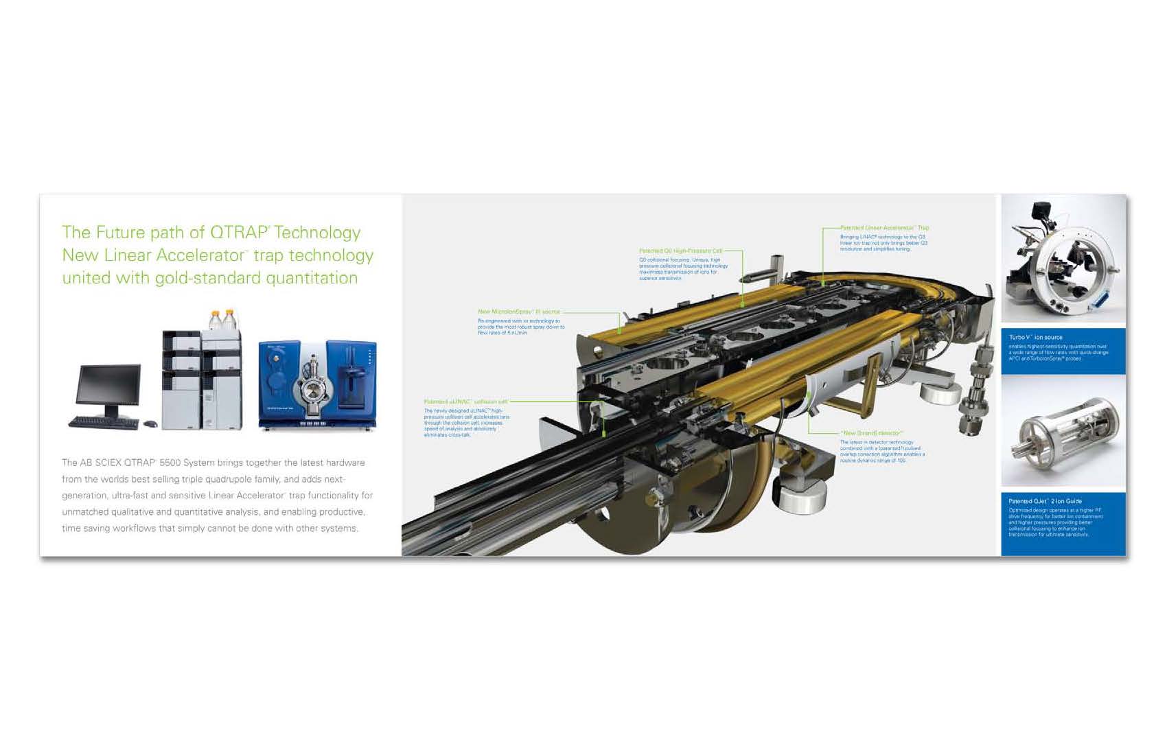
My design (below), based on the original mini brochure concept, had two versions of the same design. One for the QTRAP and one for the Triple Quad.
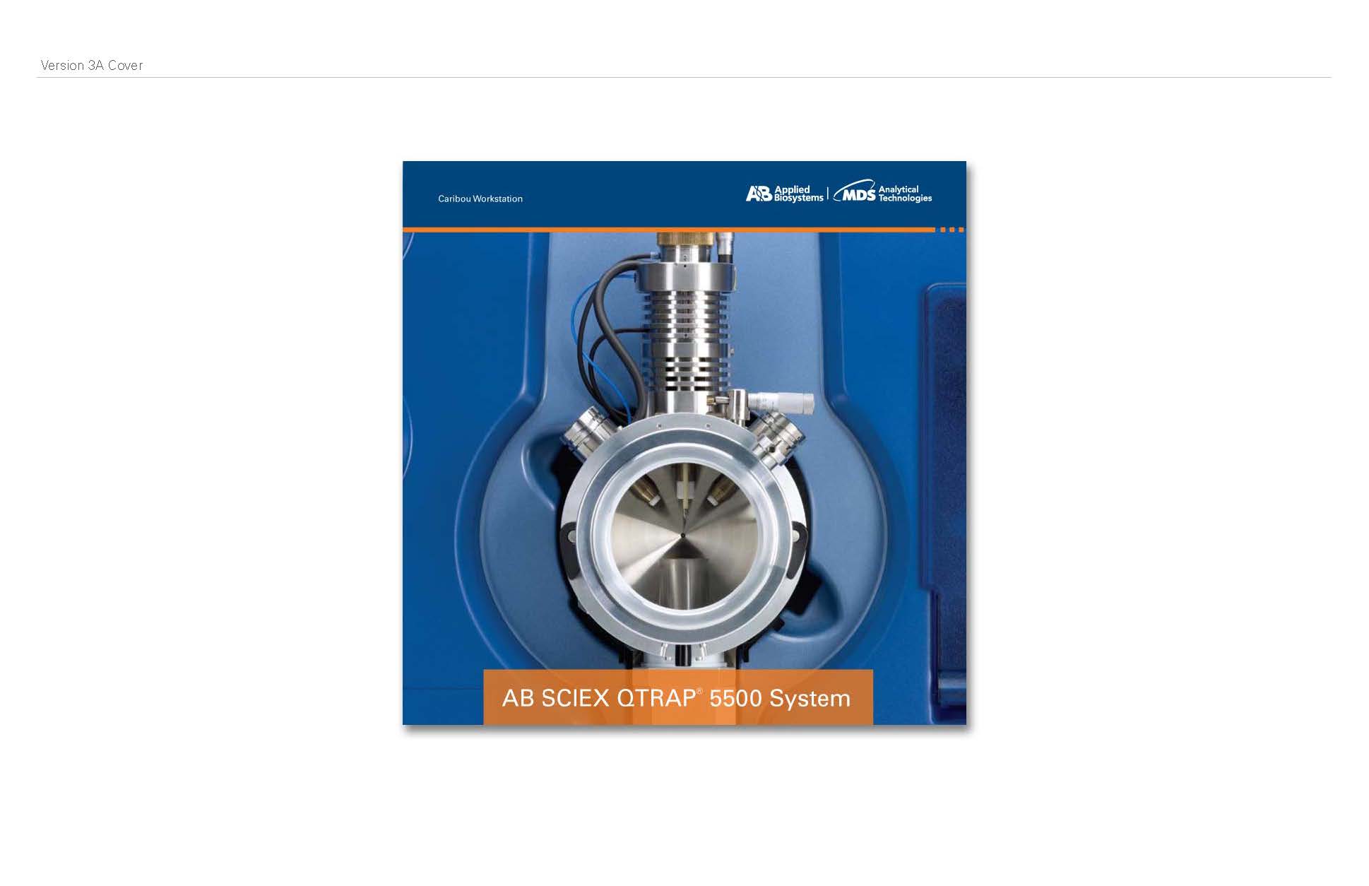
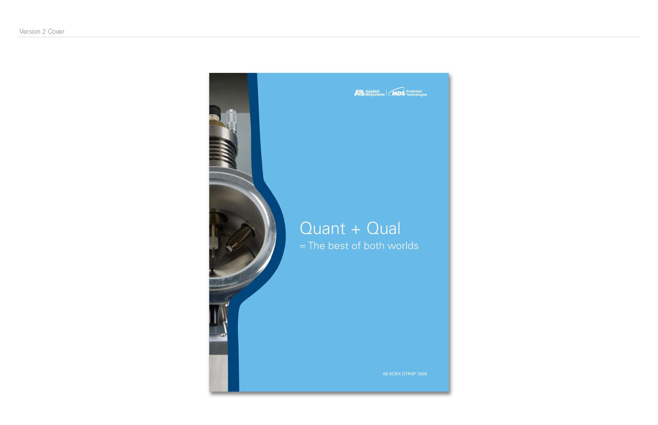
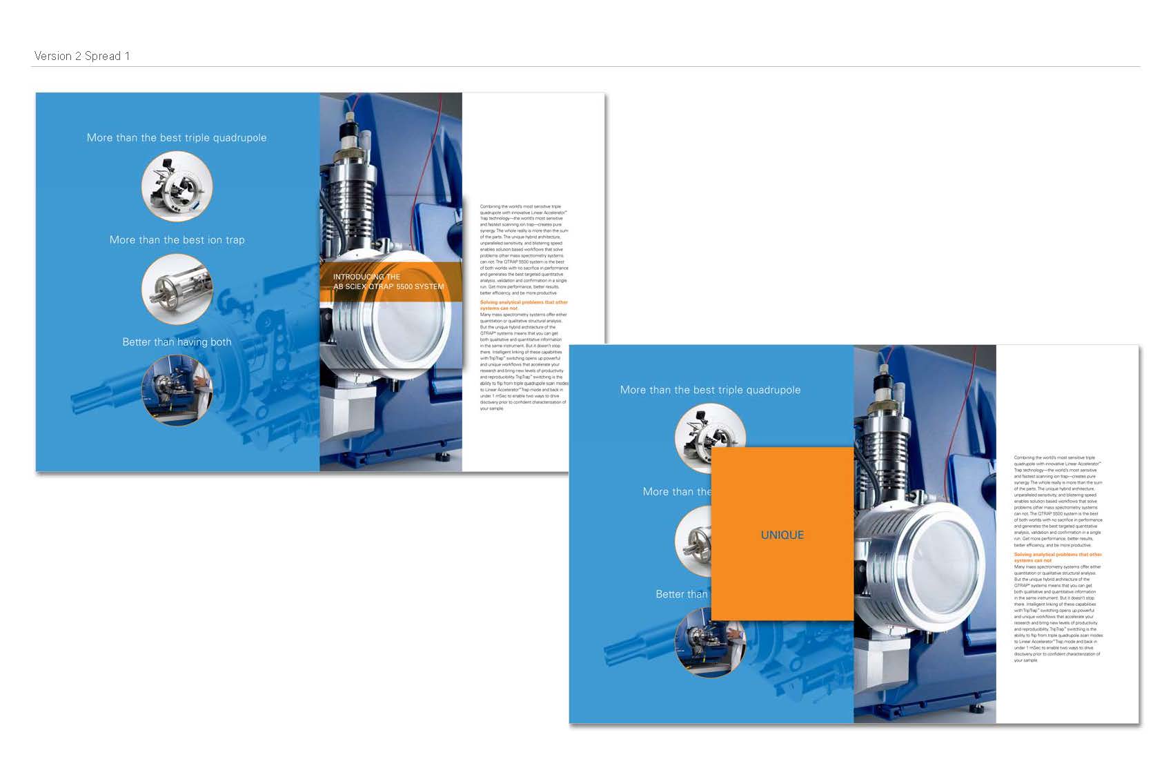
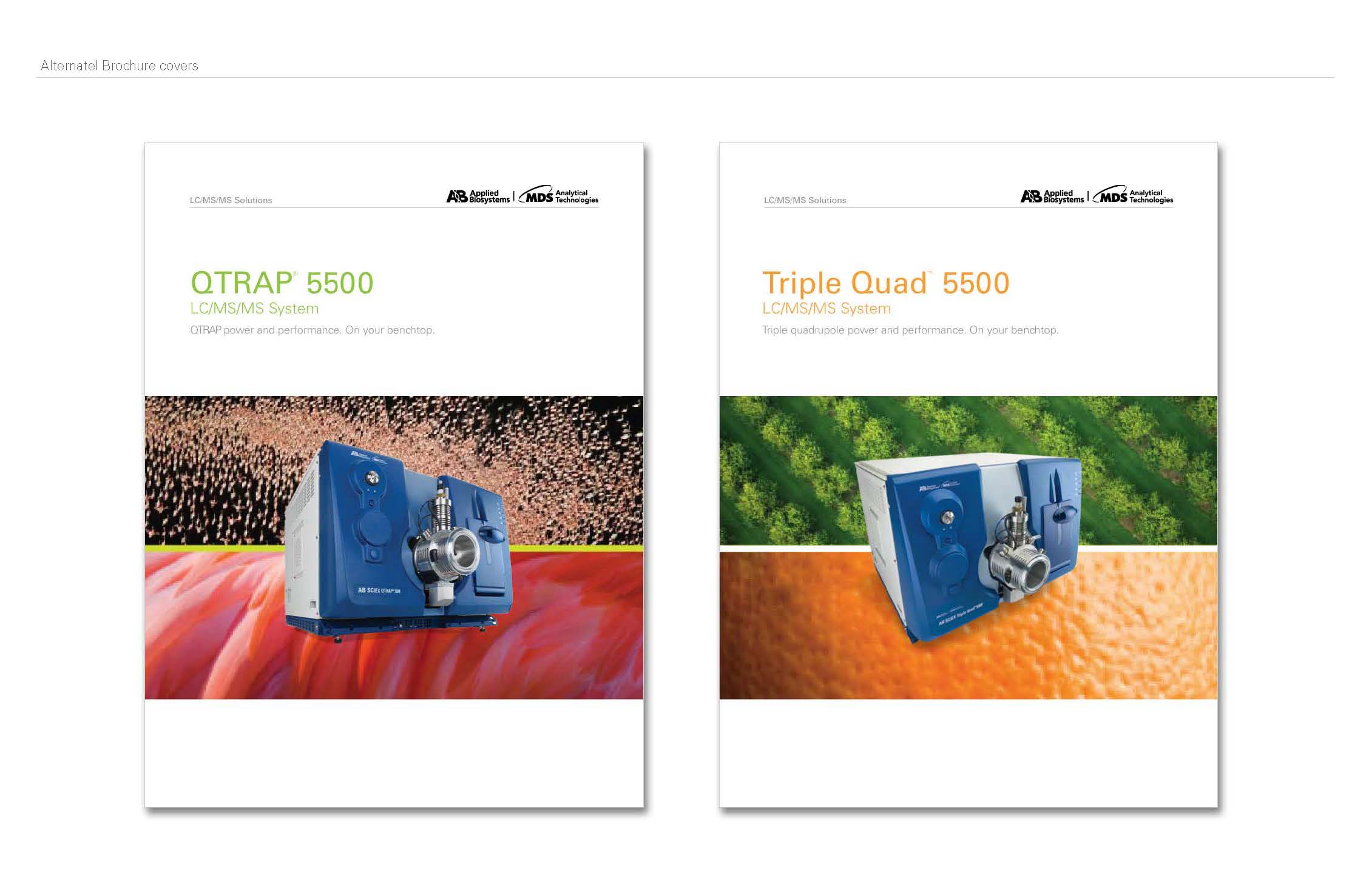
And an alternate brochure cover that was less of a departure from Applied Biosystems' look and feel, as well as the design for the folder.
The client ended up choosing Amy's design, so she went forward with the final layout of the brochure.